Gen AI Web Design

When AI became the art director

A full blog redesign and a custom AI image system that gave Aqua's threat intelligence content a visual identity it had never had.

ClientAqua Security
RoleUX, Web and Brand Designer
Year2024
ScopeBlog redesign, AI image system, Component design
30+ AI images
Custom-generated visuals matched to each post topic and styled to match Aqua's brand
2 pages redesigned
Blog homepage and post page, redesigned end-to-end and handed off for development
1 scalable process
A repeatable AI-assisted image workflow the content team can own independently
Aqua Security blog redesign on MacBook
01 · The Problem

Great research, invisible on the page

Aqua's security research team was publishing some of the most credible threat intelligence in the cloud-native space. But the blog that housed it looked like every other enterprise security site: generic dark backgrounds, borrowed stock imagery, and a layout that made every post look the same regardless of what was inside.

The imagery problem was the most visible symptom. A post about container escape vulnerabilities sat behind the same blue gradient as a post about compliance tooling. There was no visual connection between what a post was about and how it looked. For a brand built on precision and expertise, the blog wasn't making that case.

"The research is best-in-class. The blog doesn't show that."

Internal feedback, Aqua Security

The project had two tracks running in parallel: a full redesign of the blog homepage and post page layouts, and a new approach to imagery that could scale with the volume of content the research team was producing.

Goal 01
Redesign the homepage
Give the blog an editorial structure that surfaces content by relevance, not just recency.
Goal 02
Redesign the post page
Improve the reading experience for long-form technical content with better typography, tables, and CTAs.
Goal 03
Build an image system
Create a scalable, on-brand image style for every blog post using AI generation.
Goal 04
Define components
Document a blog component library: tables, code blocks, CTAs, pull quotes, and image captions.
02 · Goals

Two tracks, one system

03 · Research and Ideas

Auditing everything that needed fixing

Before designing anything, I catalogued every element of the blog: tables, IOC (Indicator of Compromise) tables, code blocks, pull quotes, CTAs, image captions, author bios. The audit revealed how inconsistently these were being used across posts and how many component patterns were missing entirely.

The imagery audit made the case clearly. Every post used the same dark gradient background, regardless of topic. There was no visual system, no brand consistency, and no way for a reader scanning the blog to know what any post was about from its thumbnail alone. That became the brief for the AI image system.
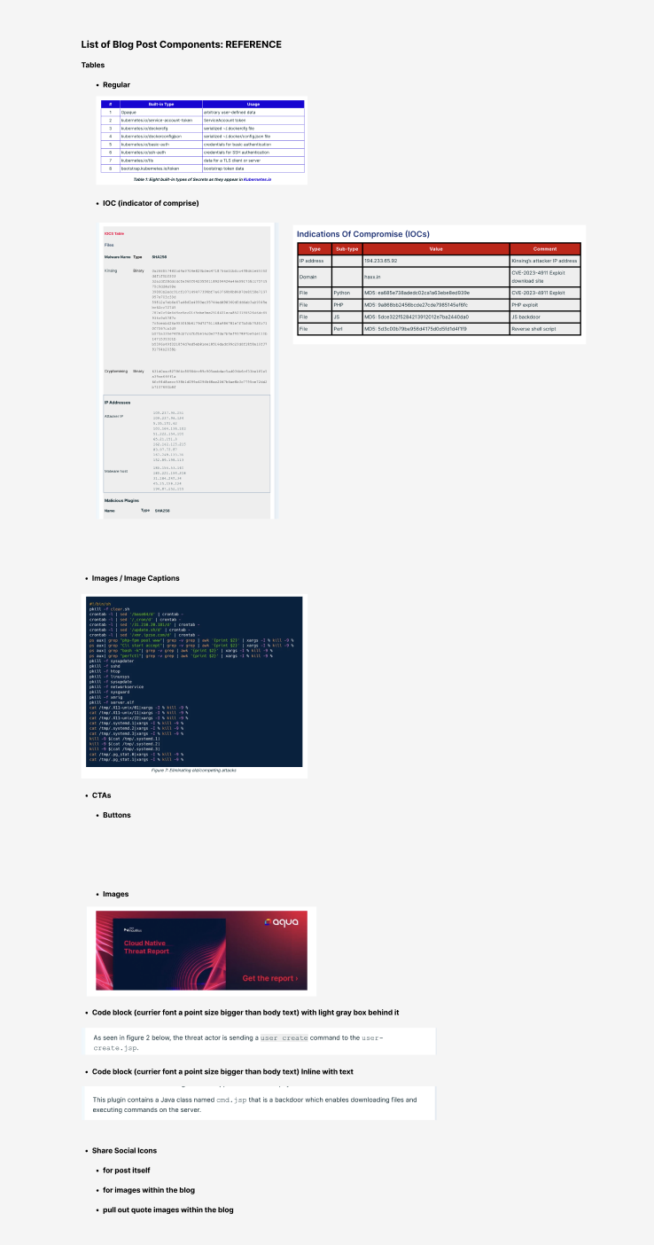
Blog component reference sheet documenting all post elements

The research topics are inherently technical and abstract: container escapes, supply chain attacks, cryptomining malware. Stock photography couldn't carry that weight without being misleading or generic. AI generation made it possible to create imagery that was conceptually accurate, visually on-brand, and fast enough to scale across 30+ posts without a photo shoot or illustration budget.

But getting there required real prompt engineering. A vague prompt produces a vague image. I built the process around translating each post's core threat concept into a precise visual metaphor, then layering in style constraints that kept every image consistent across the entire blog.
01
Read the brief
Extract the core threat: what is the attack, what does it exploit, and what mental image would a security engineer have when they read the title?
02
Find the metaphor
Translate the technical concept into a physical or environmental metaphor that reads instantly, even at thumbnail size. A leaking vessel. A hidden door. A corrupted root system.
03
Lock the style
Add the same style constraints to every prompt: dark teal palette, cinematic lighting, photorealistic render, no text, ultra-detailed, 16:9 aspect ratio. This is what makes 30 different images feel like one system.
04
Iterate to brand
Refine until the image reads as threat intelligence, not generic tech art. Test it at small size in the blog grid context before finalizing.
Prompt walkthrough
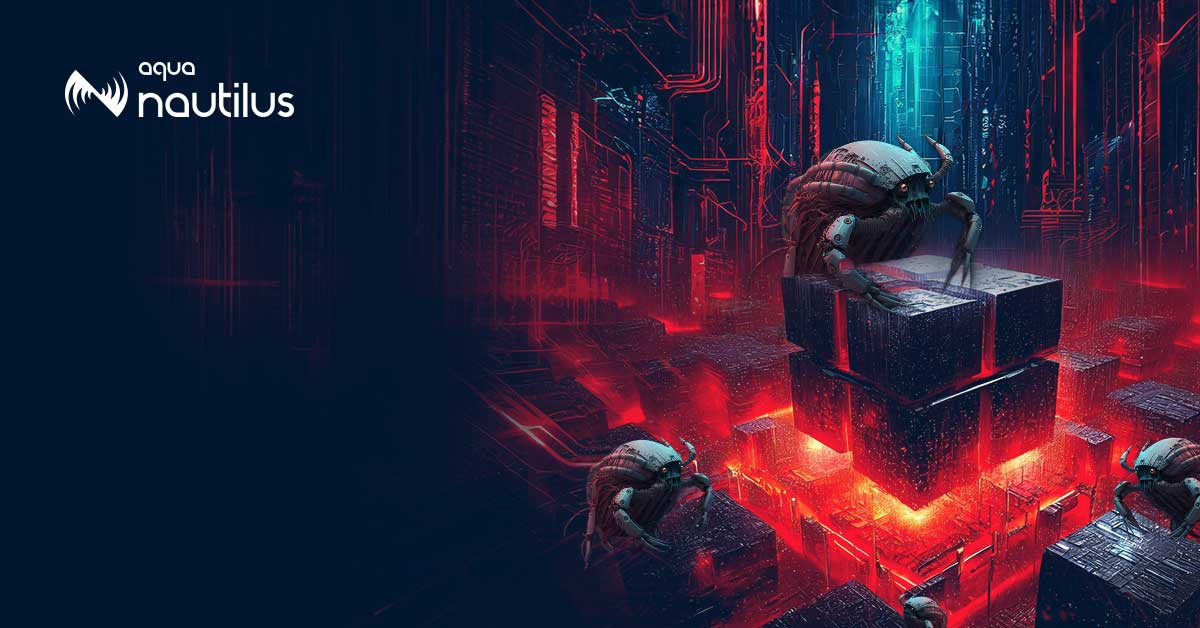
HeadCrab 2.0 malware campaign
Threat concept
A Redis server silently hijacked by malware that runs cryptomining operations in the background. The attacker embeds the malware in a way that looks like legitimate Redis activity.
Final prompt
"A menacing crustacean creature with glowing red eyes emerging from a server rack in a dark data center, teal and cyan volumetric lighting, photorealistic cinematic render, hyper-detailed, no text, ultra wide angle, threat and danger atmosphere"
04 · AI Image System

Teaching AI to think in threat intelligence

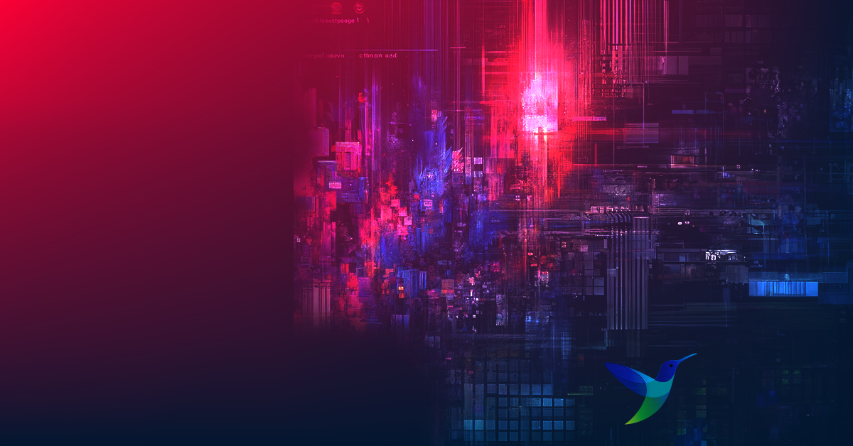
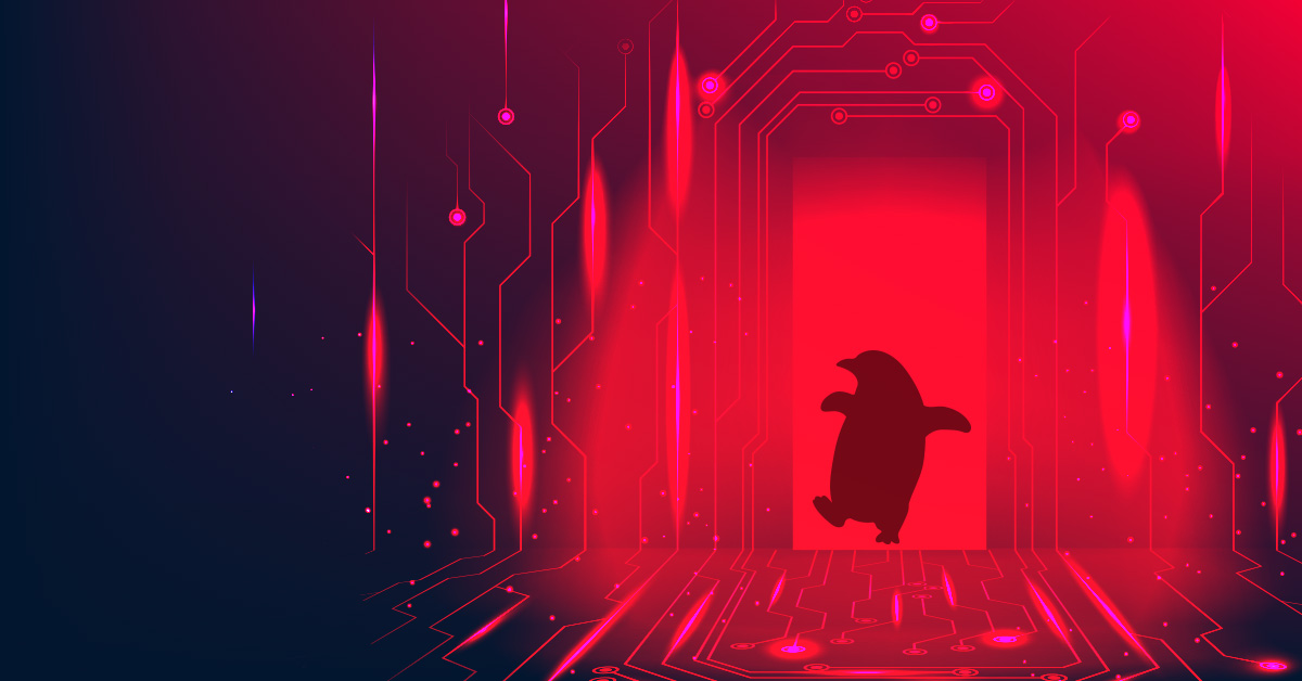
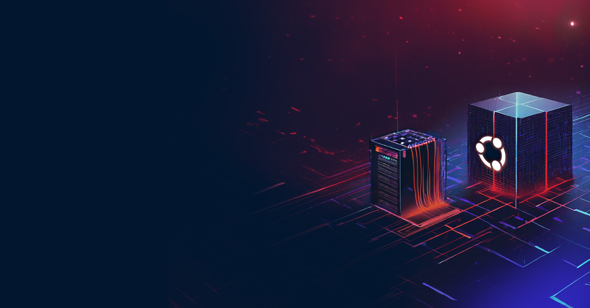
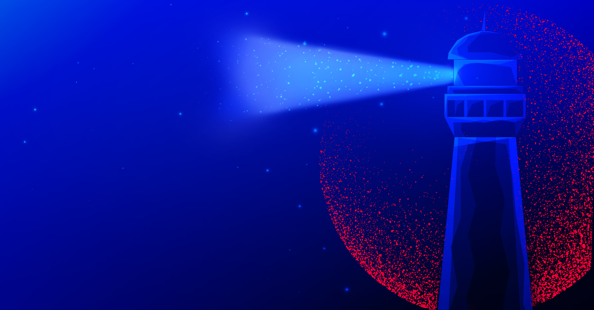
Leaky Vessels
Leaky Vessels
HeadCrab 2.0
HeadCrab 2.0
AWS EKS
AWS EKS
Fluent Bit
Fluent Bit
XZ Backdoor
XZ Backdoor
Apache Druid
Apache Druid
Snap Suggestions
Snap Suggestions
Trivy Harbor
Trivy Harbor
IBM Z Series
IBM Z Series (Technical)
IBM Z Series editorial
IBM Z Series (Editorial)
05 · Final Design

A blog that looks like its content

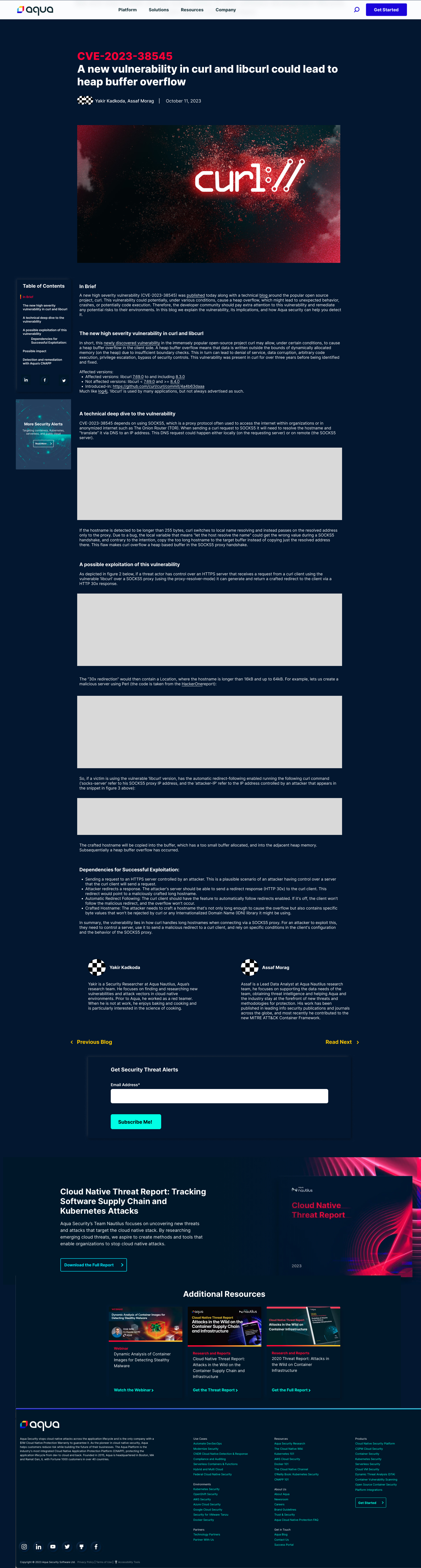
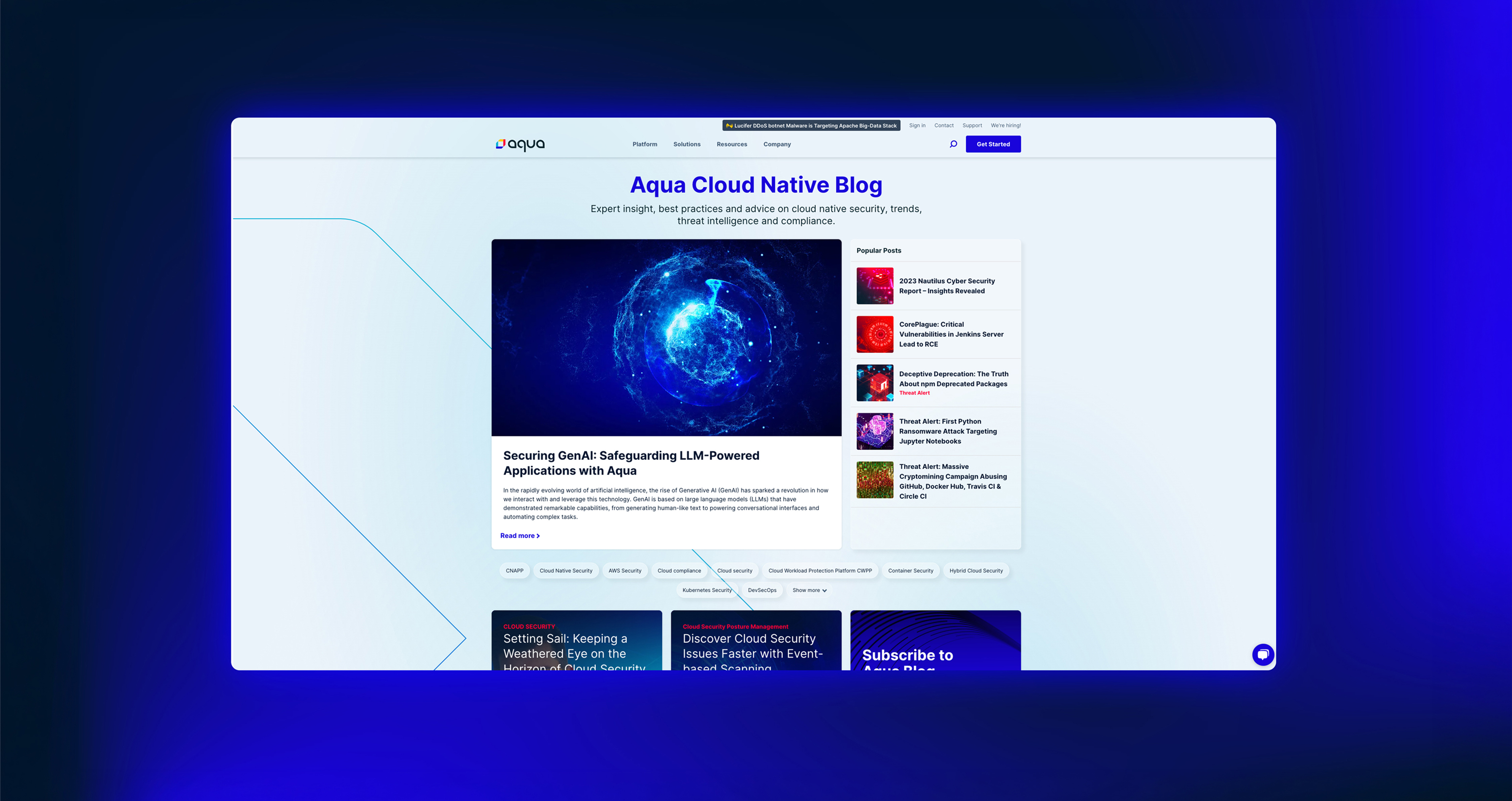
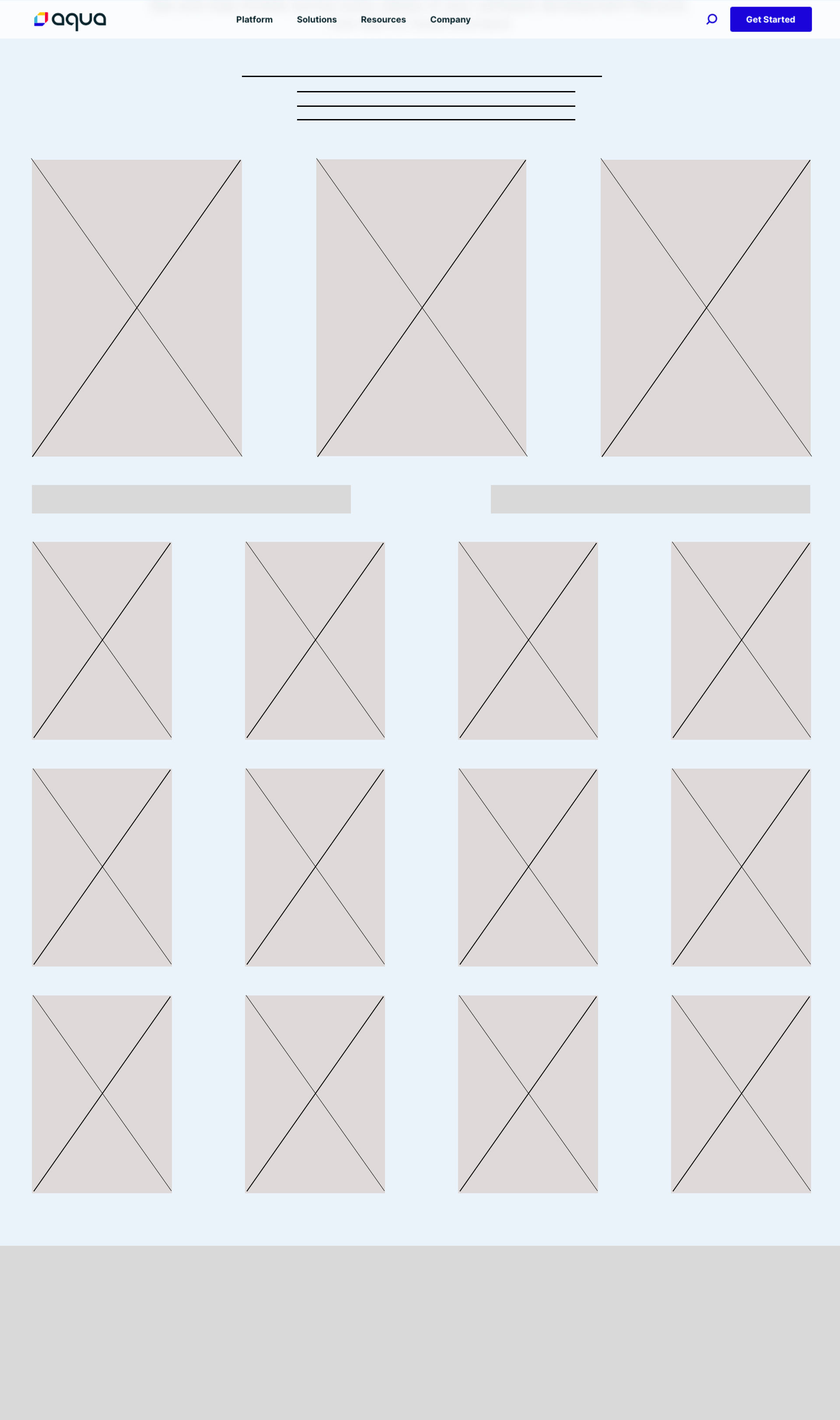
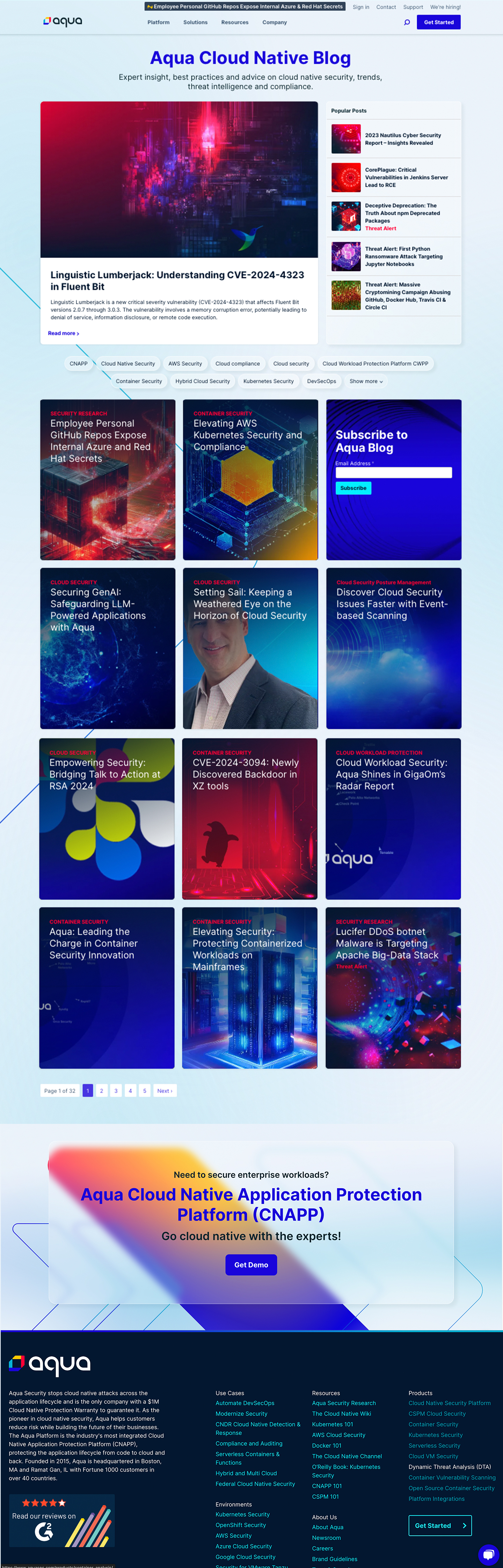
The homepage landed on an editorial structure: featured hero post above the fold, popular posts sidebar, and a filter tag row for topic navigation. The post page was redesigned with larger typography, styled tables, code blocks, in-line CTAs, and a conversion moment at the end of every article.
Blog homepage before redesign
Homepage wireframe: original layout before redesign Scroll
Redesigned blog homepage, live
Redesigned homepage: editorial hero, AI thumbnails, filter tags Scroll
Blog post page before redesign
Post page before redesign: dense layout, no visual hierarchy Scroll
Redesigned blog post page
Redesigned post: larger type, styled tables, code blocks, branded imagery Scroll

I recorded a full live walkthrough showing the scroll experience from the homepage through to an individual post, including hover states, tag filtering, and the reading flow. Both pages are shown as delivered for development.

Full walkthrough: homepage to post page
0 to 30+ custom images
Every post now has an image matched to its specific threat topic, replacing a single generic dark gradient used site-wide.
Process handed off
I documented the AI image workflow and handed it to the content team so they can generate new images independently, with no designer needed per post.
Shipped to production
The homepage and post page went live at aquasec.com/blog, from wireframe to production in one project cycle.
First cohesive blog identity
For the first time, the blog had a consistent visual language: editorial structure, branded imagery, and a documented component system, all built from scratch.
06 · Prototype

See it in motion

You've seen the work
Back to the full portfolio
Back to Portfolio