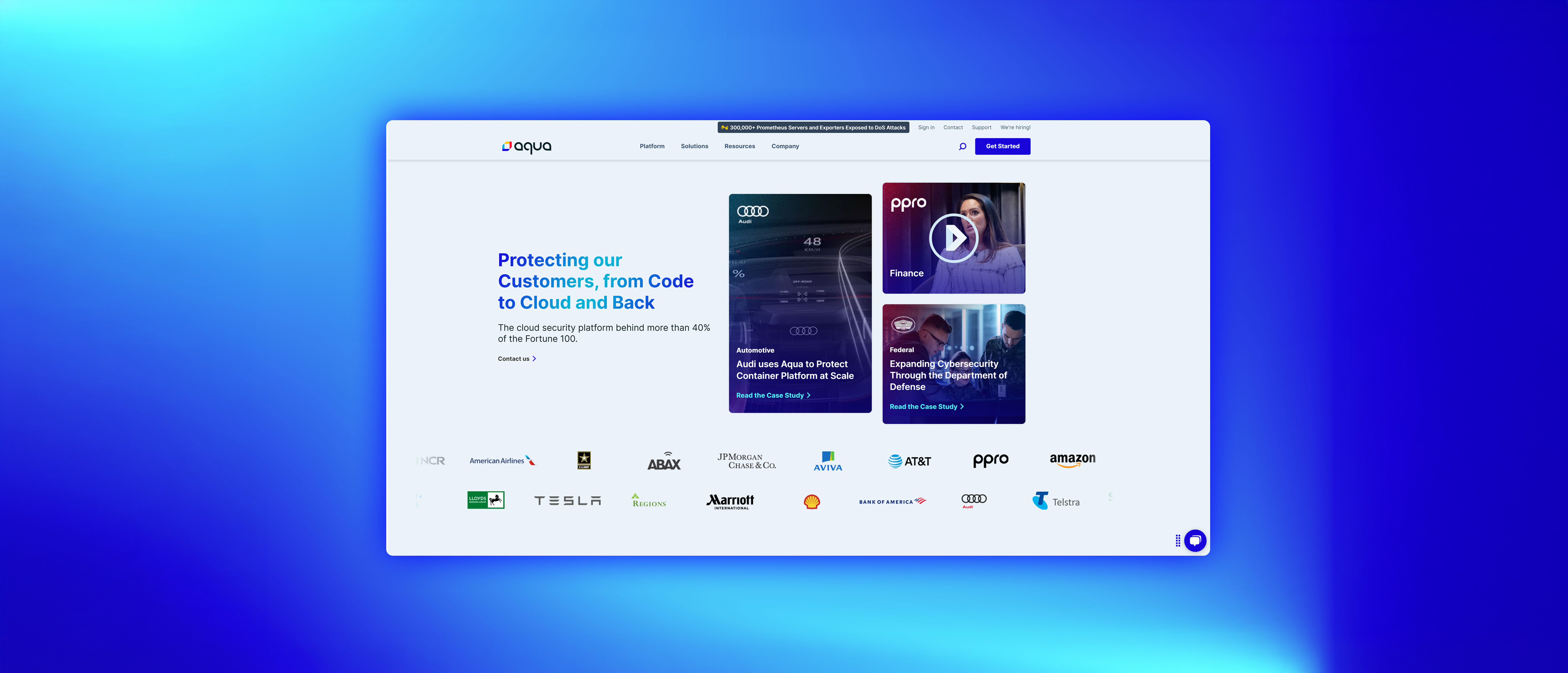
Redesigning the customer-facing marketing pages for a global cybersecurity brand to make complex enterprise stories feel clear, credible, and human.
Aqua Security's customer page was underperforming. Enterprise buyers, who rely heavily on social proof before committing, were landing on a page that felt like a directory listing: company logos, thin text, and no real story. The page wasn't building trust; it was filling space.
Security decisions at the enterprise level are high-stakes and slow. Buyers need to see companies like themselves succeeding before they move forward. The existing design wasn't giving them that.
"Prospects are getting to this page and leaving. We need it to do more work for us."
Aqua Security StakeholderWorking with the marketing and product teams, I aligned on four goals before any design work started. These goals shaped every decision that followed, from information architecture to the visual weight of individual components.
I started with competitive research and internal stakeholder interviews to understand what was and wasn't working. From there, I moved to low-fidelity sketches and collaborative whiteboard sessions to explore structural options before committing to any layout.
Key questions at this stage: How do we surface the most relevant customer for any given visitor? What does a case study card need to show to earn a click? How do we handle customers who have restrictions on what can be published?
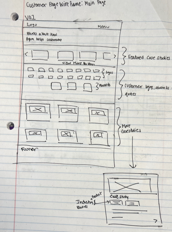
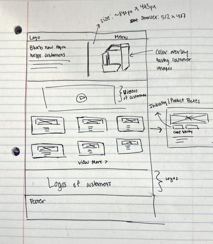
This project had two distinct parts. Part 1 was the main customer page: a listing of all case studies where prospects land and browse. Part 2 was the individual case study story page: where a single customer's full story is told with context, challenge, solution, and result.
I wireframed both, making sure the two pages worked as a system. The main page needed to earn a click; the story page needed to earn trust once you got there.
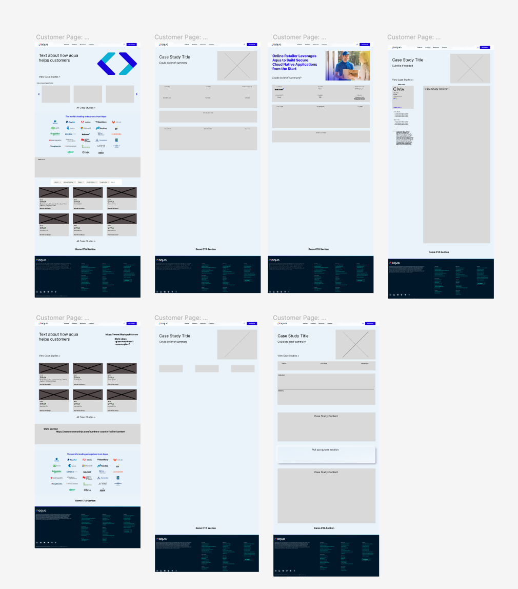
The final design landed on a hybrid of both approaches: a featured hero story above the fold for maximum immediate impact, backed by a card grid for self-directed exploration. Each card shows the customer logo, industry, a one-line outcome, and a direct path to the full case study.
I chose the Audi case study for the hero treatment. Its high-recognition brand and clear measurable outcome made it the strongest trust signal to lead with.
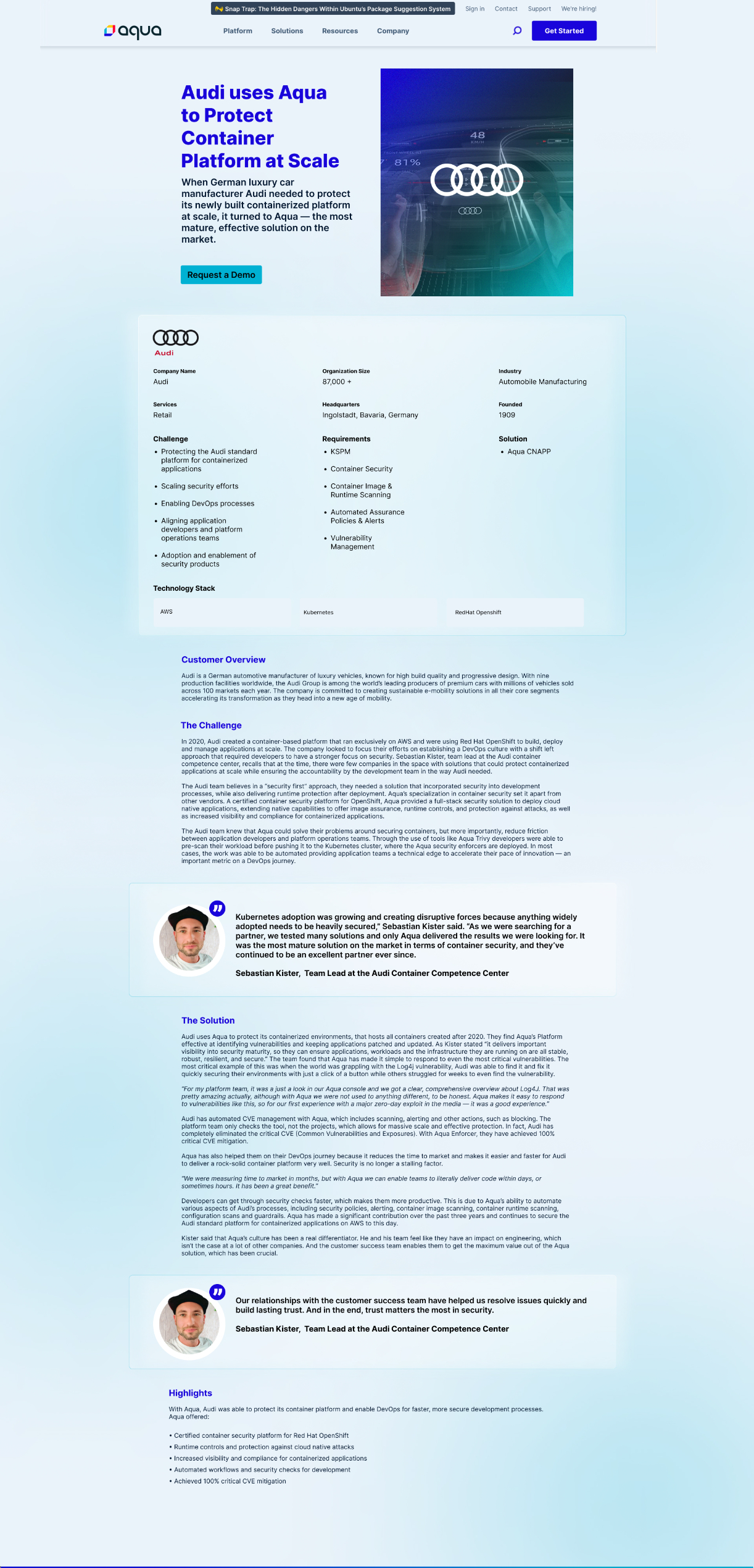
I recorded a full live walkthrough to capture the scroll experience and the transition from the main customer listing into an individual case study story page. Both parts of the system are shown as delivered for development.