Logo, identity system, website, and a four-piece print suite. Zero to launched in seven days.
Global Venture Catalyst is a platform run by Ivy League professors and advisors, connecting emerging entrepreneurs, universities, investors, and sponsors around shared innovation. They came in needing everything at once: a logo, an identity system, a full website, and a marketing suite of print flyers aimed at four very different audiences.
"We needed a brand that could wear four different jackets and still look like the same person."
GVC Program DirectorWith no time for pen-and-paper exploration, I had to start straight in the tool. I built a shared token system (colours, type, spacing) first so every iteration stayed on-brand automatically. Changes cascaded across the website and all four flyers simultaneously, keeping everything coherent without slowing down.
The logo needed to work across a full website, four print flyers, and event signage, all at the same time. I ruled out icon-based marks immediately: with four audience types and a seven-day window, a wordmark would be faster to execute and less likely to feel off-brand in a specific context. The result is a clean wordmark built on a geometric grid, versatile enough to anchor every touchpoint in the system.
For color, I chose a deep navy and bright accent over safer, neutral tones. GVC sits at the intersection of academia and entrepreneurship — the palette needed to feel credible to a university partner but energetic enough to resonate with a student audience. Neutral would have pleased no one.
The identity system was designed to flex. A core palette and type system gave every deliverable a shared DNA, while the layout framework allowed each flyer to lead with a different message and tone for its specific audience without breaking consistency.
 On light
On dark
On light
On dark

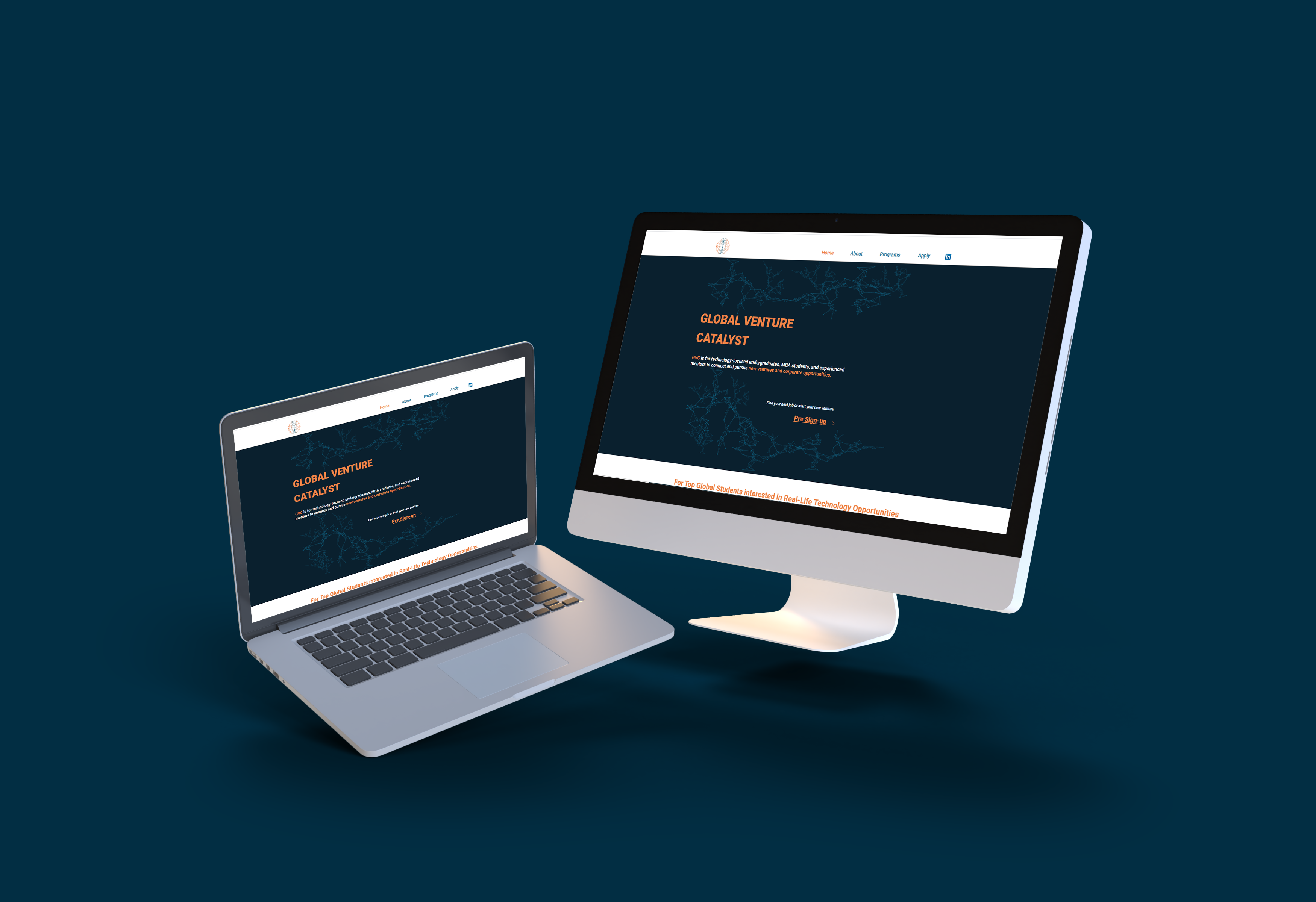
With the brief locked and the token system in place, I built the website through rapid daily iterations. I reviewed each version with the GVC team and incorporated feedback the same day. Not every piece of feedback was implemented directly — some requests conflicted with visual consistency or would have broken the layout on mobile. Those conversations were part of the process: learning to push back constructively while keeping the client's trust is a skill the timeline forced me to develop fast.
The recordings below capture the actual progression from first draft to final build.
I structured the final site to move any visitor from "What is GVC?" to "I want to get involved" in as few clicks as possible. The homepage carried the brand voice; the programs page broke down how the platform worked for each audience type.
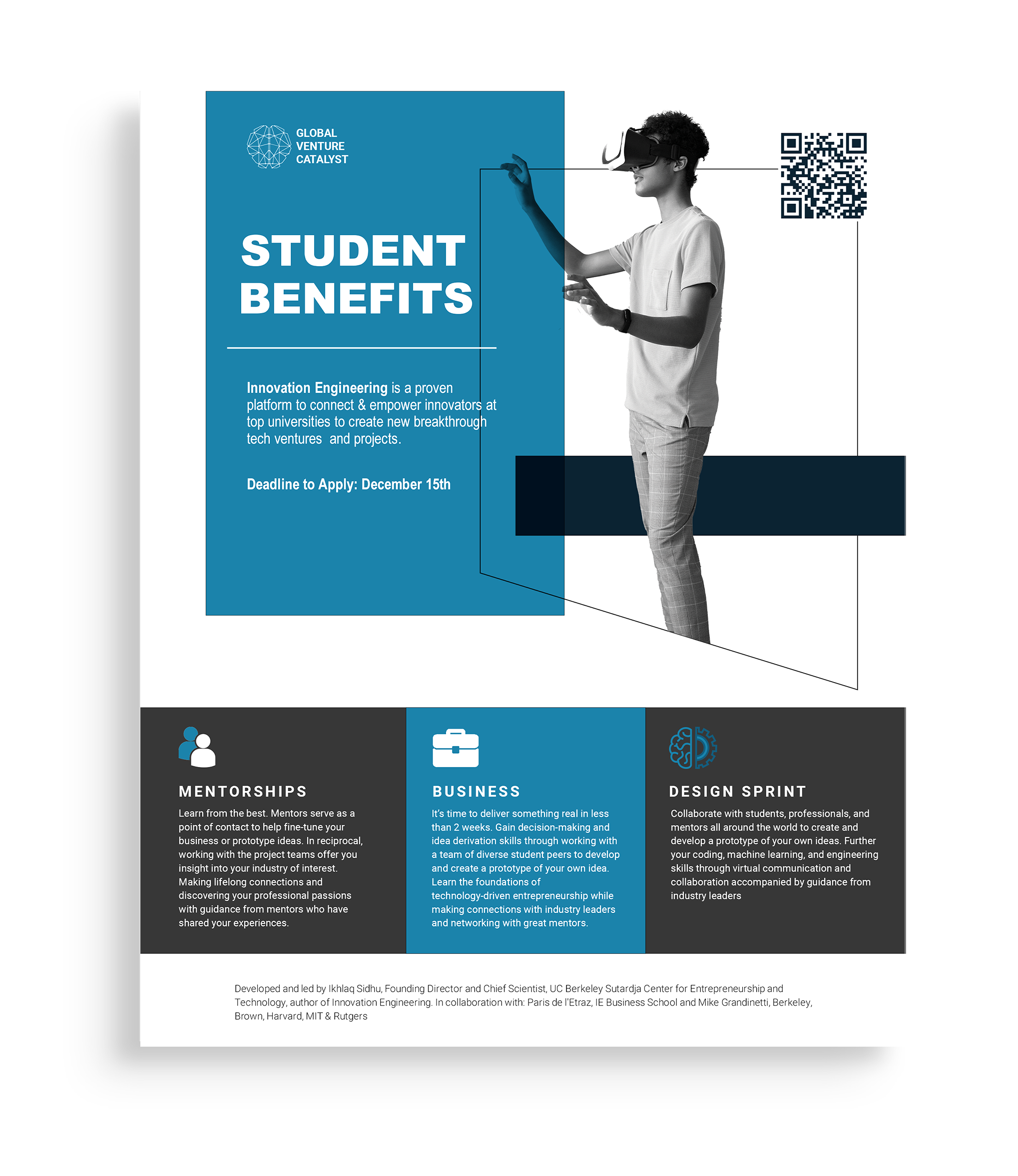
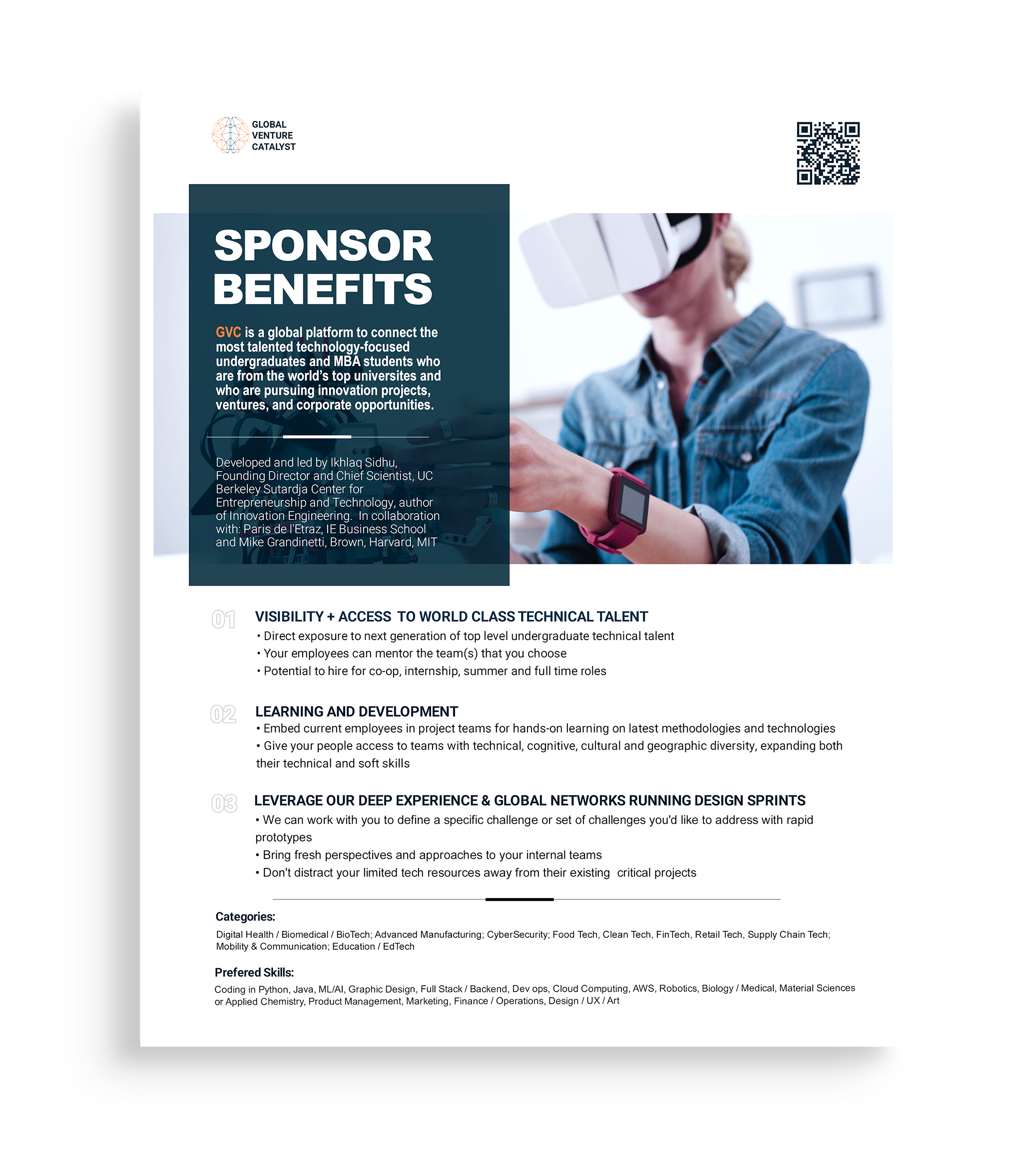
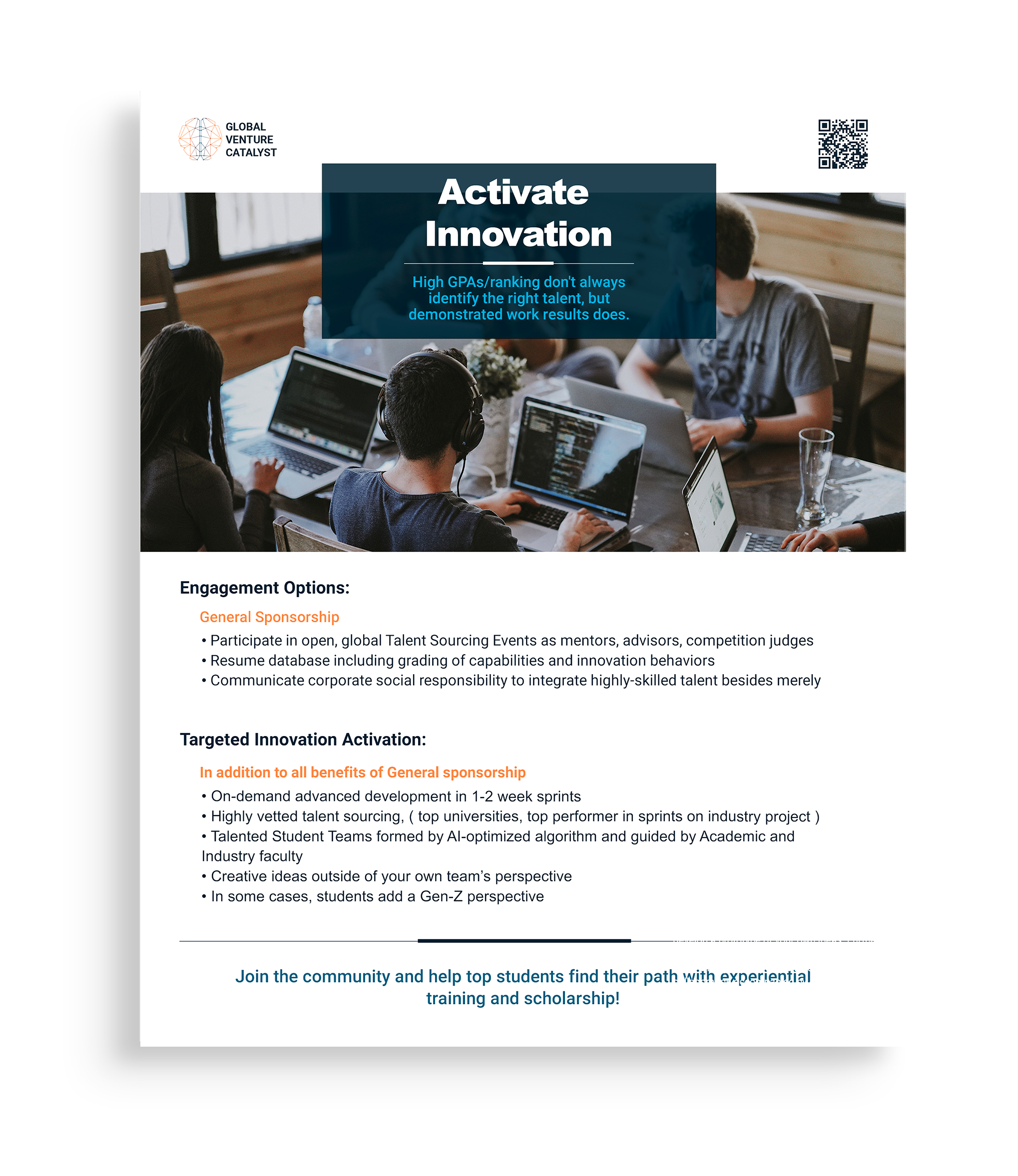
Each flyer leads with a different message for a different audience, but all four sit inside the same visual system. Same palette, same typeface, same grid different story. Click any to expand.