Icon Design Illustration

An icon set built from scratch

When no existing style matched the vision, I designed my own. 37 custom iOS icons across dark & light themes

TypePersonal / iOS
RoleIcon Designer
Year2020
ScopeIcon Design, Dark & Light Variants, Widget Elements
37
Custom icons across dark and light themes
2
Full theme variants: dark and light, both complete
3
Deliverable types: icons, widgets, and home screen layout
Custom iOS icon system
The Spark

When what exists isn't enough

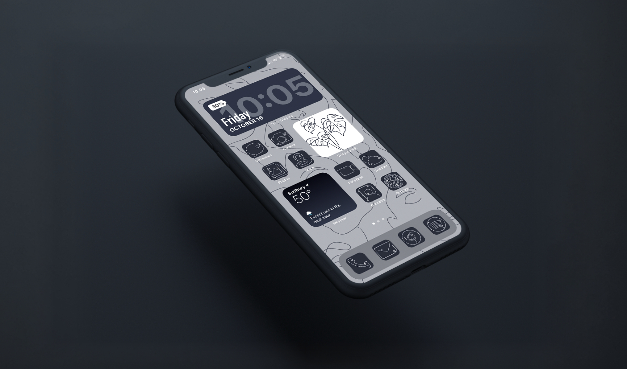
When Apple introduced iOS 14's home screen customization, it opened a door I immediately wanted to walk through. The ability to replace app icons with custom designs meant a fully curated, visually consistent home screen was finally possible.

The problem: I had a specific aesthetic in mind: clean, minimal line art with a consistent stroke weight and a refined sensibility. After searching through icon packs and marketplaces, nothing matched. The existing options were too illustrative, too bold, or inconsistent in their visual language.

So I designed my own. Not as a workaround, but as a design challenge: could I build a complete, cohesive icon system from scratch that would work seamlessly across both dark and light home screen contexts?

"If the tool doesn't exist, build it. Every icon set here started because the right one wasn't available."

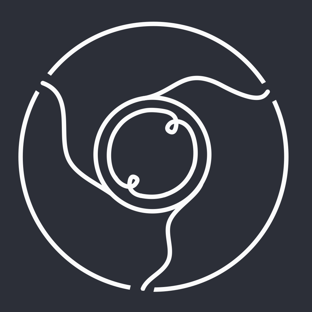
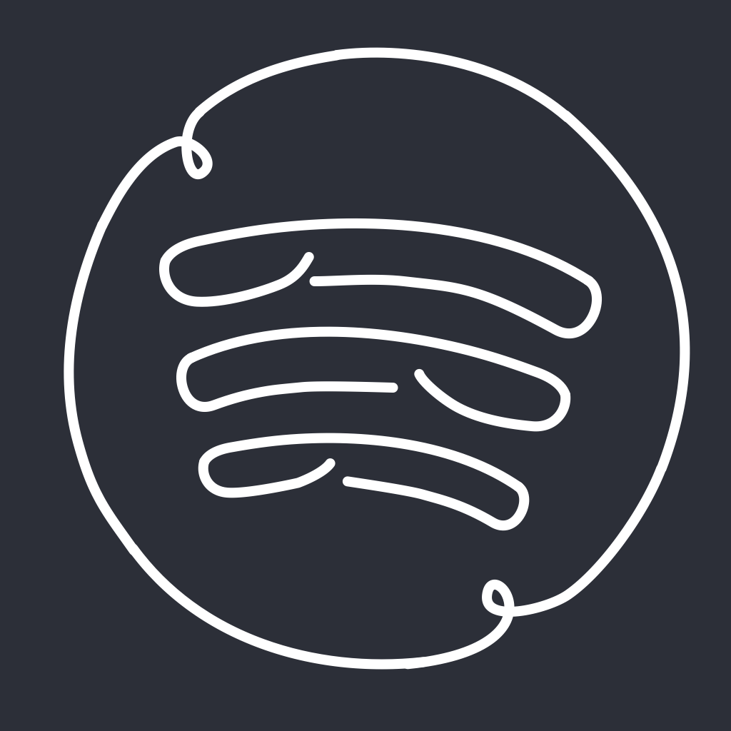
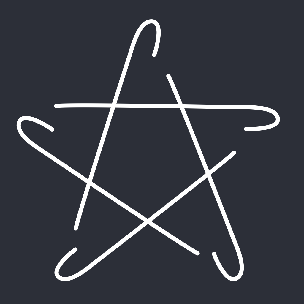
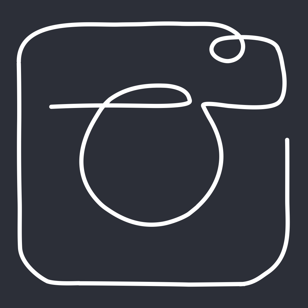
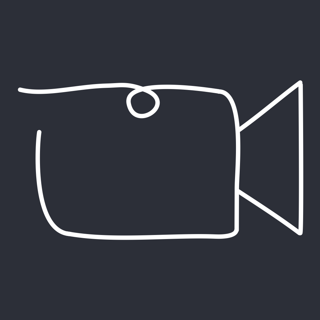
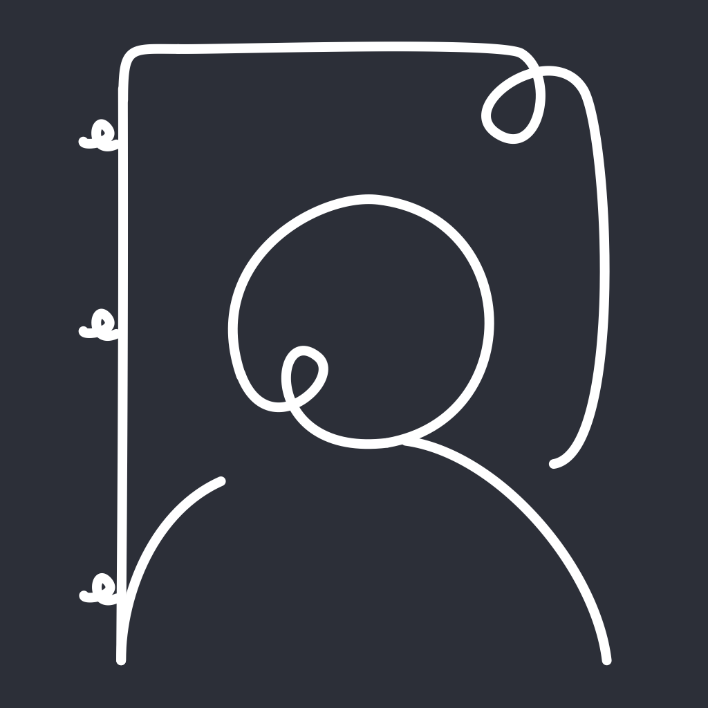
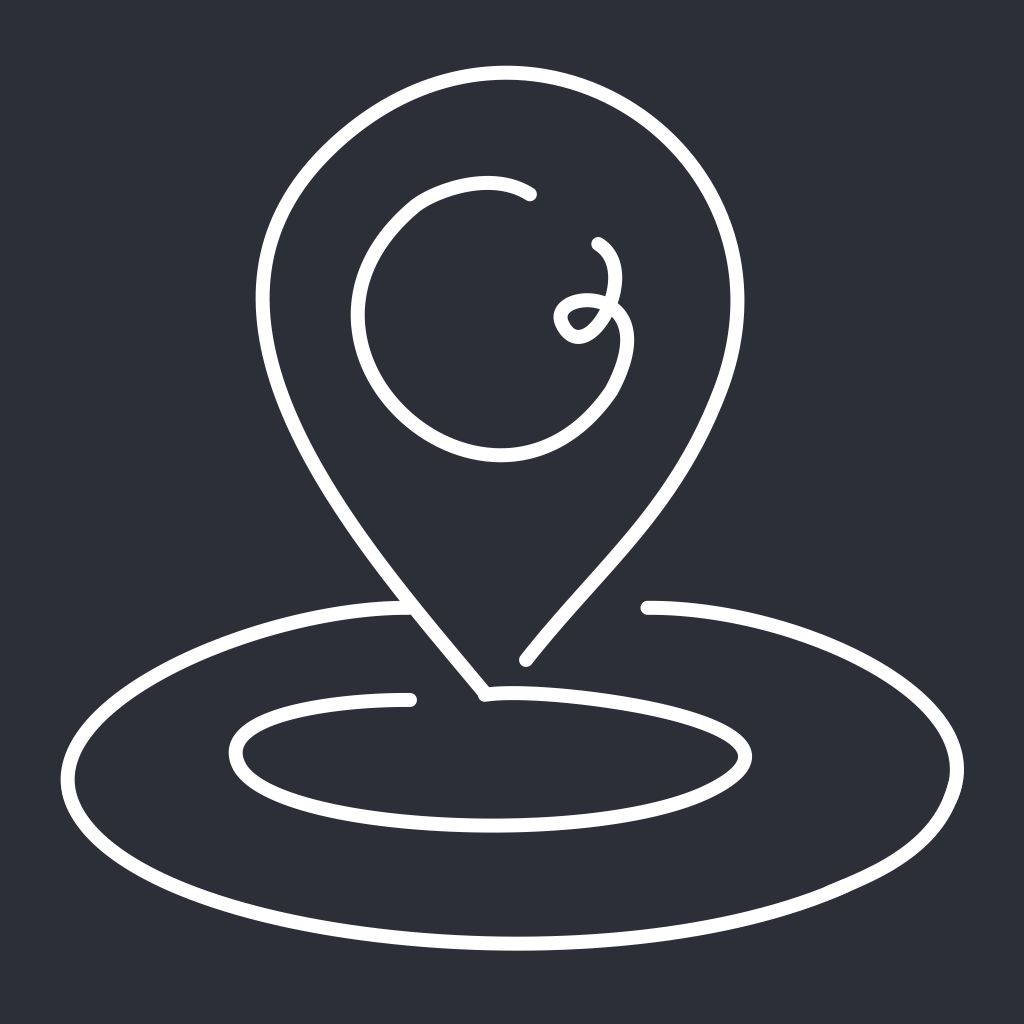
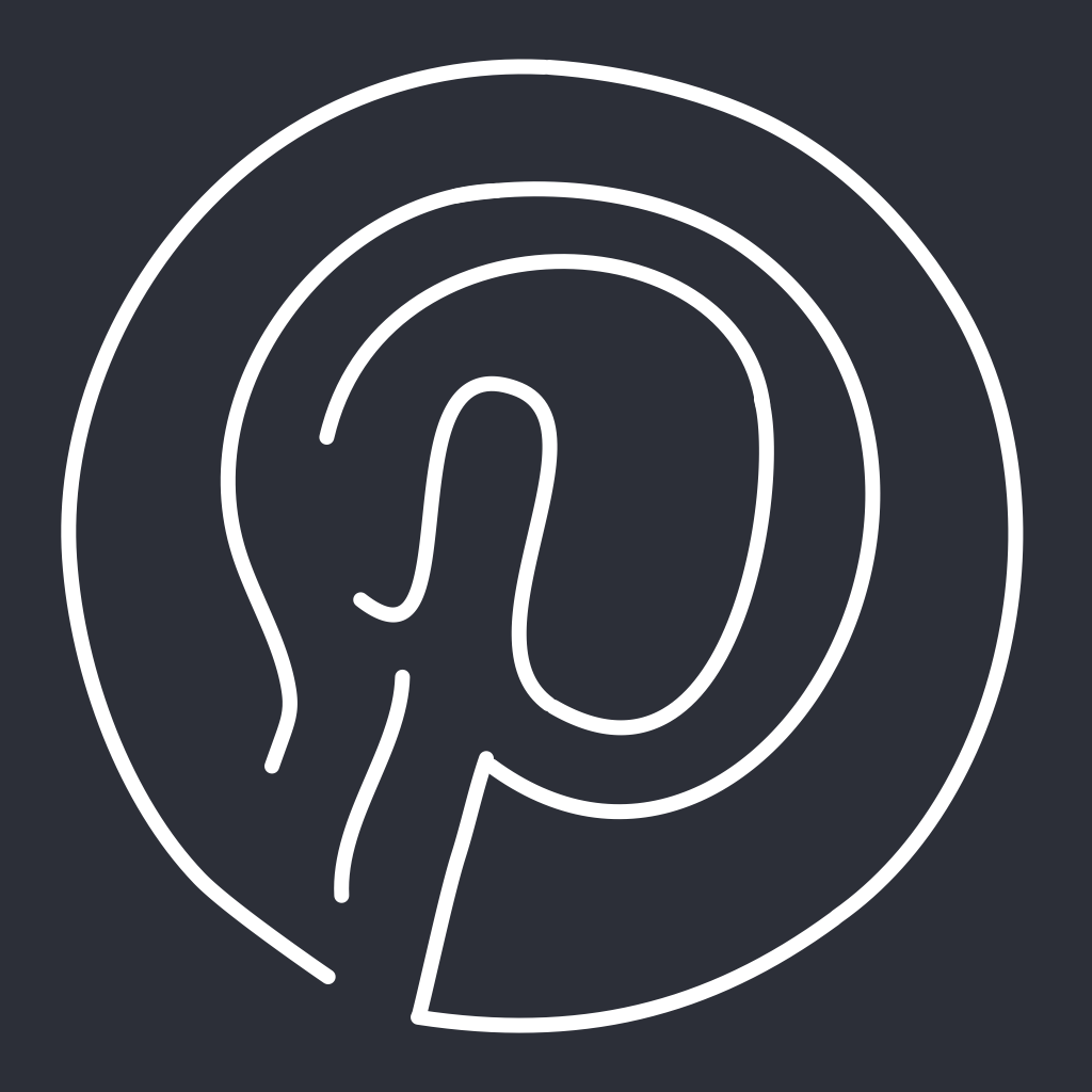
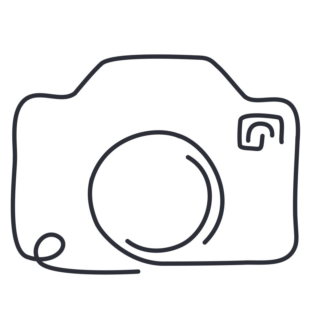
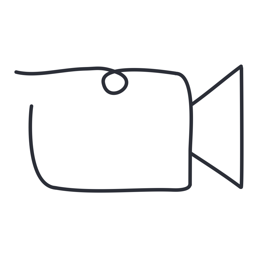
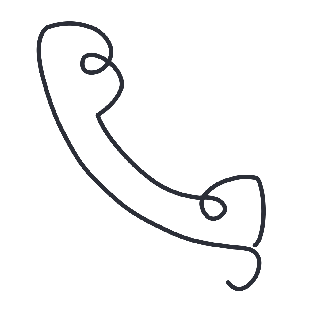
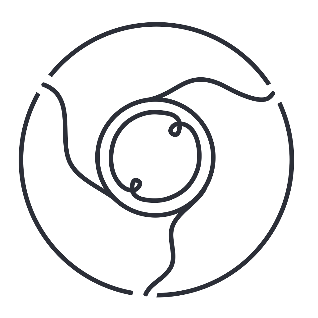
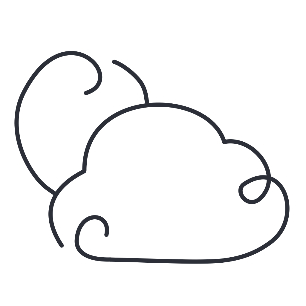
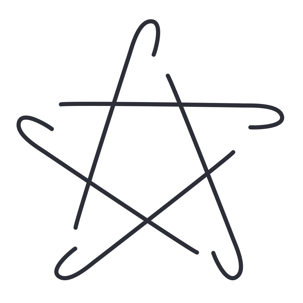
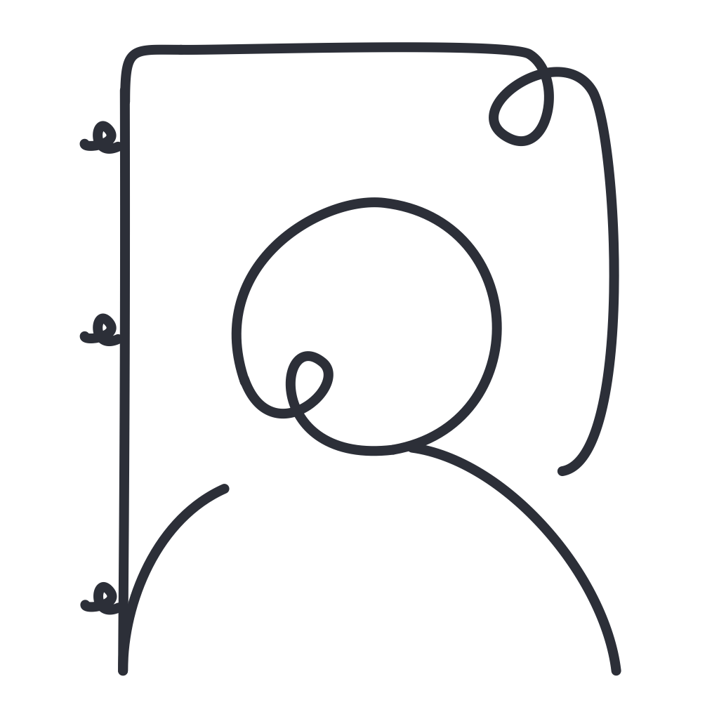
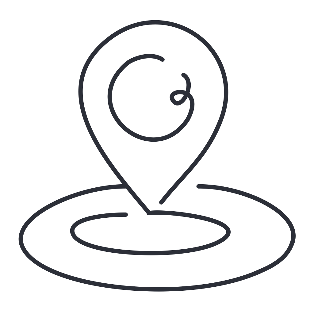
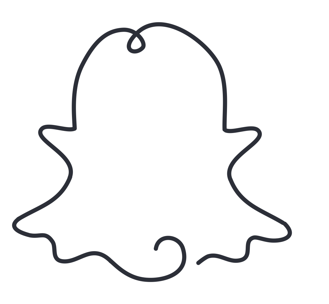
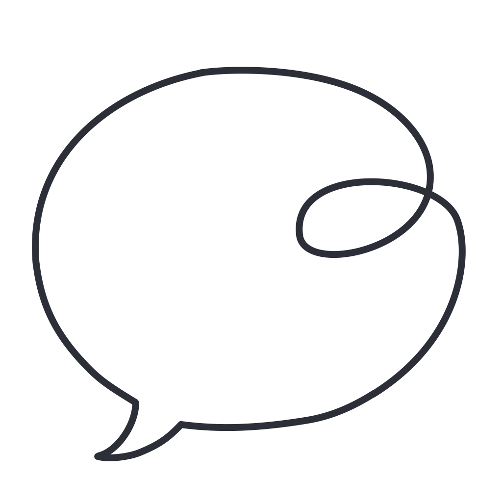
Every icon follows the same set of rules: a consistent stroke weight of 1.5pt, rounded line caps, no fills, and a fixed 24×24 artboard with uniform padding. These constraints are what create the cohesion: when every icon plays by the same rules, the set feels like a system, not a collection.

The dark version uses a deep navy background with soft white strokes. The light version inverts to a near-white surface with the same dark ink. Both were designed simultaneously, not as afterthoughts of each other, so neither compromises for the other.

Widget elements followed the same language but adapted for larger canvas sizes: more whitespace, slightly heavier optical weight to hold their own at larger display sizes.


Design System

Rules that create cohesion

Dark Version
Line art on deep navy
Custom icon dark
Custom icon dark
Custom icon dark
Custom icon dark
Custom icon dark
Custom icon dark
Custom icon dark
Custom icon dark
Custom icon dark
Custom icon dark
Custom icon dark
Custom icon dark
Custom icon dark
Custom icon dark
Custom icon dark
Custom icon dark
Custom icon dark
Custom icon dark
Custom icon dark
19 custom icons, dark theme · 24×24px artboard, 1.5pt stroke, rounded caps
Light Version
Same system, opposite canvas
Custom icon light
Custom icon light
Custom icon light
Custom icon light
Custom icon light
Custom icon light
Custom icon light
Custom icon light
Custom icon light
Custom icon light
Custom icon light
Custom icon light
Custom icon light
Custom icon light
Custom icon light
Custom icon light
Custom icon light
Custom icon light
18 custom icons, light theme · same system, opposite canvas
Widget Elements

Scaled up for bigger moments

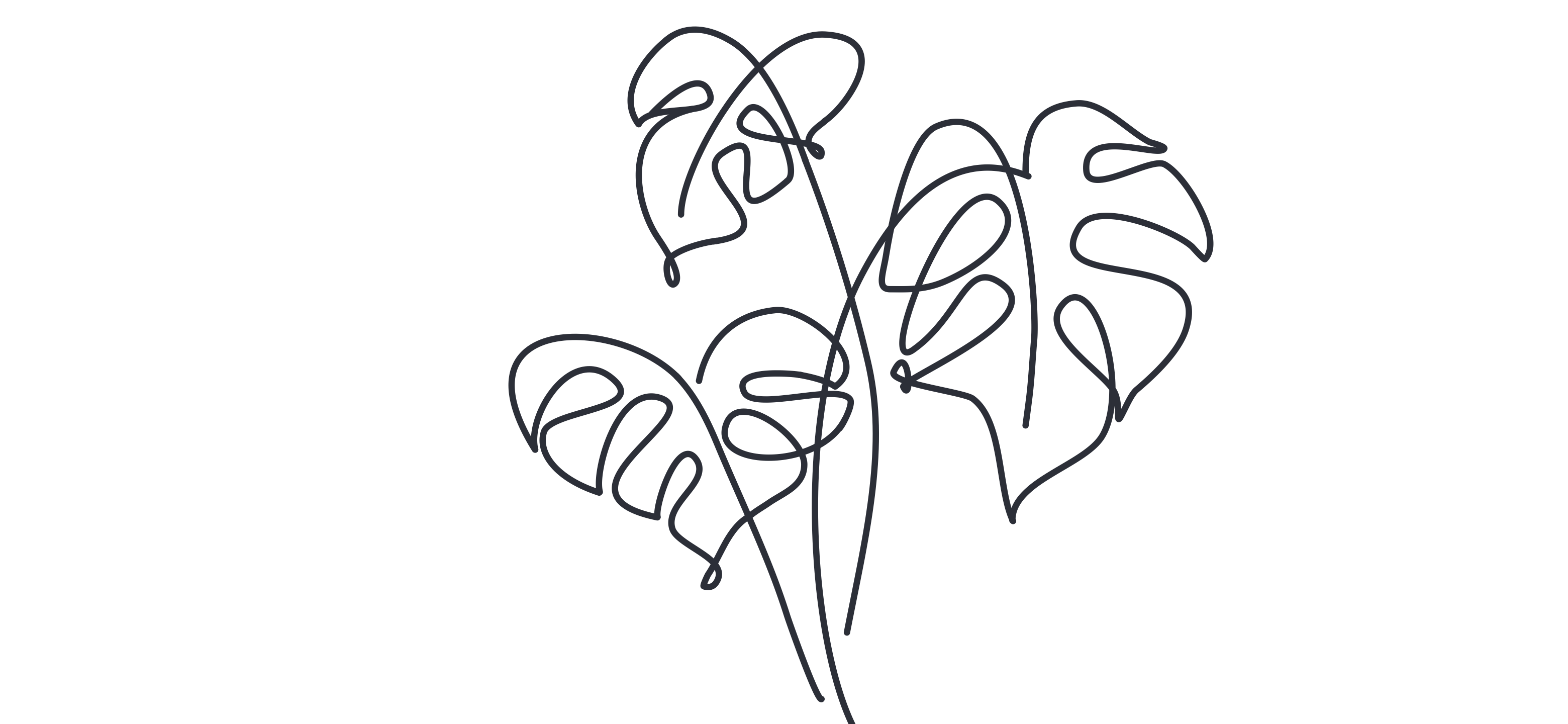
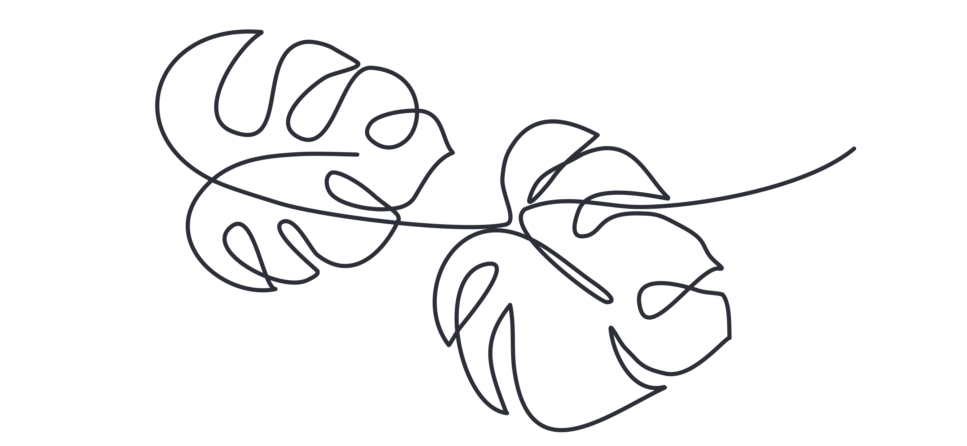
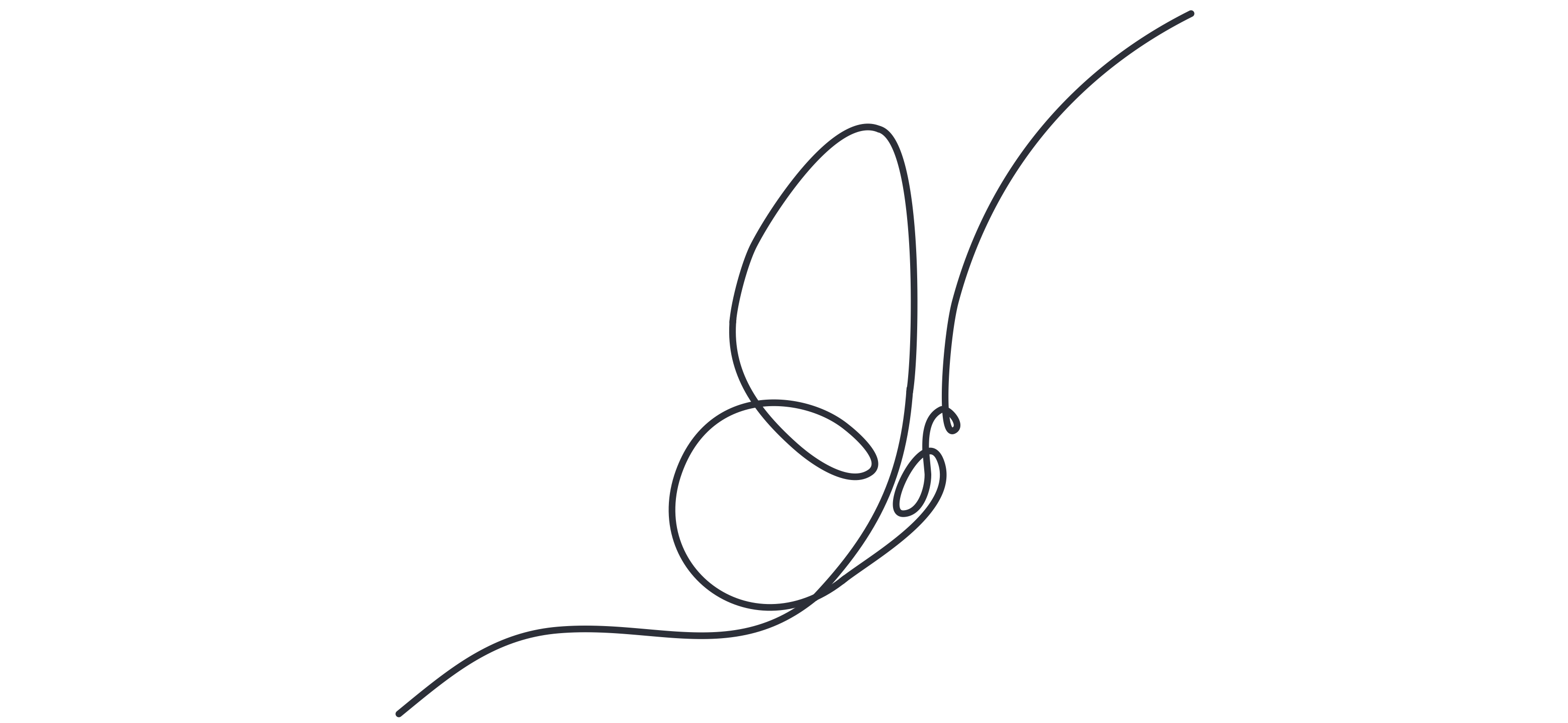
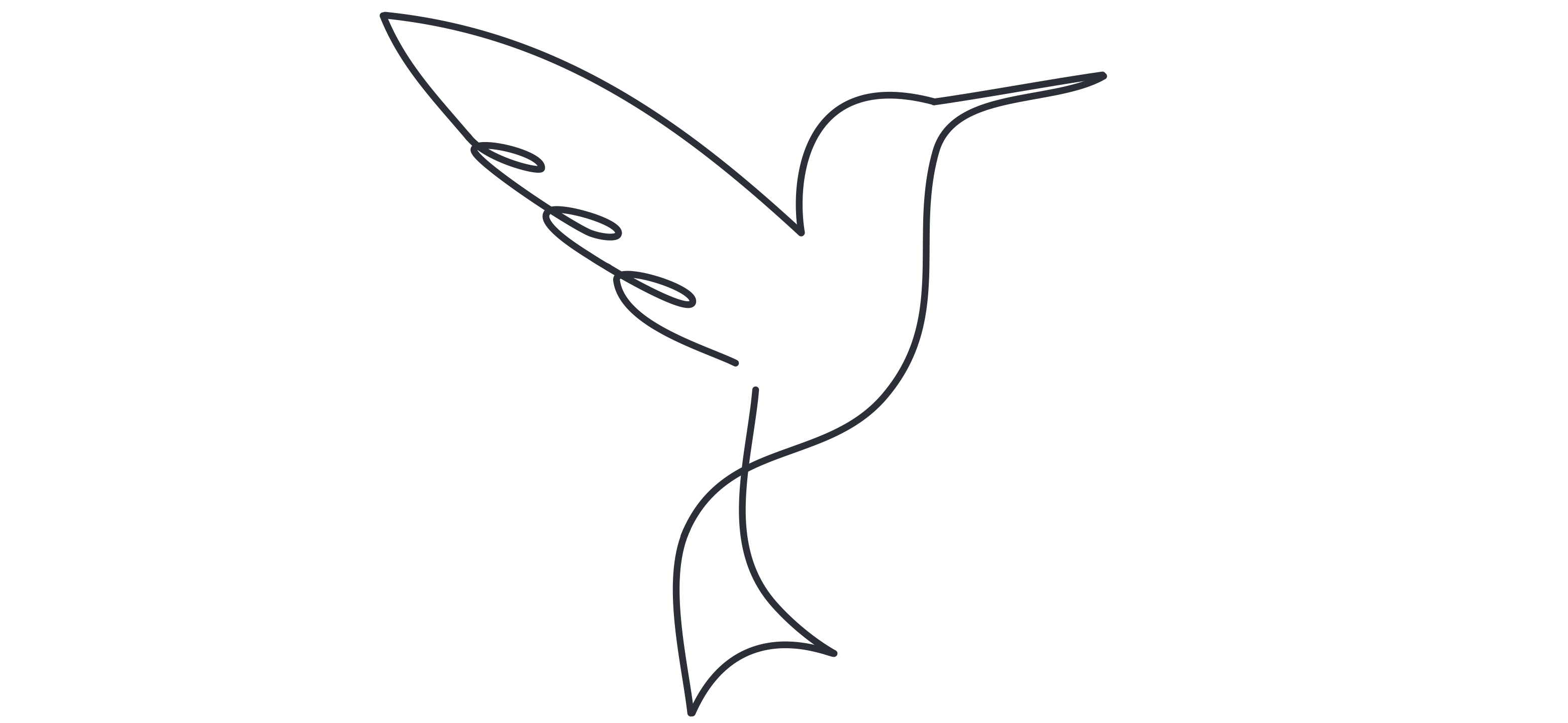
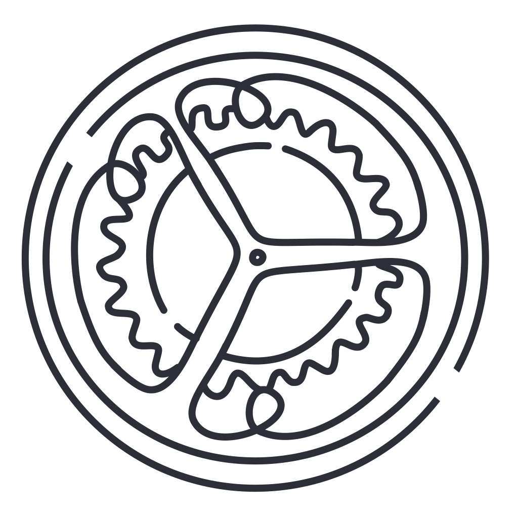
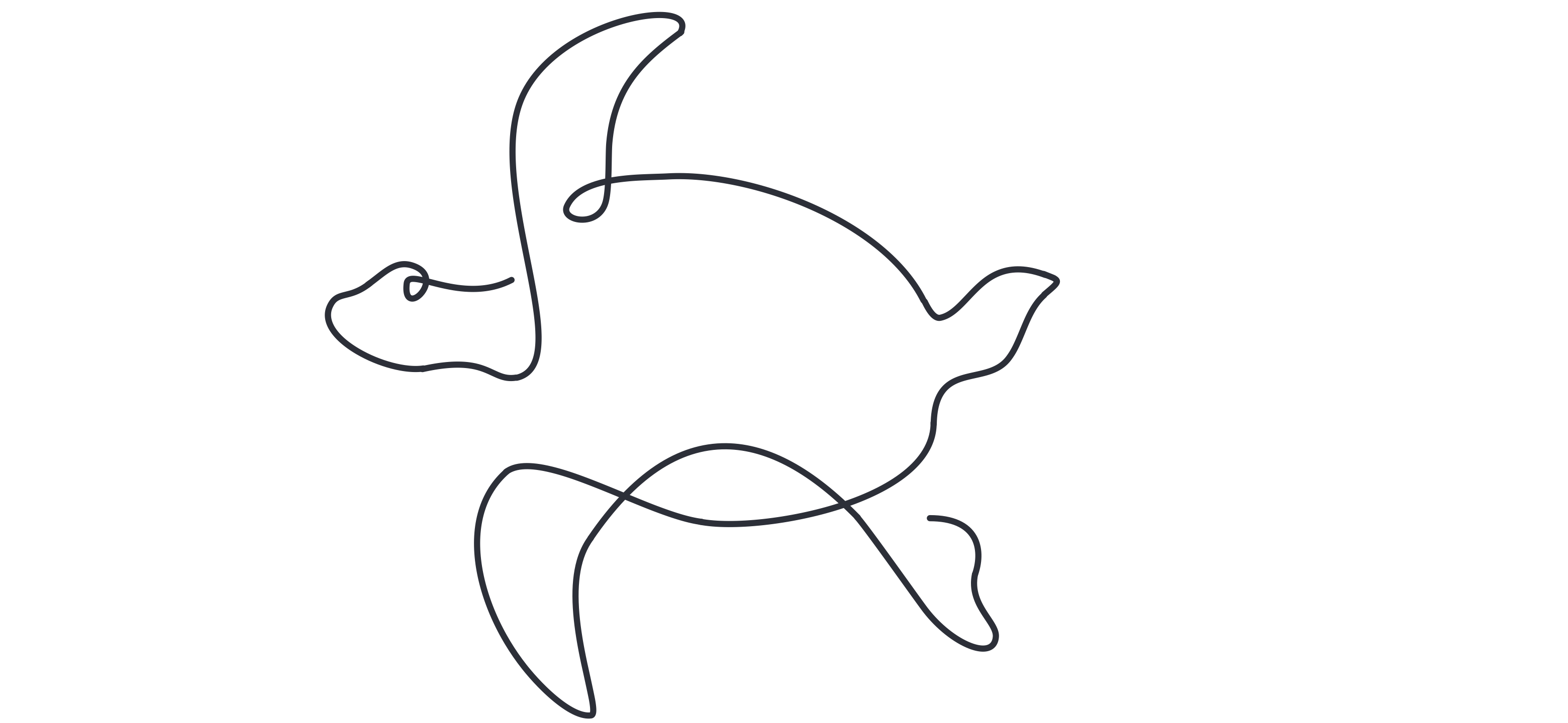
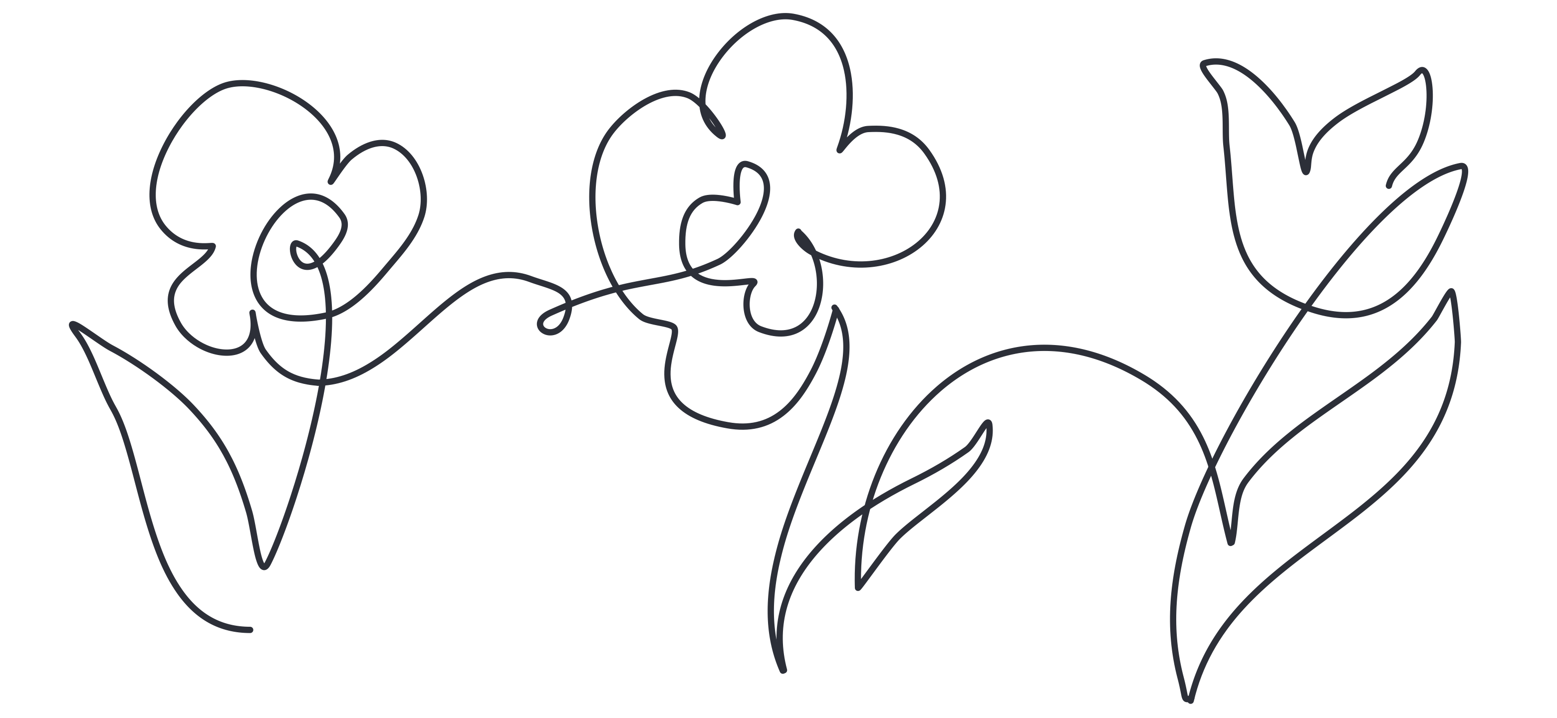
Widgets demanded a slightly different treatment: the same visual language, but with more room to breathe. I optically adjusted stroke weights to feel equivalent at 2×2 and 4×4 grid sizes. The result is a set of widget elements that sit harmoniously alongside the icon set without feeling like a different design system.
Turtle botanical widget illustration
Turtle
Flowers botanical widget illustration
Flowers
Monstera leaves botanical widget illustration
Monstera Leaves
Monstera leaves botanical widget illustration
Monstera Leaves (alt)
Butterfly botanical widget illustration
Butterfly
Hummingbird botanical widget illustration
Hummingbird
Takeaway

What this says about
how I work

System Thinking
I don't design individual pieces — I design rules that generate consistent pieces. The same thinking I apply to icon systems, I apply to design systems, component libraries, and brand guidelines.
Craft at a Granular Level
Optical weight adjustments, consistent stroke caps, pixel-perfect alignment across 37 icons. The details most people skip are the ones I consider non-negotiable.
Designing for Context
Dark and light weren't two versions of the same file — each was designed for its context from the start. The same principle guides every interface I design: what works in one context doesn't automatically work in another.
Self-Directed Ownership
No brief, no client, no deadline. I identified the gap, wrote the constraints, did the work, and shipped it. That's the same muscle that makes me effective when a team is moving fast and needs someone who doesn't wait to be told what to do.
You've seen the work
Back to the full portfolio
Back to Portfolio