End-to-end UX design for a fitness tracking app, from empathy research through to polished mobile screens. A self-directed academic project to demonstrate the full UX process.
The fitness app market is saturated with technically capable products that feel clinical, overwhelming, or joyless. Most are built around data collection rather than behavior change. The result? Apps people download, open twice, and abandon.
The real challenge isn't tracking fitness. It's helping people build a lasting relationship with it. That required understanding not just what users do, but how they think and feel about exercise before a single screen was designed.
"The best fitness app isn't the most feature-rich. It's the one people actually open every day."
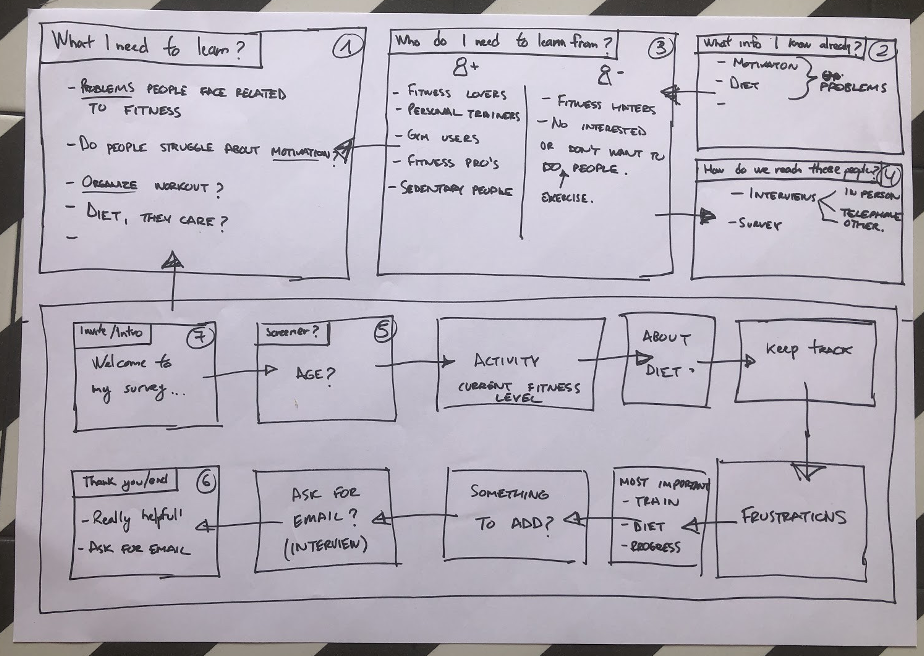
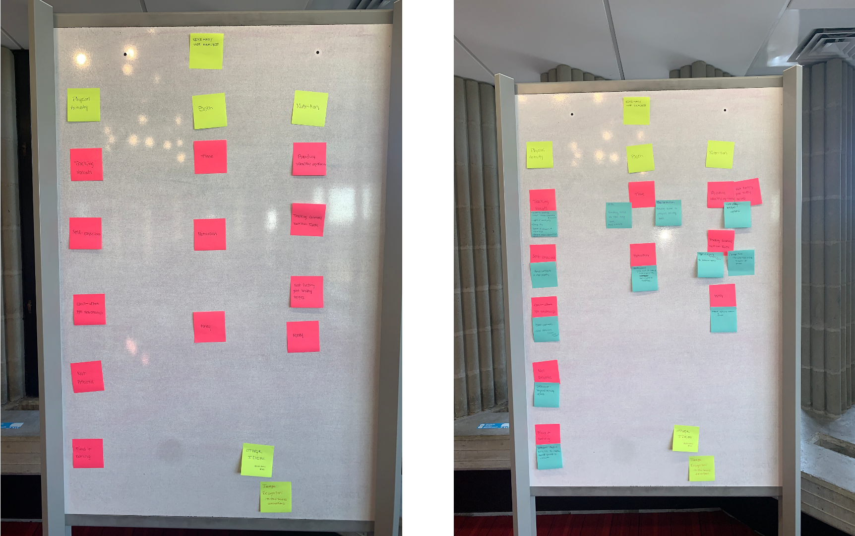
Before any wireframe was drawn, I spent time understanding real people's relationships with fitness. I conducted interviews across fitness levels: complete beginners, gym regulars, and lapsed exercisers. The goal was to map emotional journeys around motivation, habit formation, and barriers.
Key themes emerged quickly: people don't fail because they lack information about fitness. They fail because the tools don't match how motivation actually works in the real world.
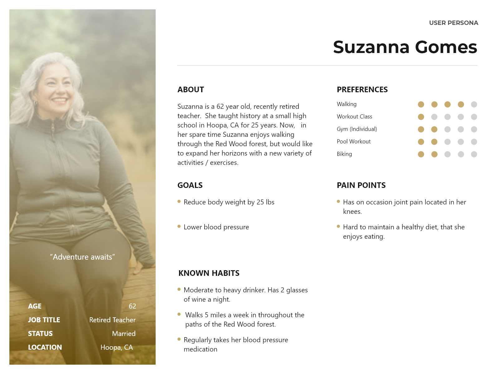
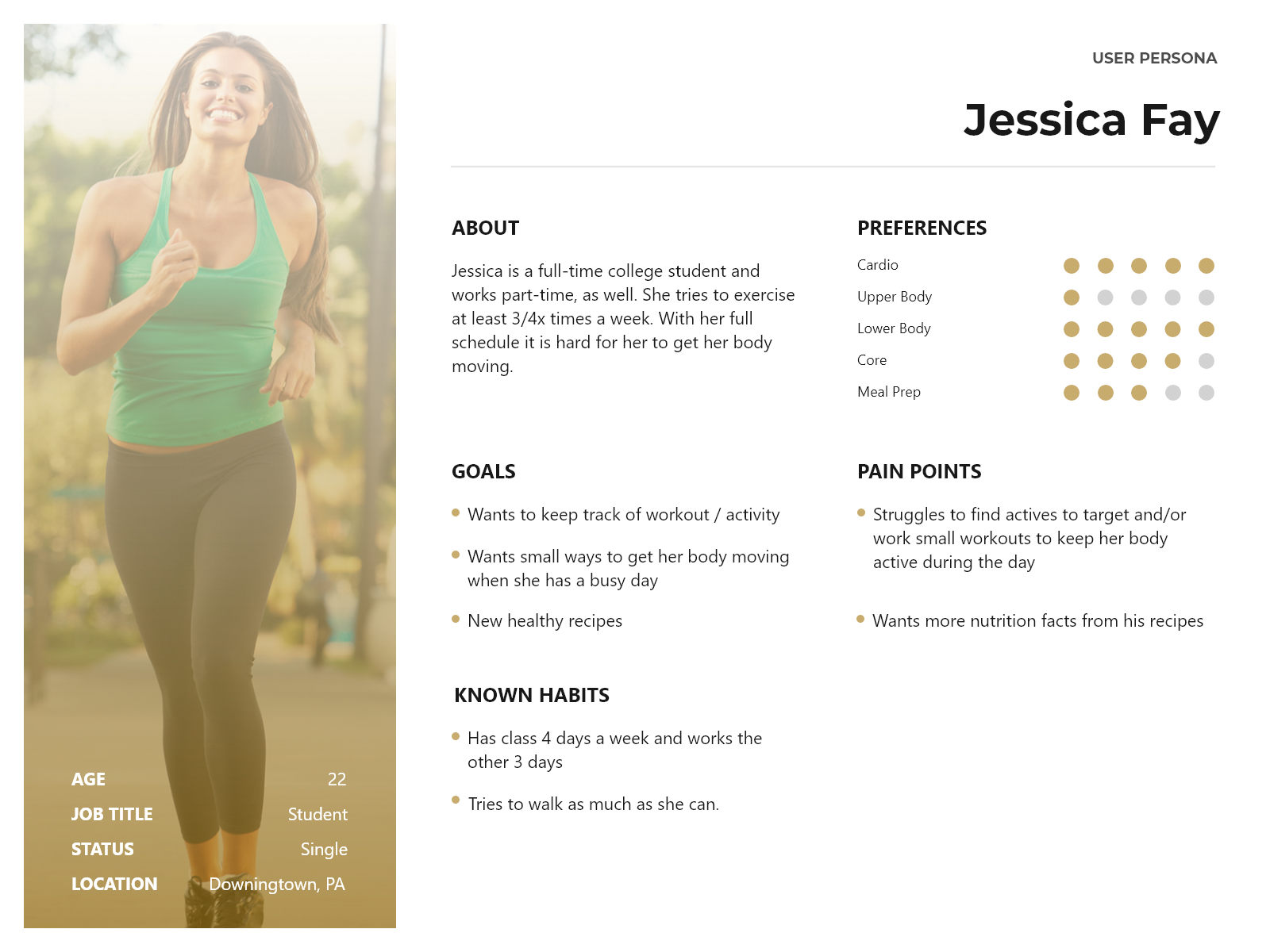
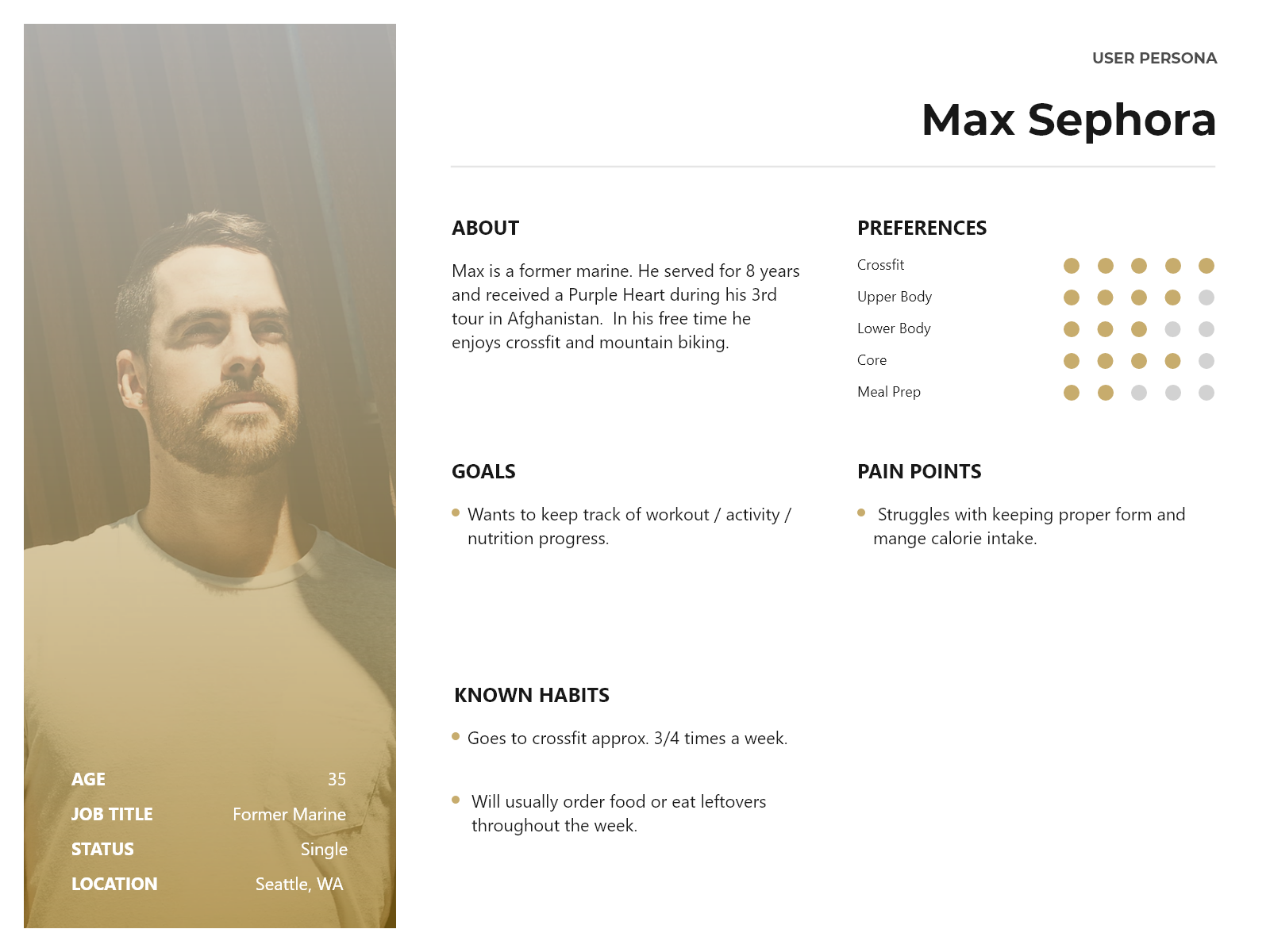
My research surfaced three distinct user archetypes. Each persona shaped a specific design decision, from onboarding length to notification tone to workout discovery.
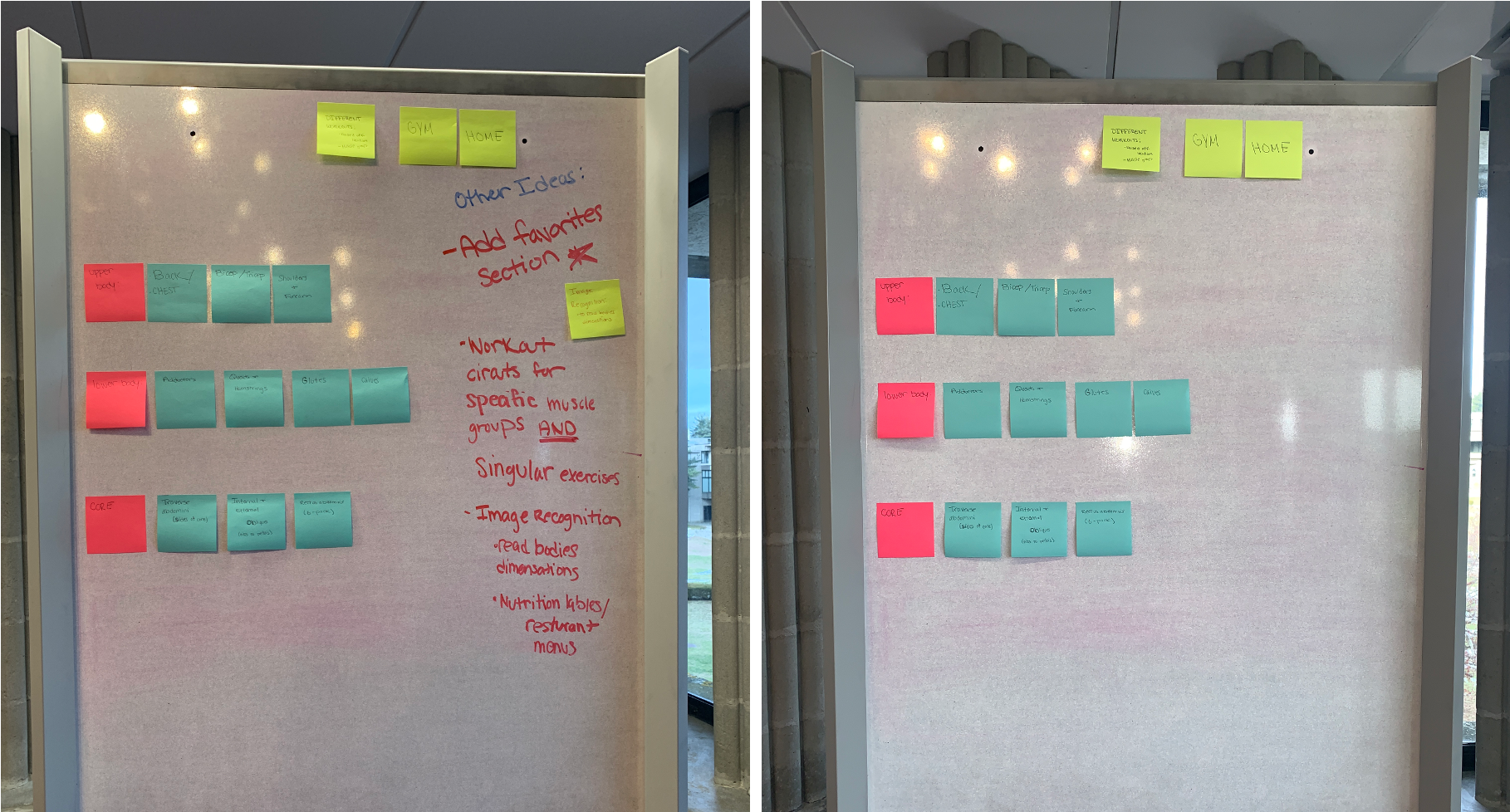
With three personas and their distinct navigation patterns mapped, the next step was defining the app's structure. The IA needed to serve both the time-poor beginner and the data-driven regular without overwhelming either.
I built the site map around three core pillars: tracking daily activity, setting and managing goals, and community accountability. Every nav decision was tested against each persona's mental model.
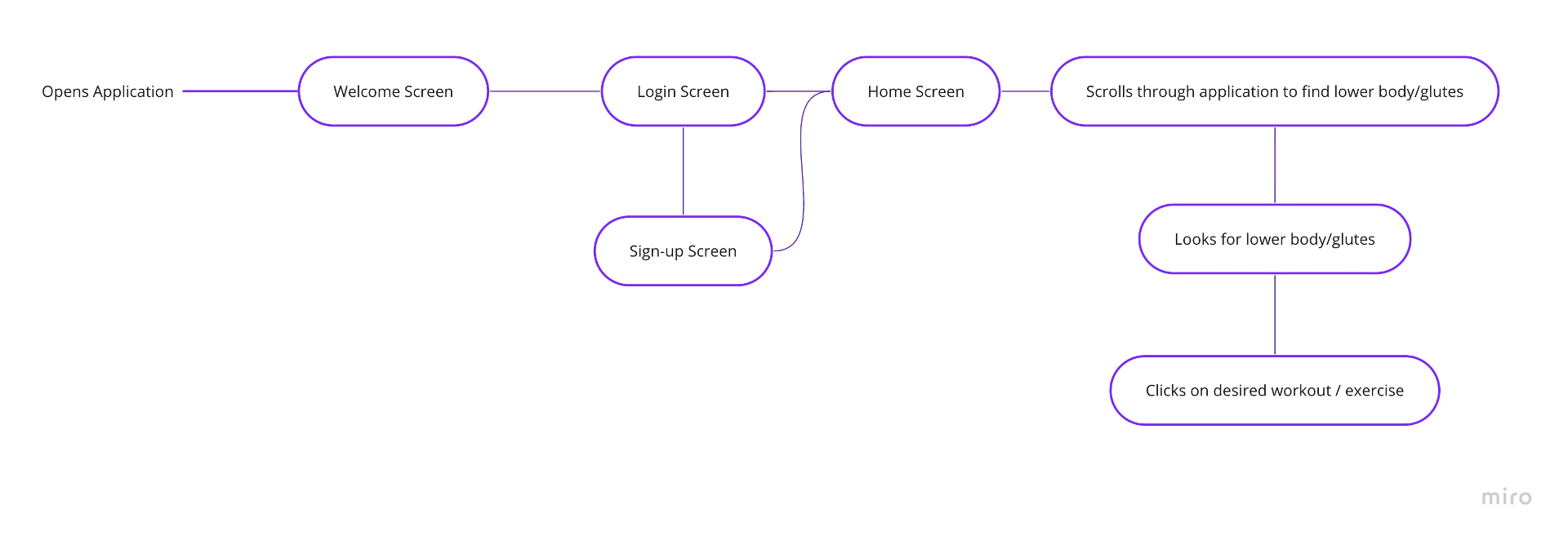
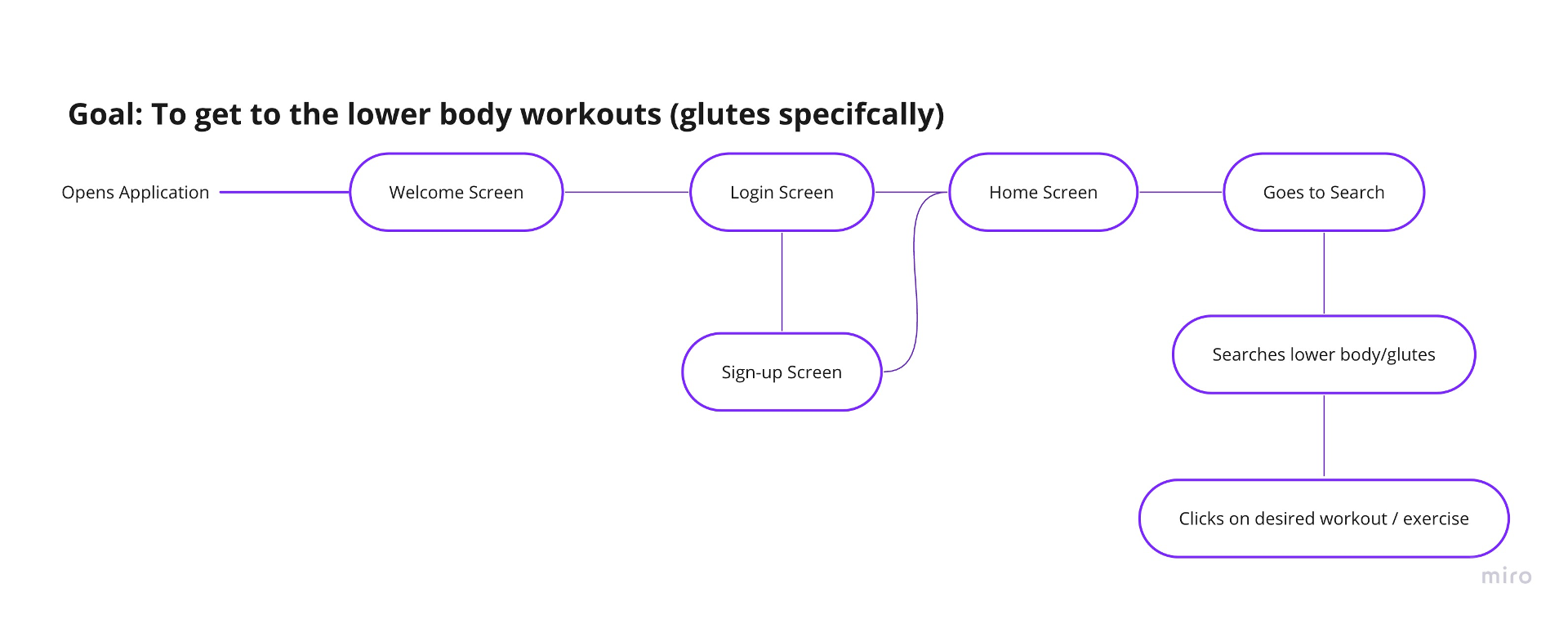
Wireframing started with hand-drawn sketches to rapidly explore layout ideas without commitment. Three key flows were sketched first: activity logging (the highest-frequency interaction), goal creation, and workout discovery.
After several rounds of paper iteration, I built digital lo-fi wireframes in Figma and tested them with users. I refined navigation patterns and content hierarchy based on observation, not assumption.
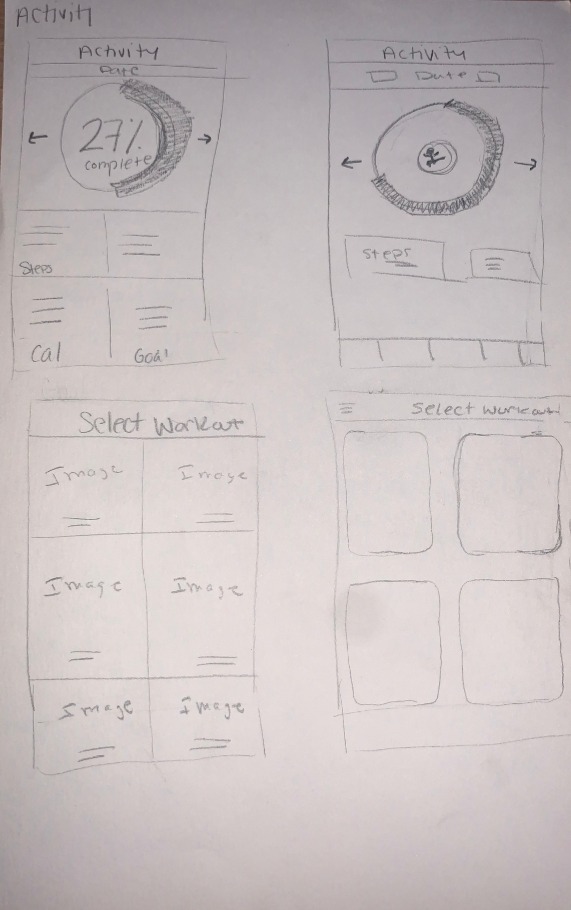
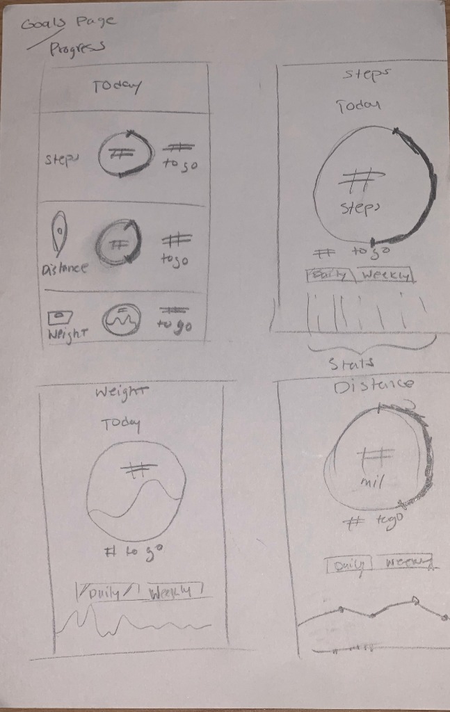
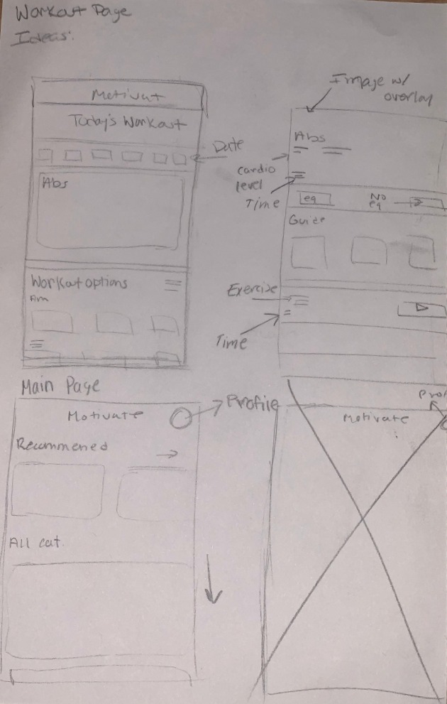
Hand-drawn sketches for activity log, goal-setting, and workout discovery flows
Most fitness apps default to dark, aggressive aesthetics that signal intensity over support. Motivate deliberately goes the other direction: warm, energetic, and calm enough to open on a low-motivation day without feeling like a challenge.
Typography was chosen for scannability during movement. Large, high-contrast numbers for metrics. Generous line height in body text. A color system built around energy without pressure.
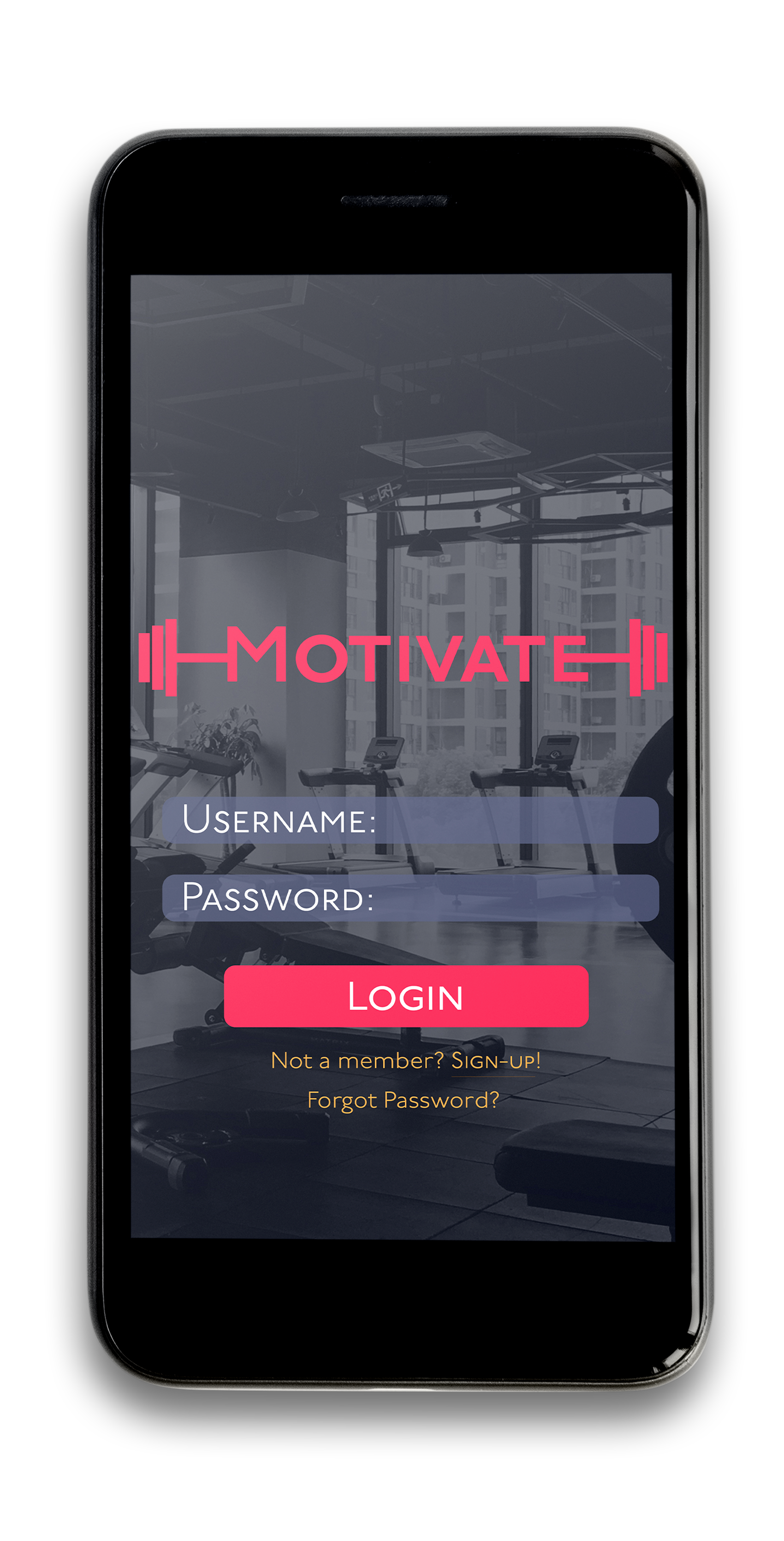
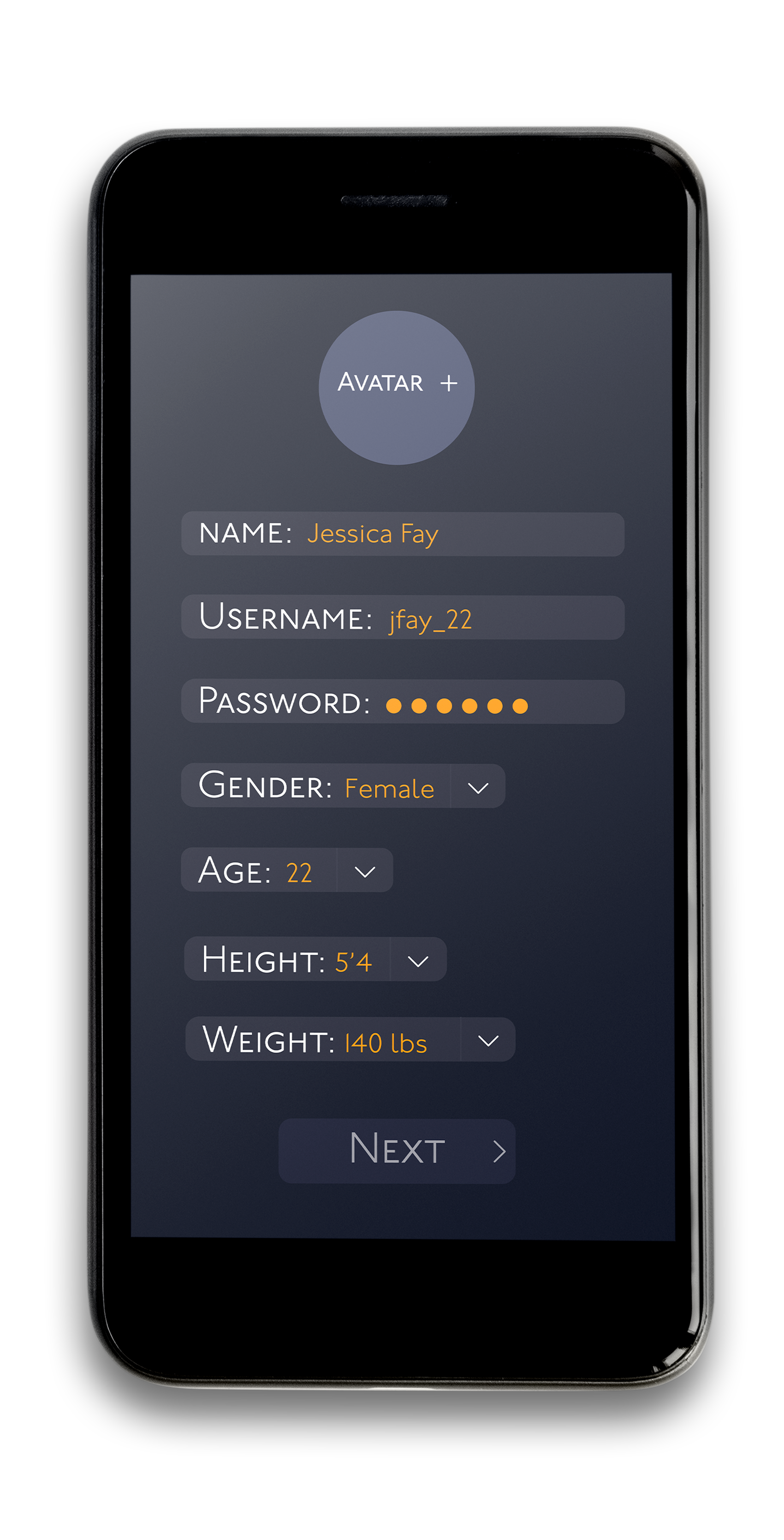
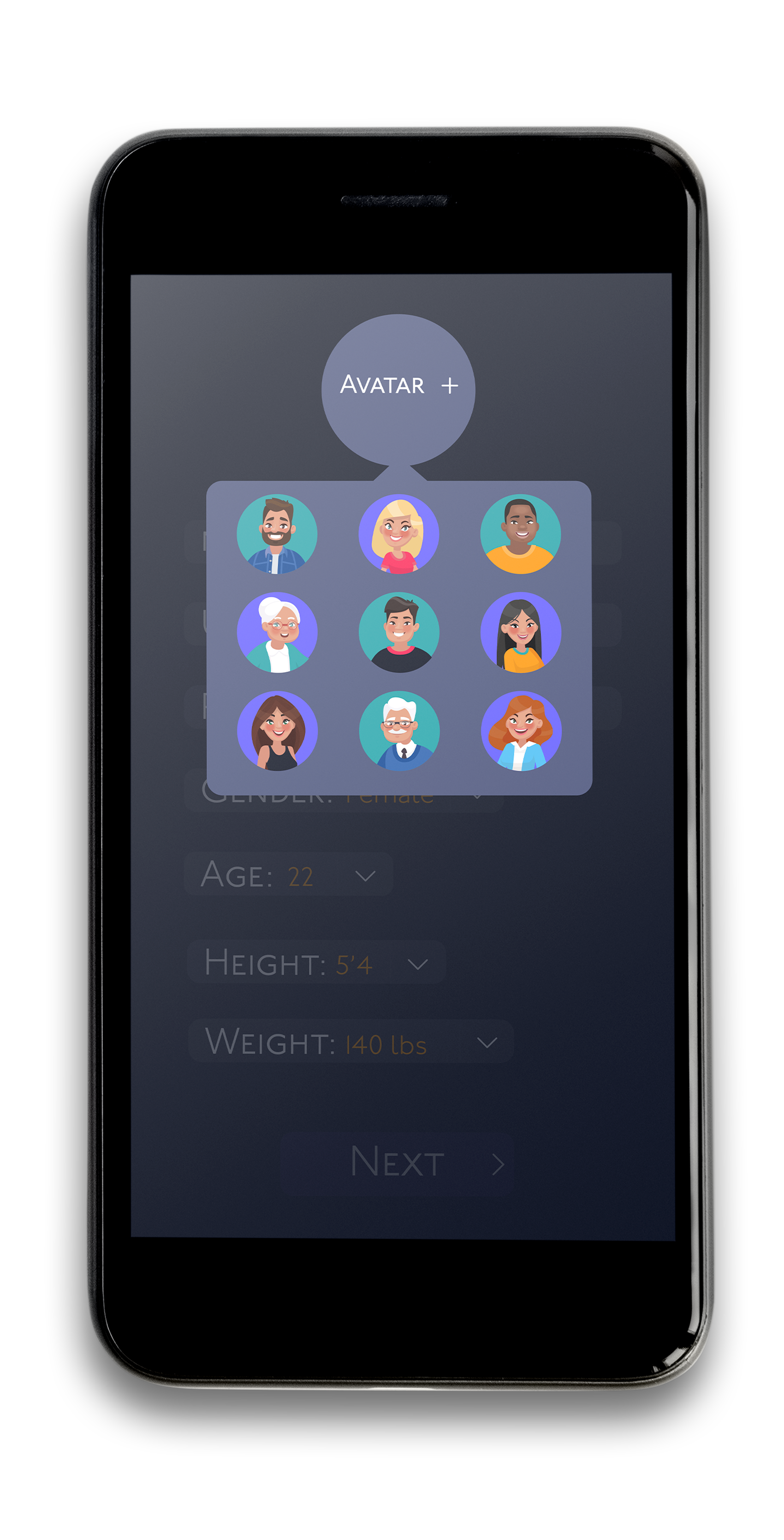
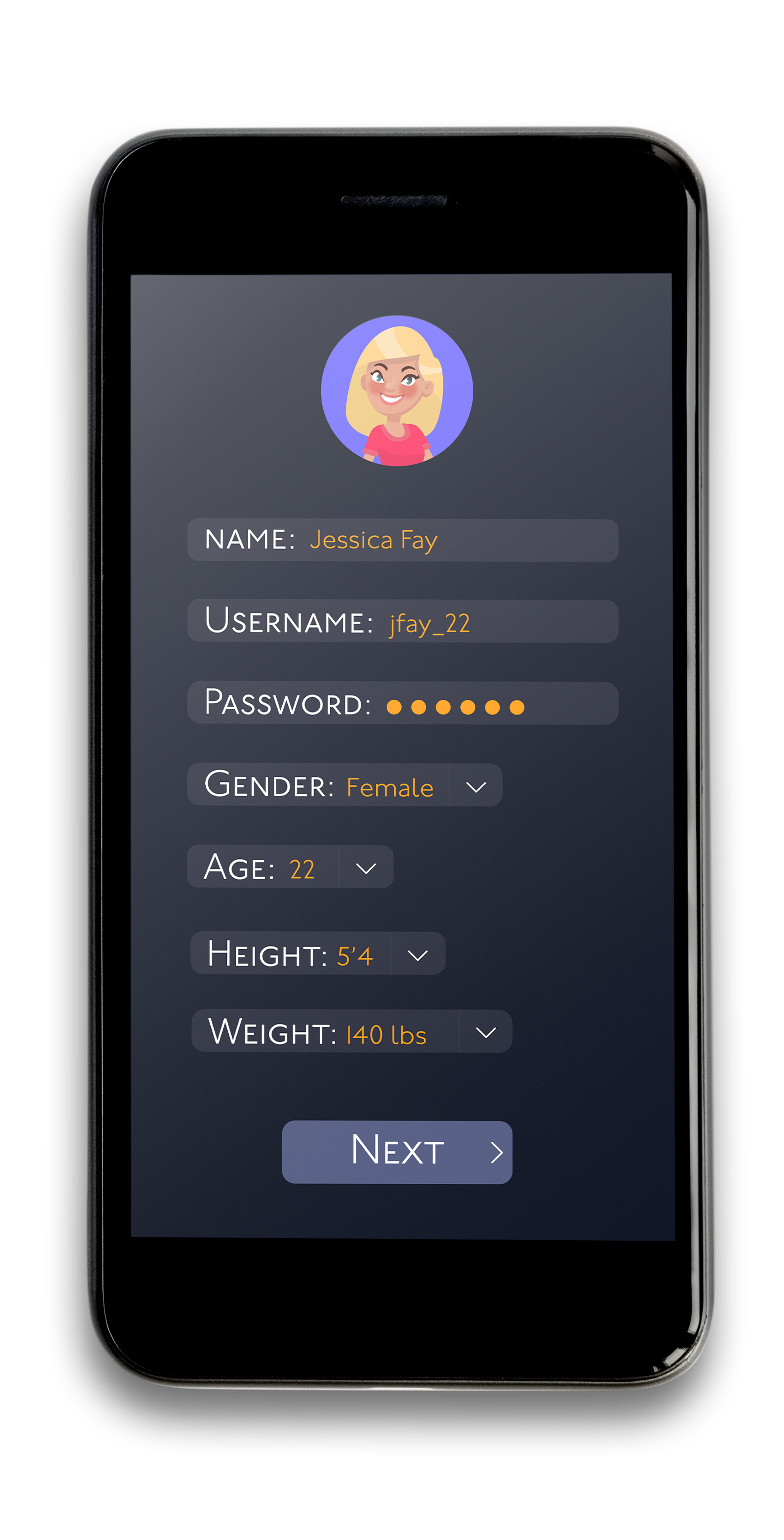
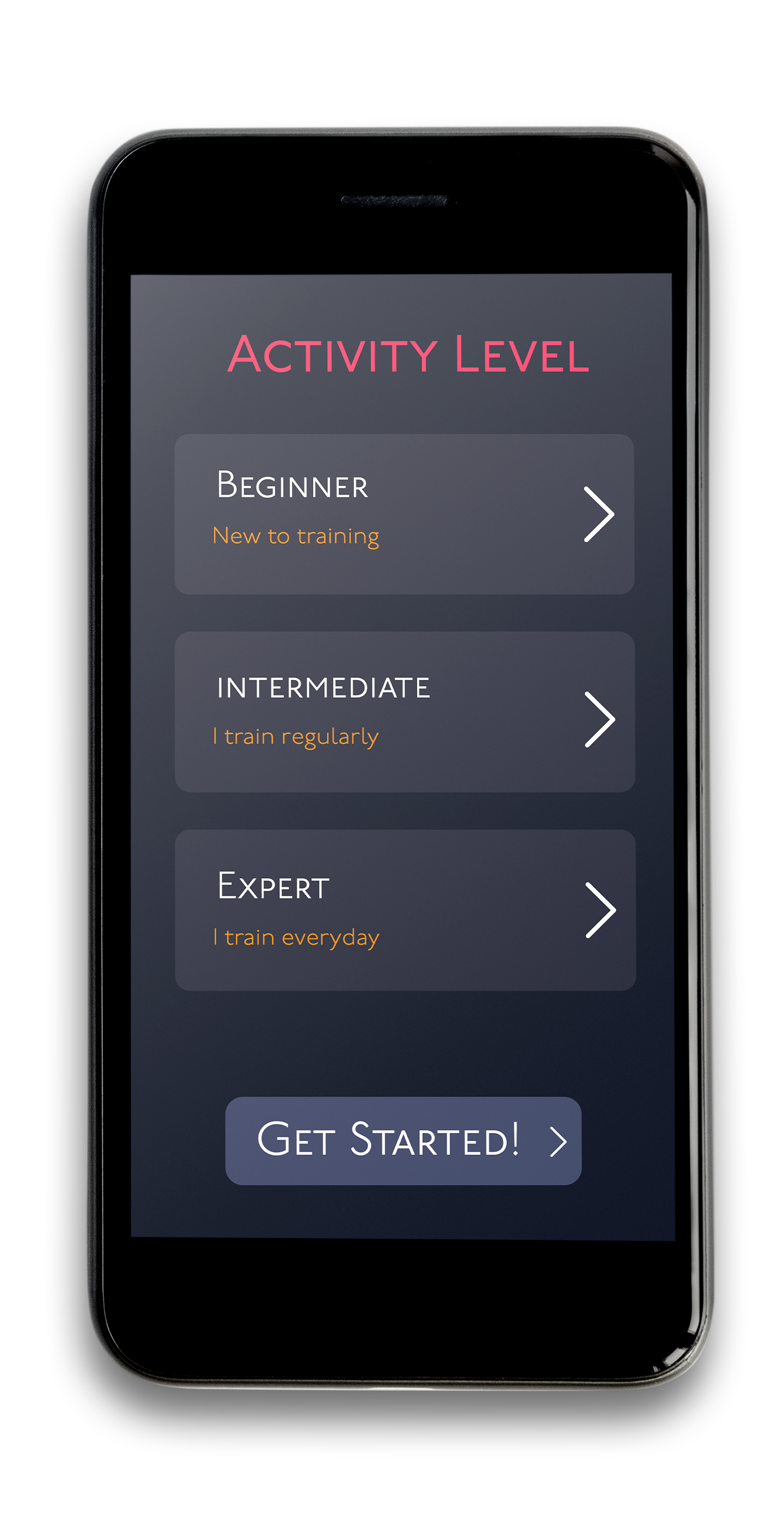
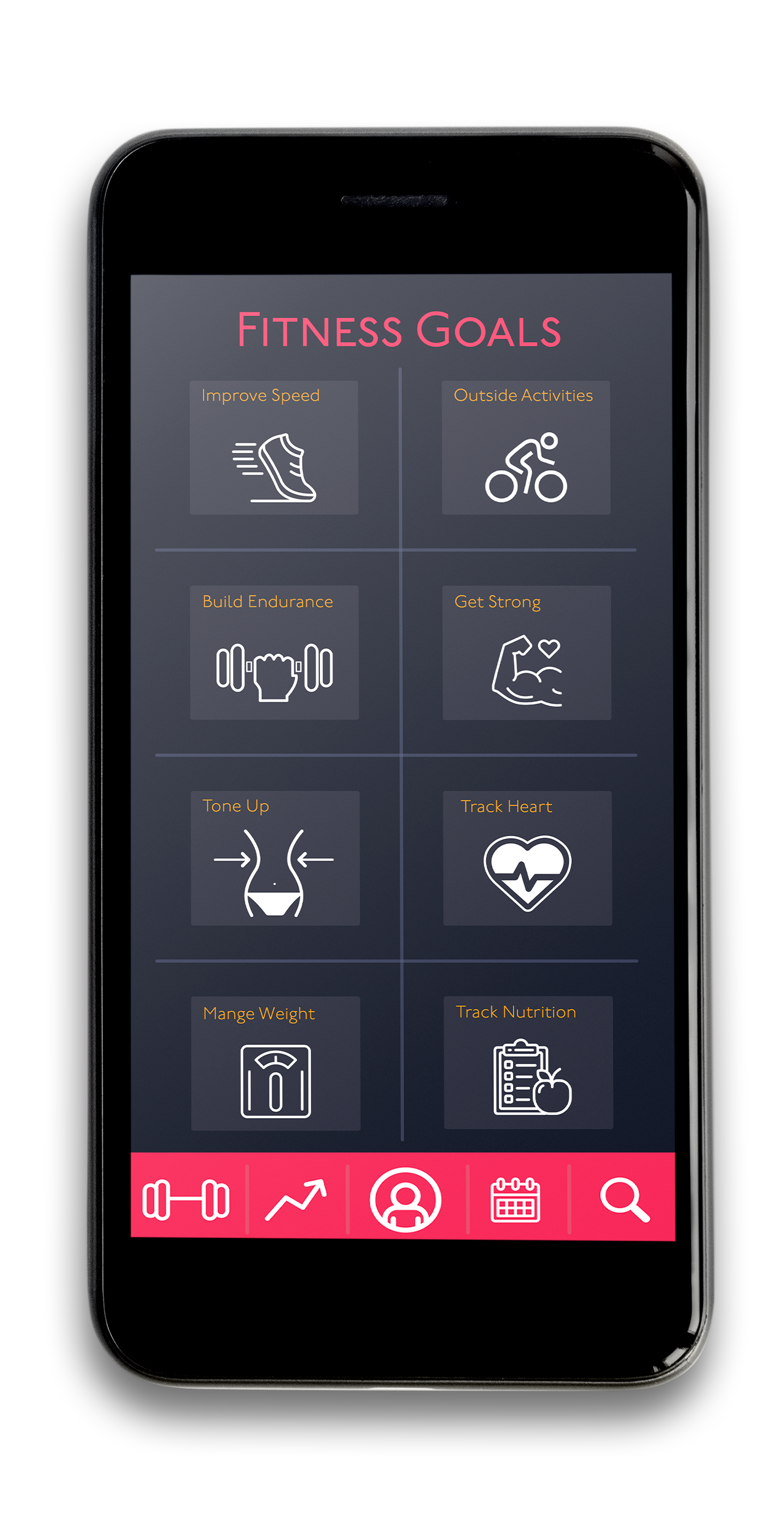
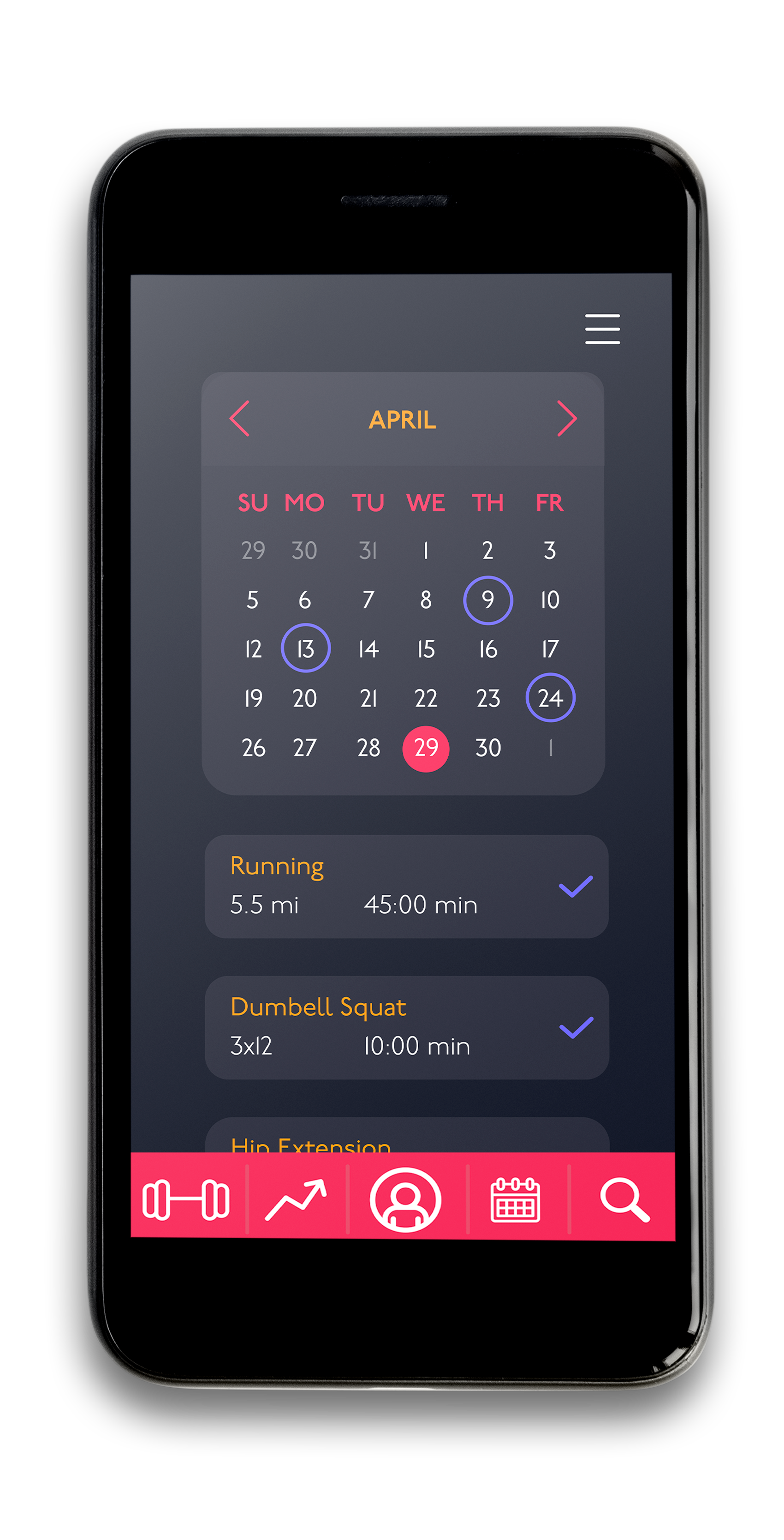
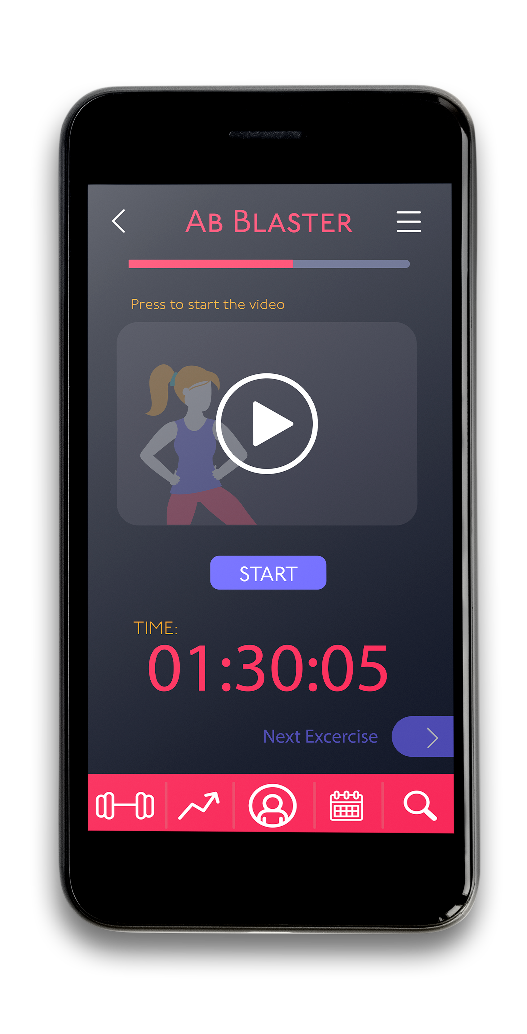
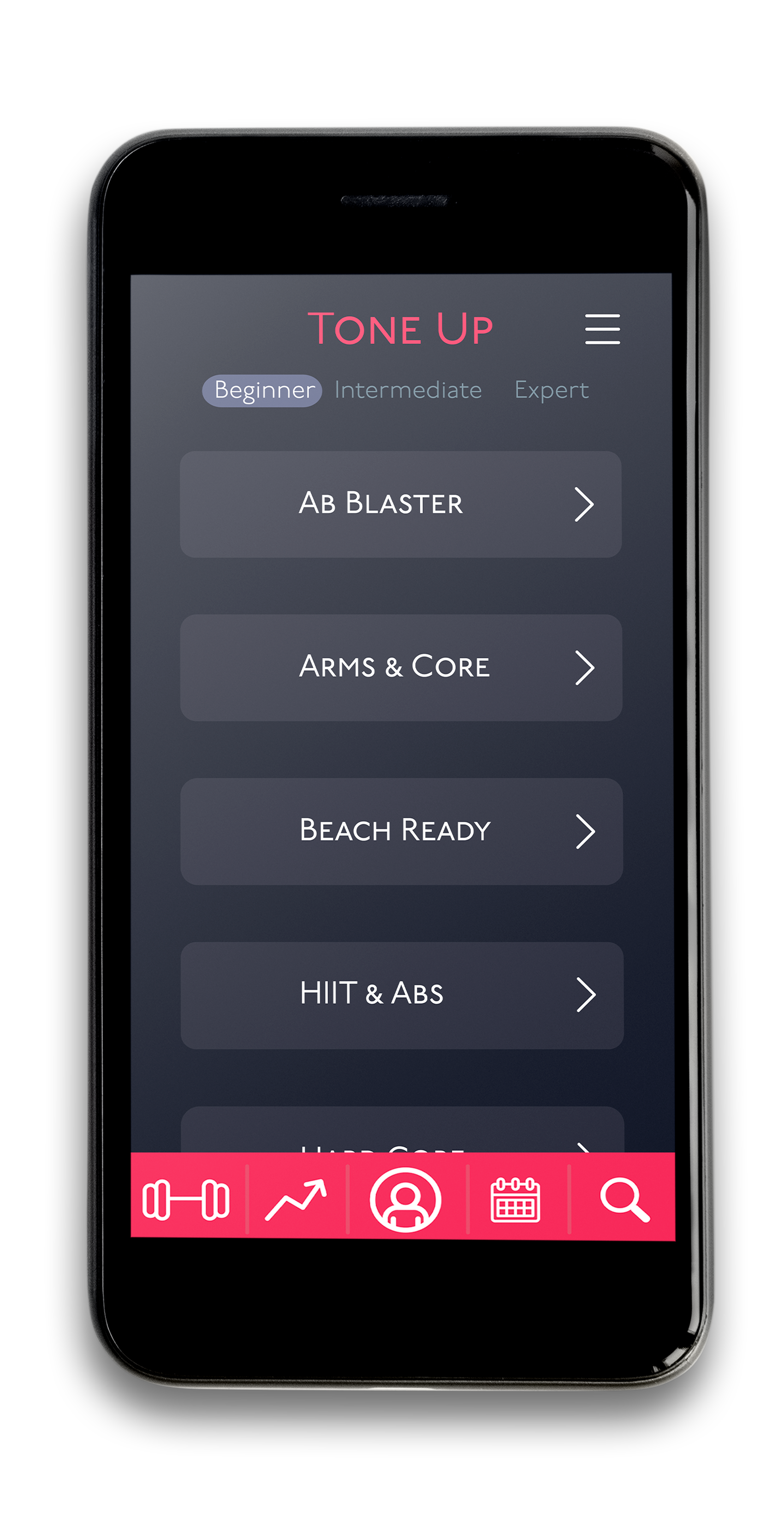
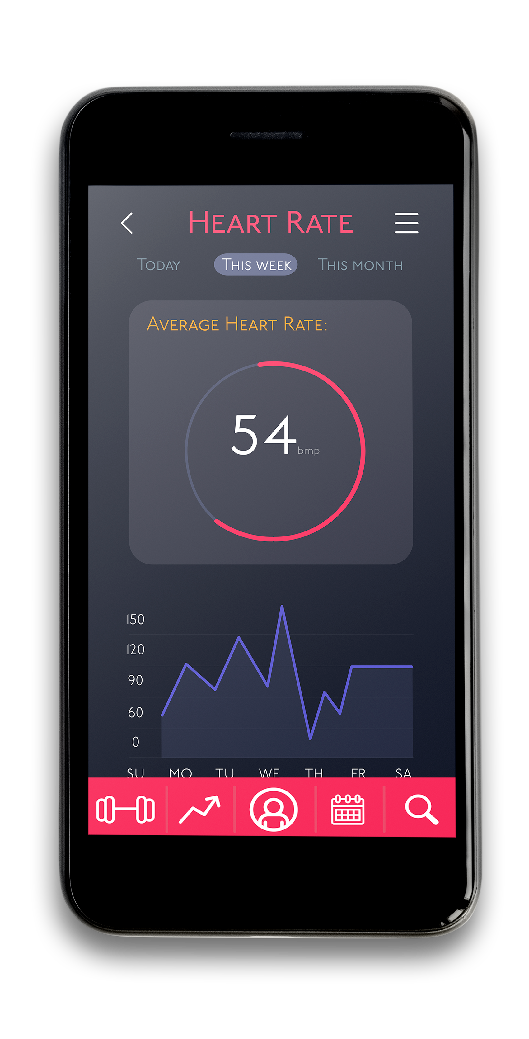
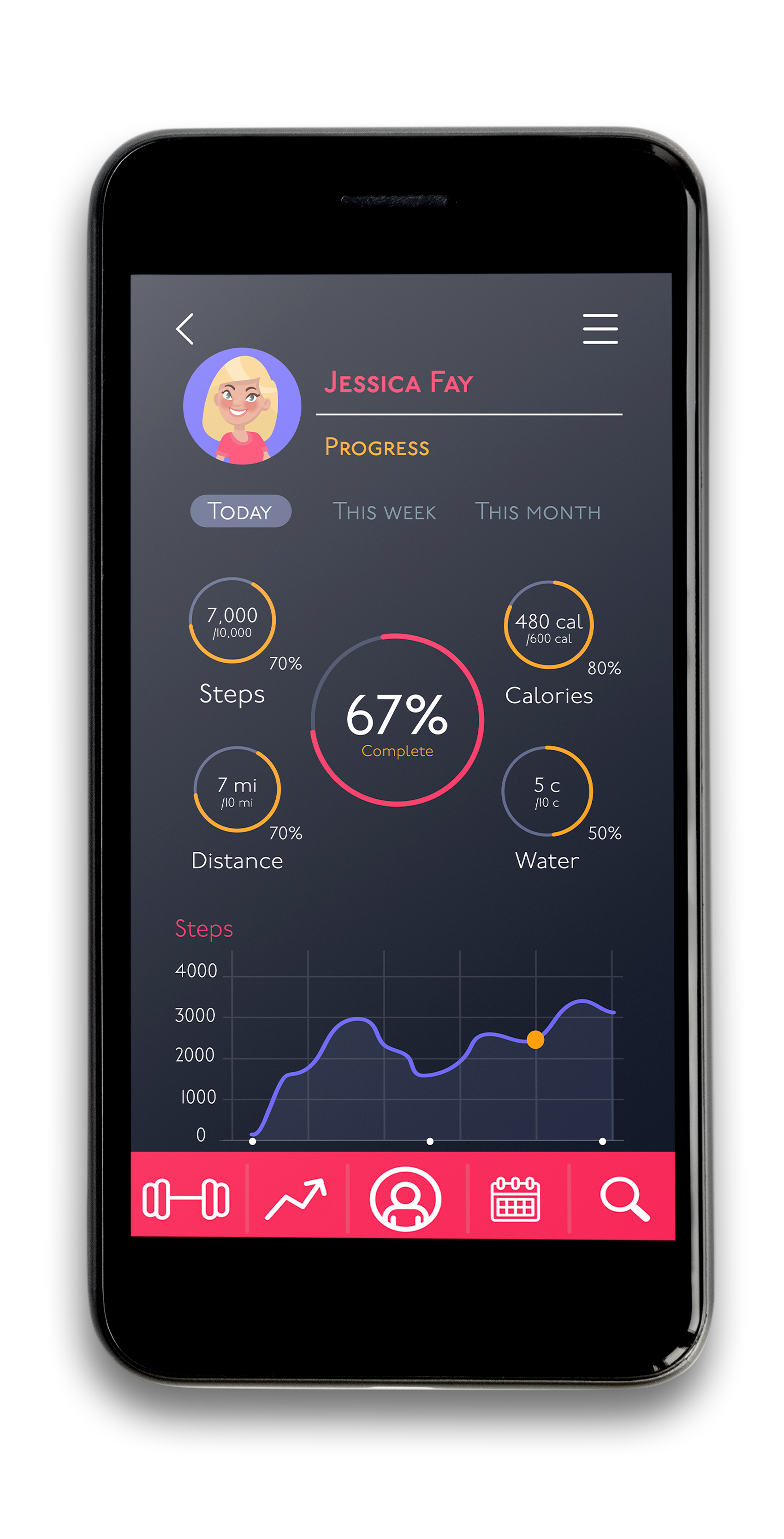
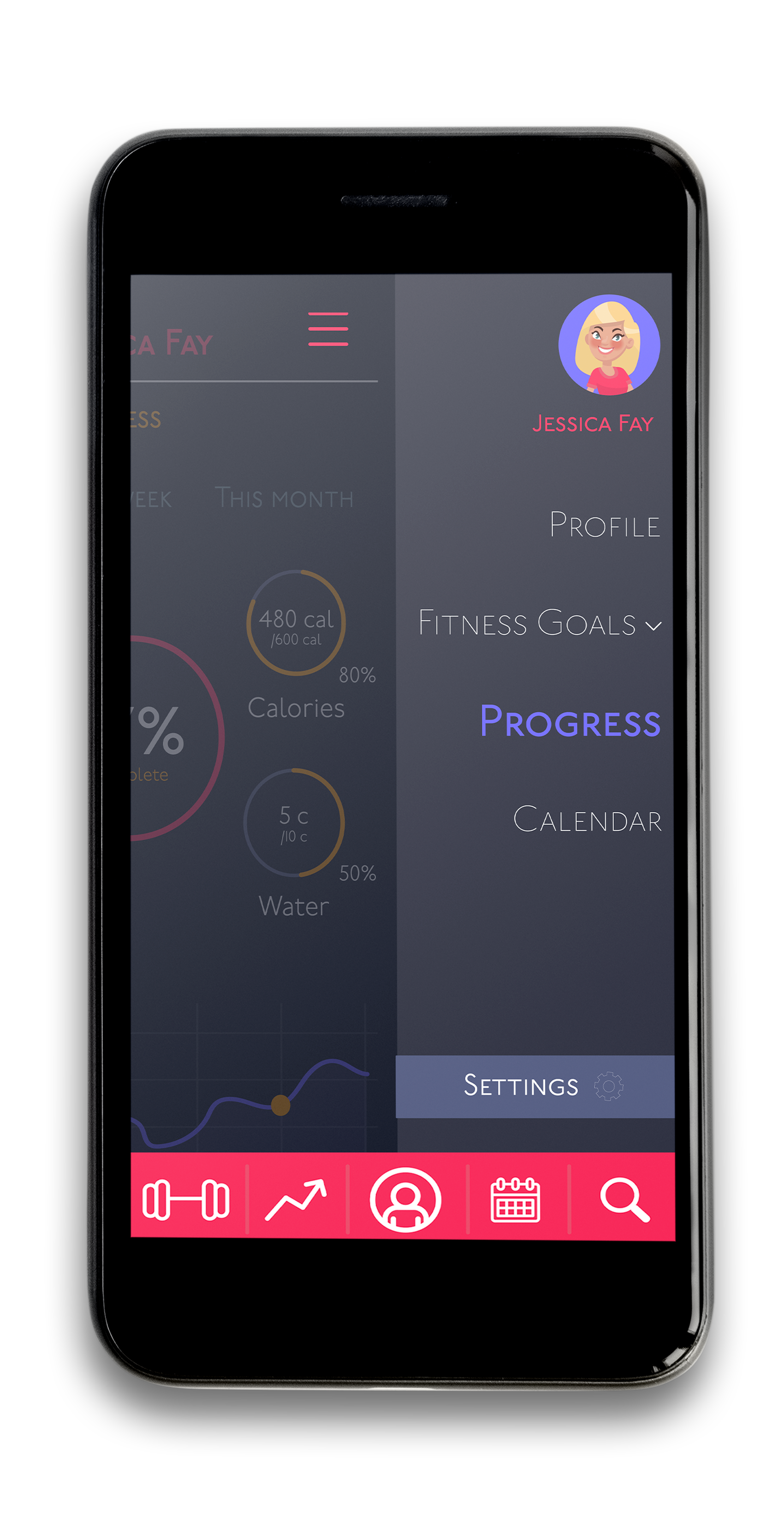
Click any screen to expand. All screens designed for iOS, covering the full user journey from first open to daily habit.