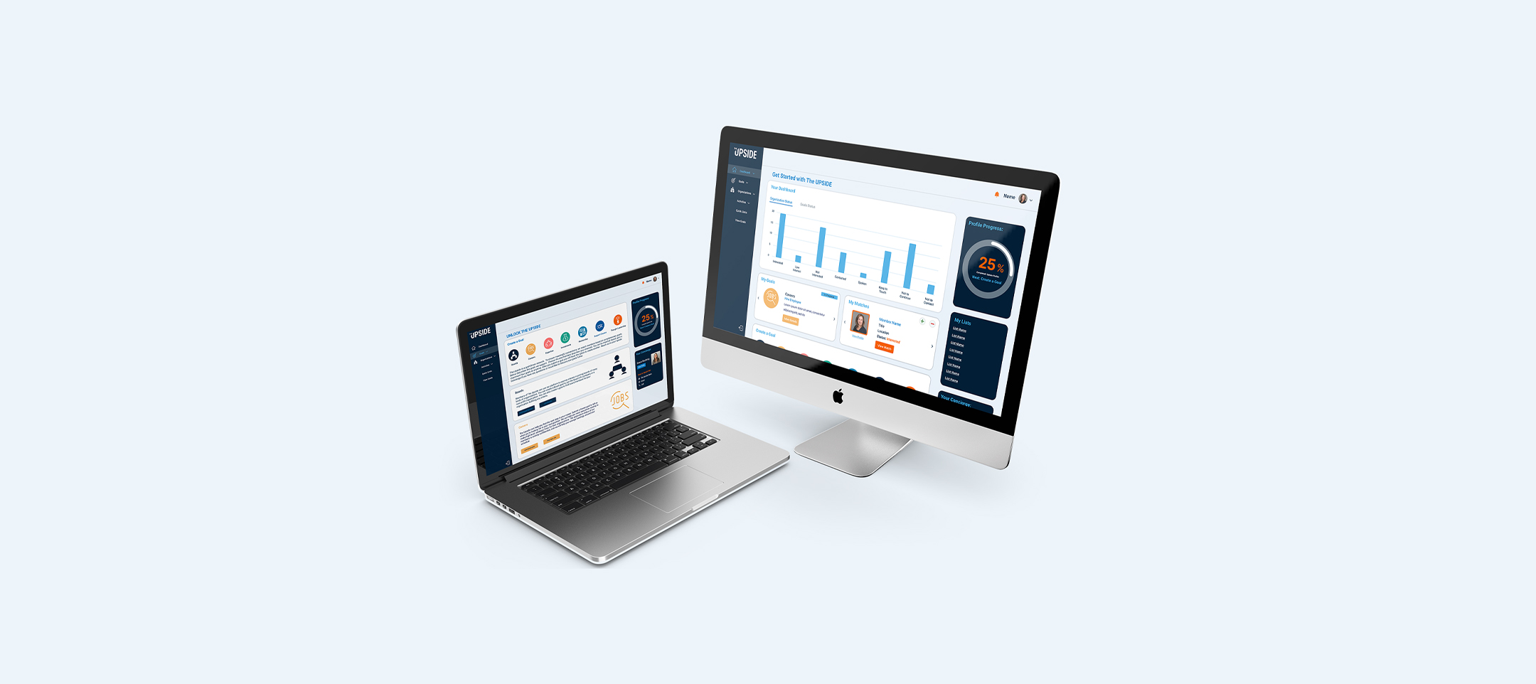
End-to-end UX redesign for an exclusive professional networking platform
The Upside is an exclusive digital networking platform connecting ambitious professionals across sectors: entrepreneurs, executives, creatives, and early-career talent within curated communities. The community itself was strong. The platform was not.
When they came to me, the product had outgrown its original design. The UX felt dated and fragmented. The visual brand lacked the polish and exclusivity the community deserved. Users struggled to discover value quickly, and the navigation made it hard to understand who else was in the network.
The core tension: a high-quality, curated membership trapped in a product experience that didn't communicate that quality at all.
"The platform needed to feel as exclusive and polished as the community itself."
Before touching any design tools, I spent time in discovery. I conducted interviews and contextual observation sessions with members across the platform's main user types. The goal was to understand not just what they did, but what they were trying to accomplish and where the product was getting in the way.
Key research questions focused on: how members found and evaluated new connections, what made them return to the platform week over week, where they felt friction or confusion, and what they wished the platform did that it currently didn't.
I synthesized findings into themes and mapped them to user needs, which then directly shaped the personas and IA decisions that followed.
My research surfaced three distinct user types, each with different goals, frustrations, and definitions of value. These personas became the north star for every navigation, component, and copy decision throughout the project.
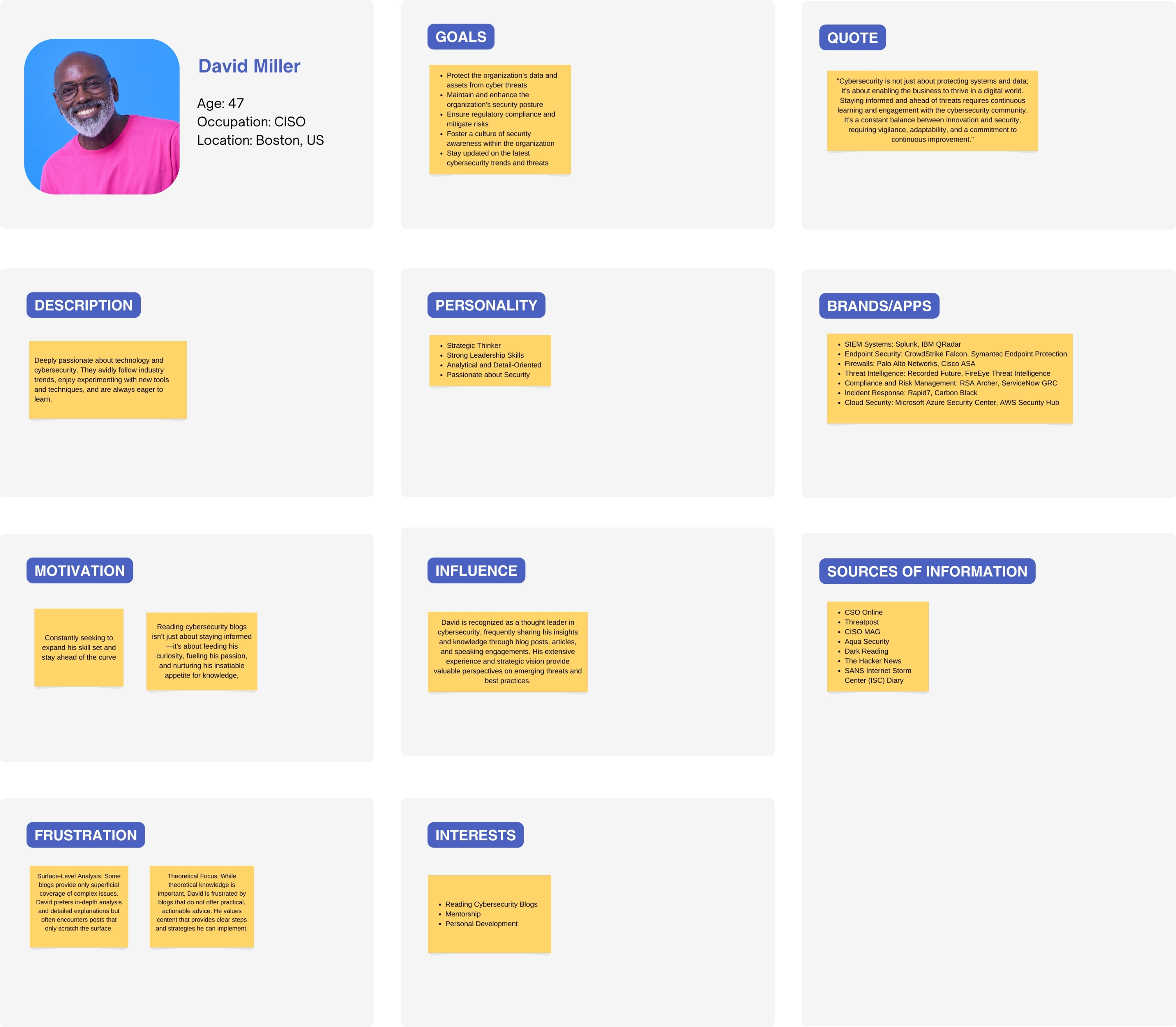
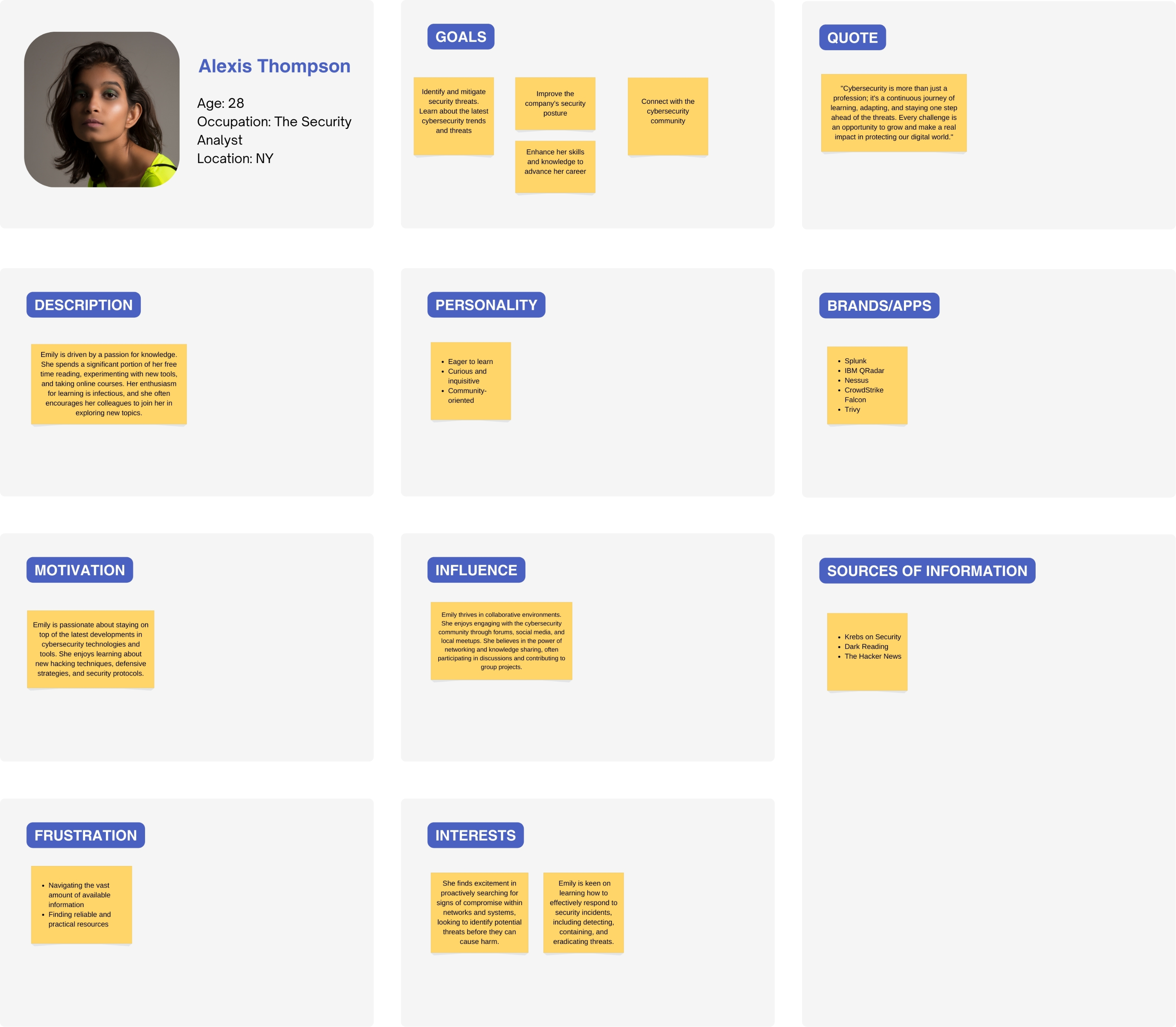
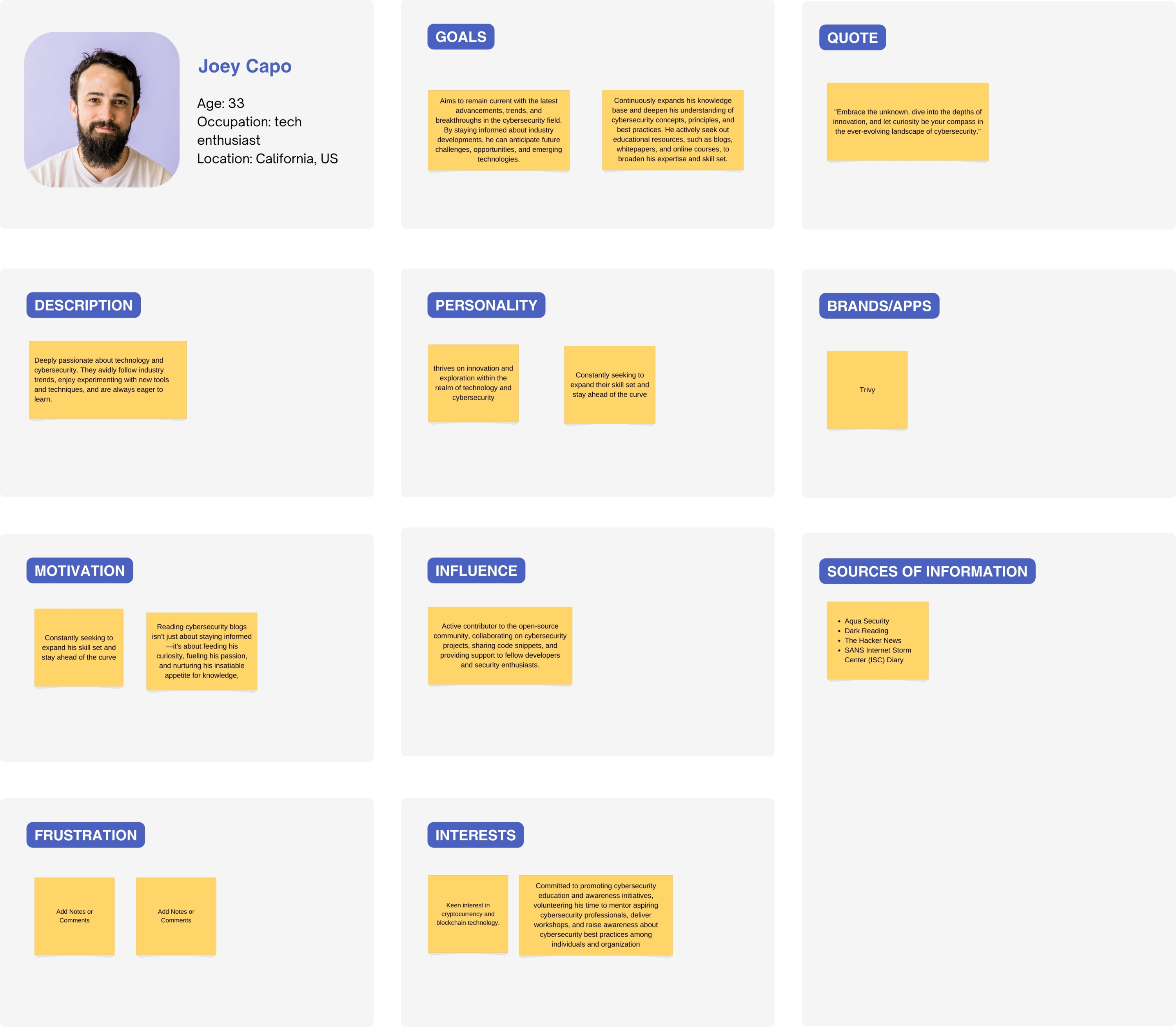
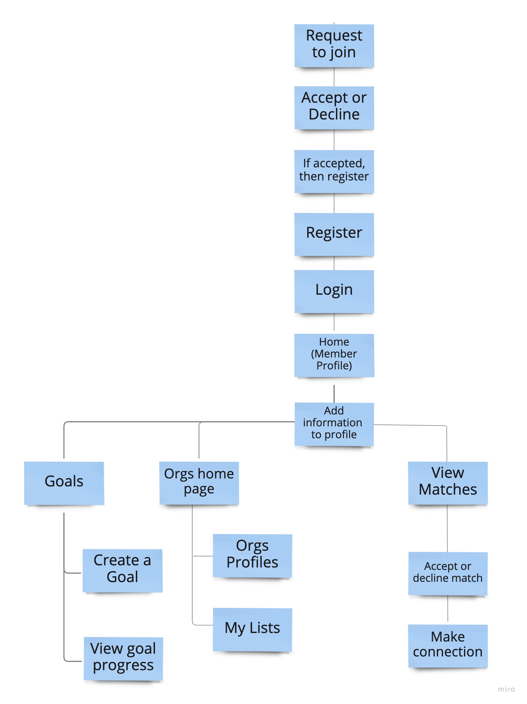
With personas defined, I rebuilt the platform's structure from scratch. The existing IA buried key features and made it difficult for users to orient themselves within the first two clicks.
I mapped a new site structure that prioritized discovery, value recognition, and cross-persona flexibility. The goal was a hierarchy that felt intuitive whether you were a time-poor executive scanning for signal, or an early-career member trying to find a mentor.
I wireframed in two phases. First, hand-drawn sketches to rapidly explore layout ideas and navigation patterns without committing to anything. Then, digital lo-fi wireframes to test specific interactions and page structures with a subset of users.
I ran multiple iteration rounds on the dashboard, the organization discovery flow, and the member profile. I refined navigation and hierarchy until they felt intuitive across all persona types.
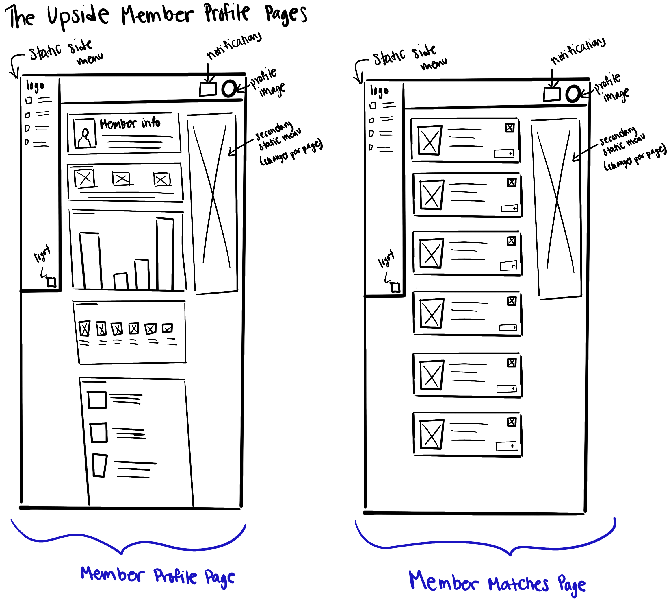
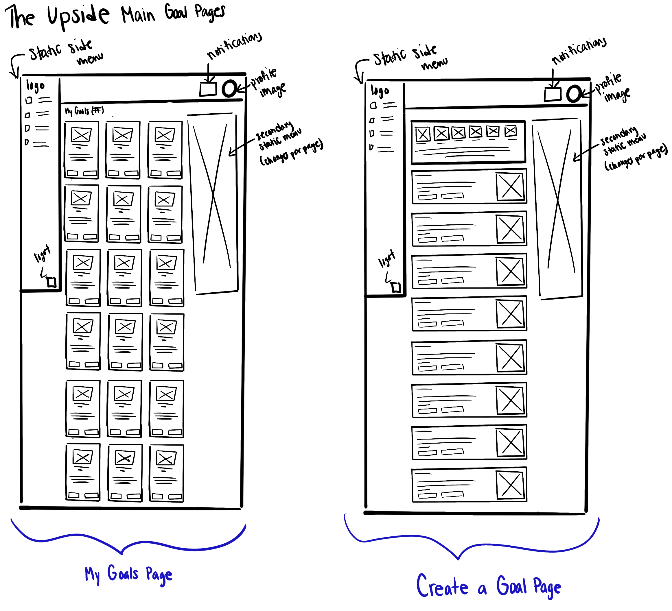
Hand-drawn sketches, rapid layout exploration before committing to digital
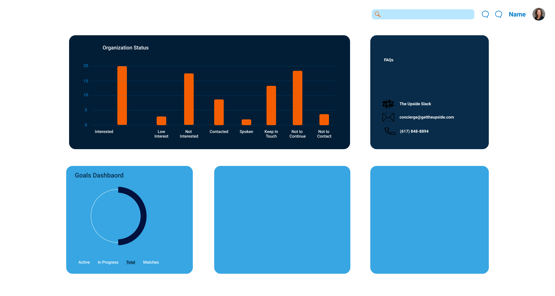
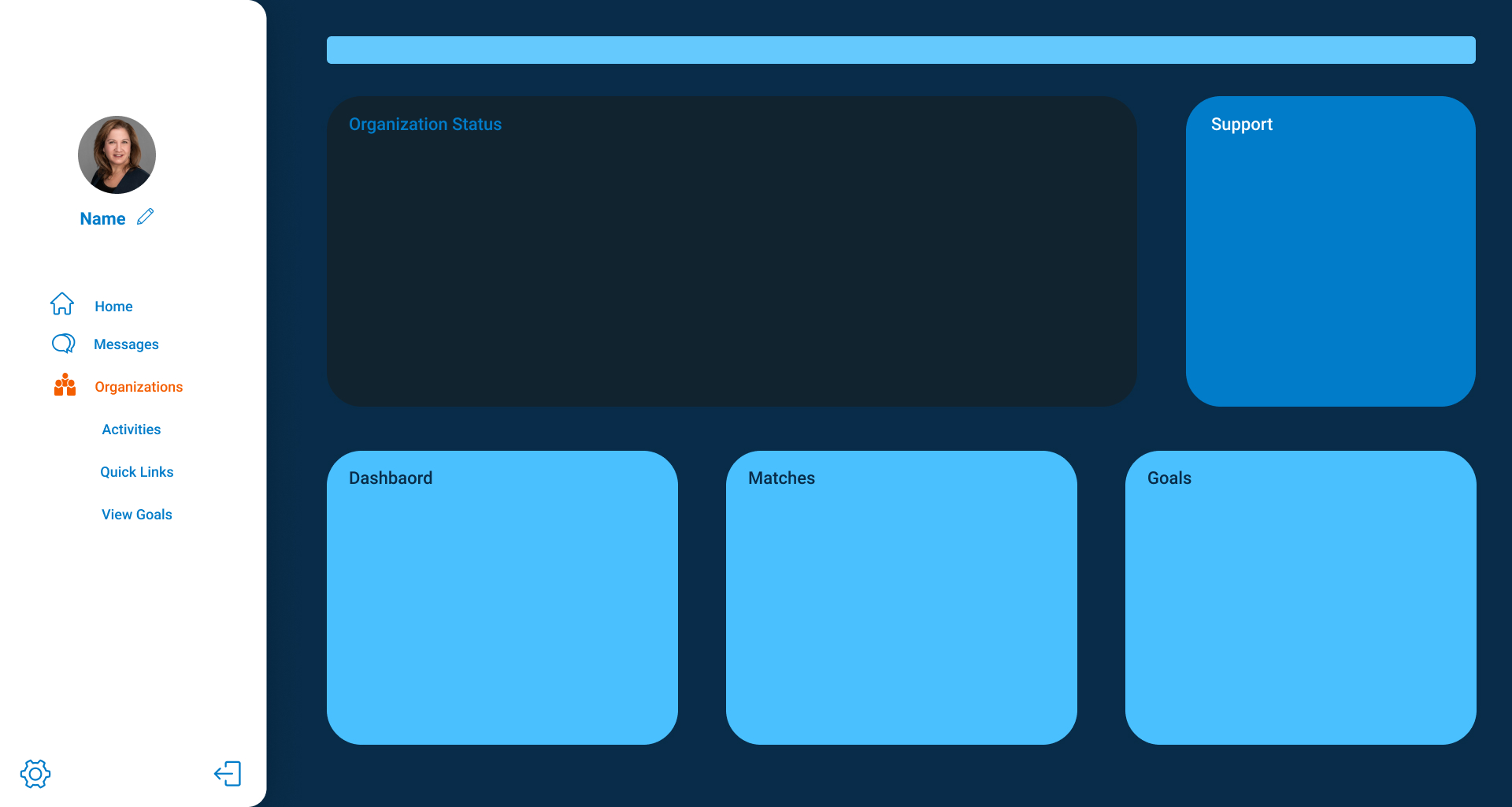
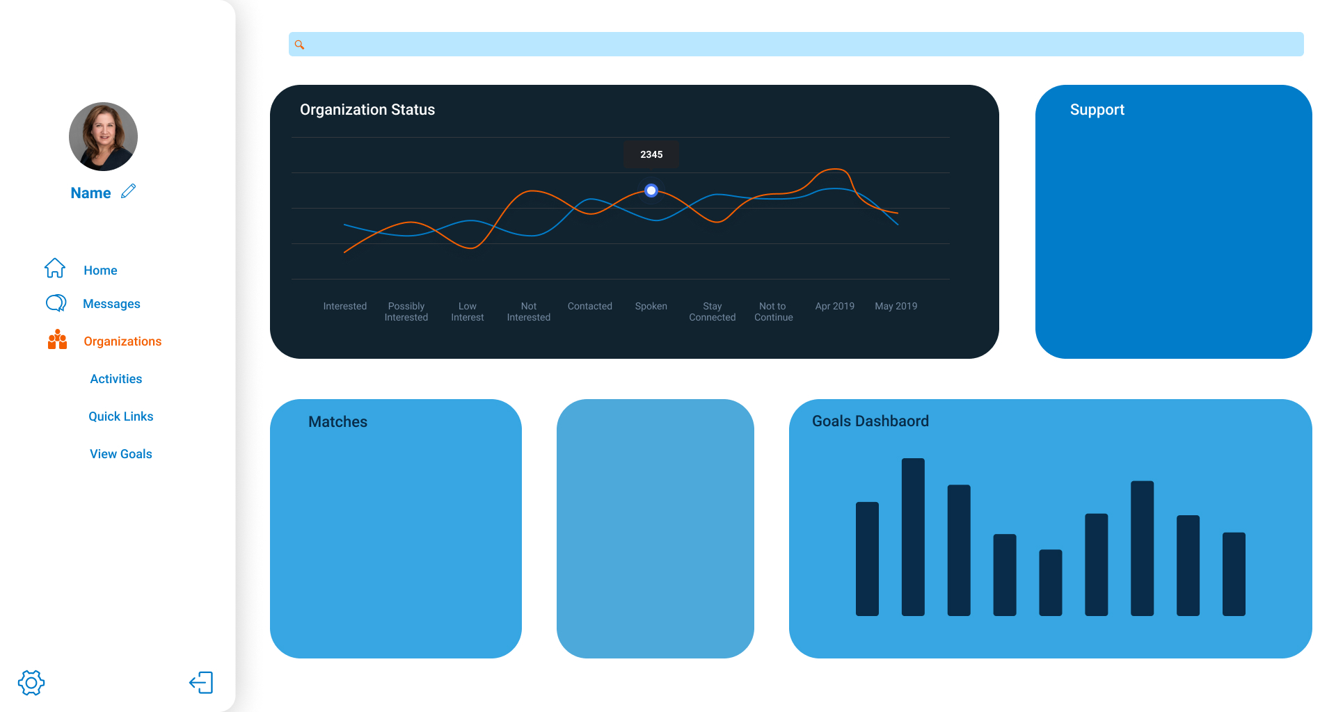
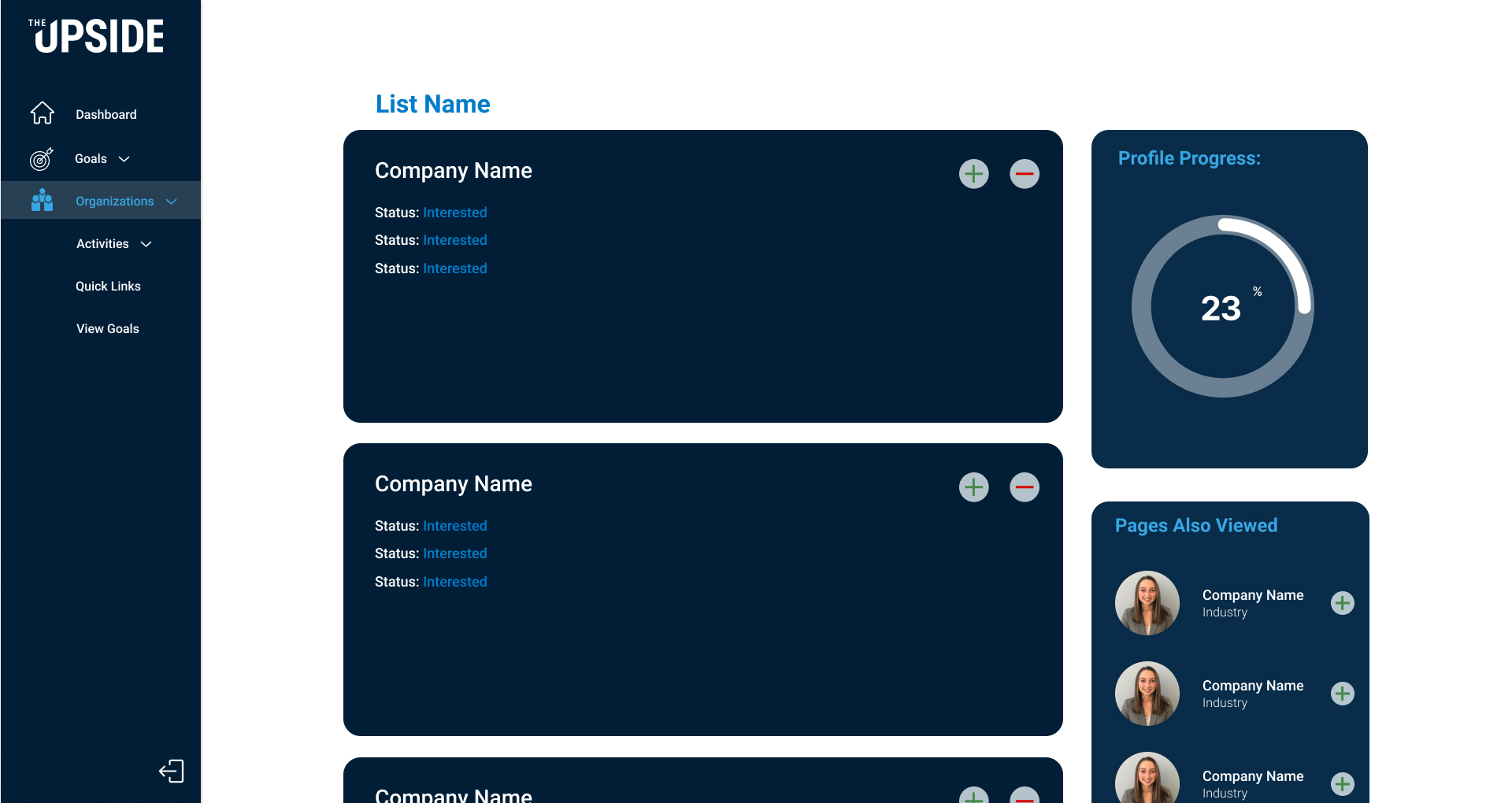
Digital lo-fi wireframes tested with users before moving to hi-fi
With a validated structure in place, I focused the visual design phase on building a brand that matched the exclusivity of the community. This meant a refined color palette, a clear typographic hierarchy, and a component library built for consistency at scale.
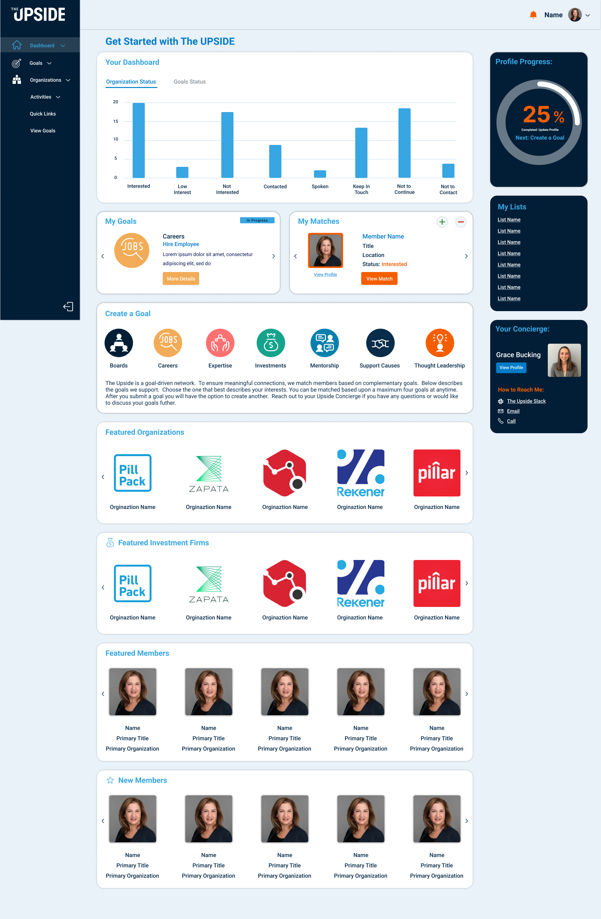
The new design language moved away from the generic SaaS aesthetic of the original toward something that felt considered, premium, and human. Dark backgrounds for focus areas. Warm accents to signal action. Clean, open layouts that didn't crowd the user.
I documented every UI component and built it for reuse, so future design work could scale without starting from scratch.
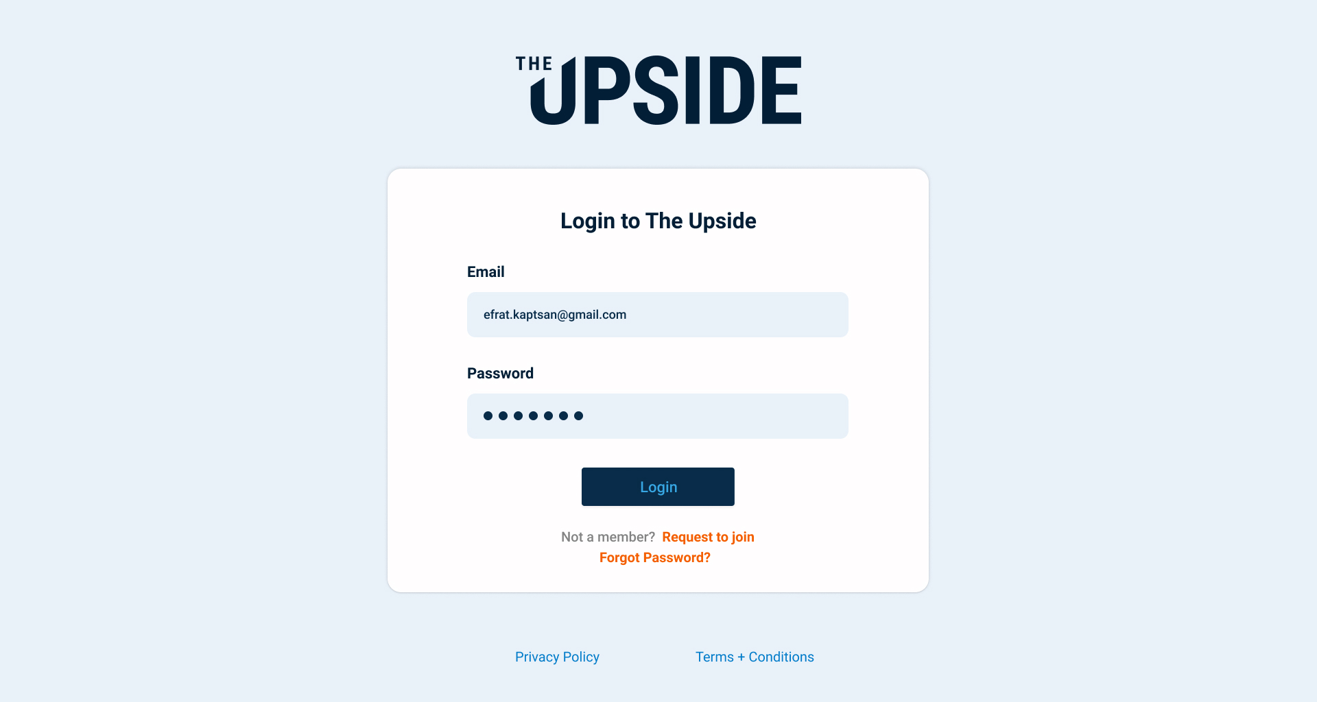
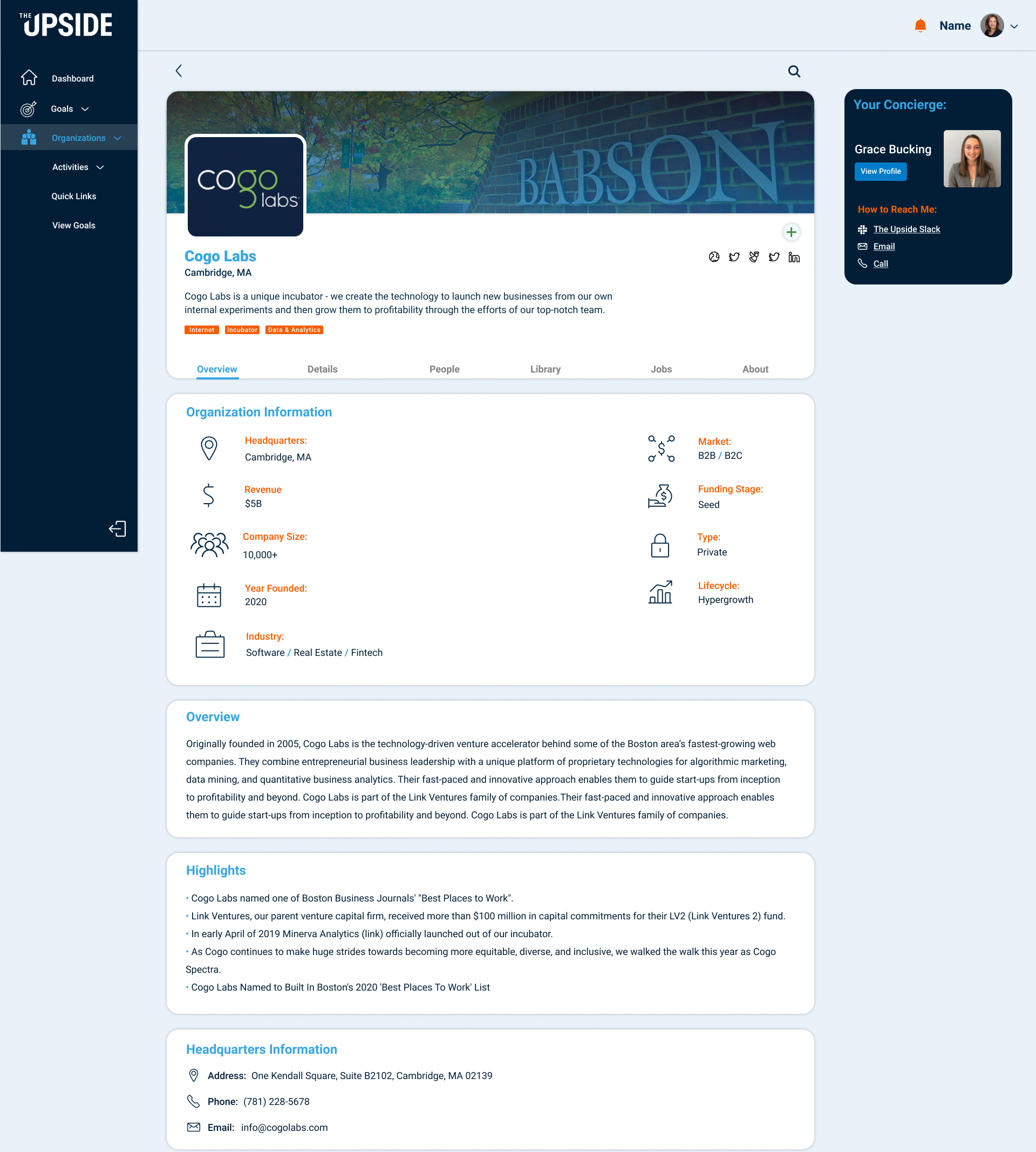
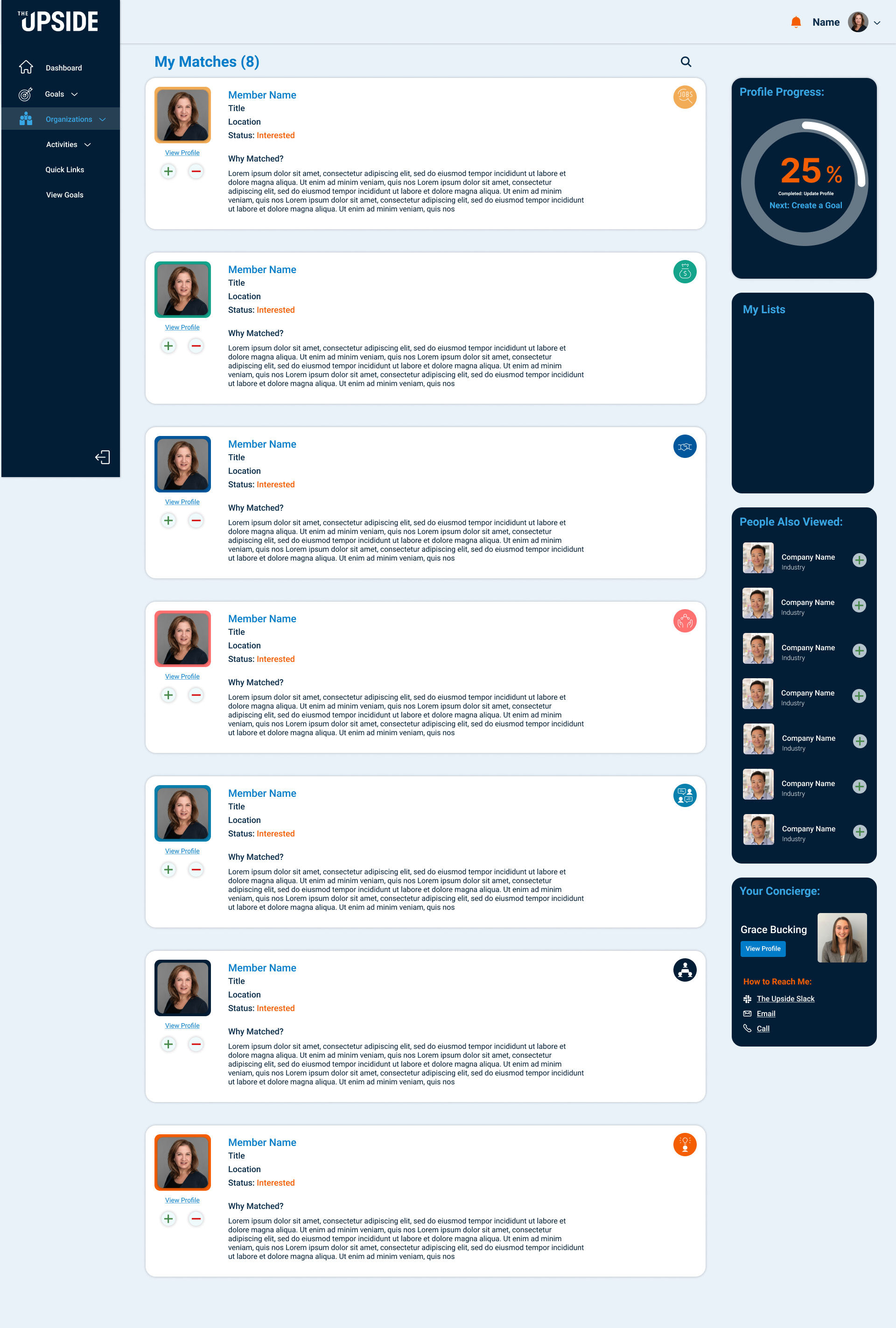
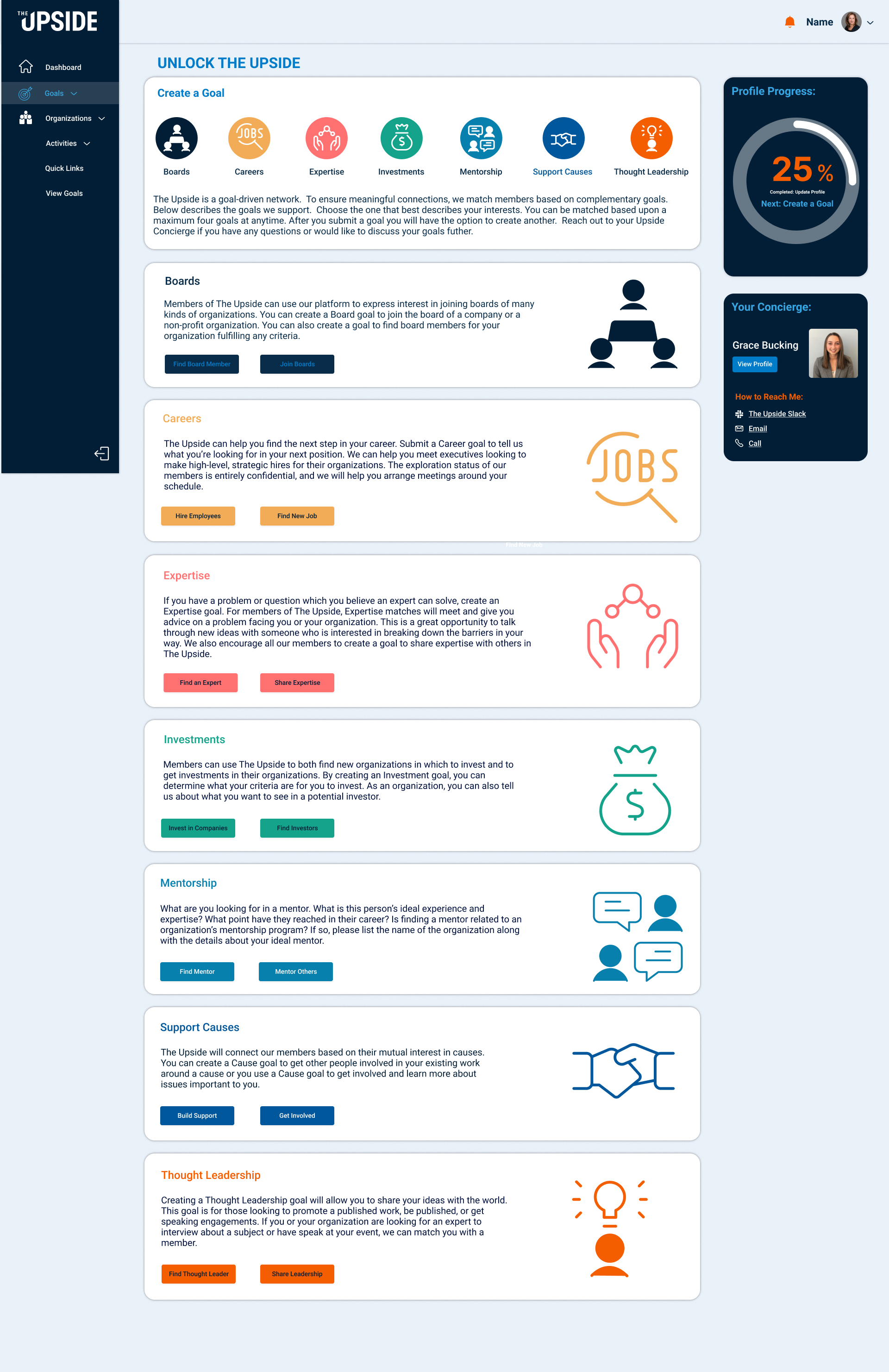
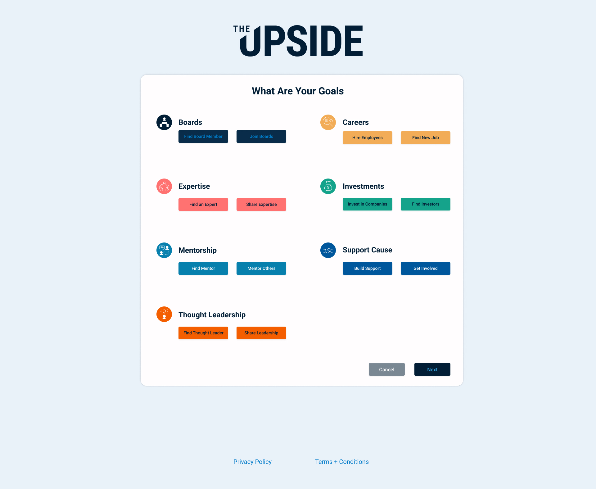
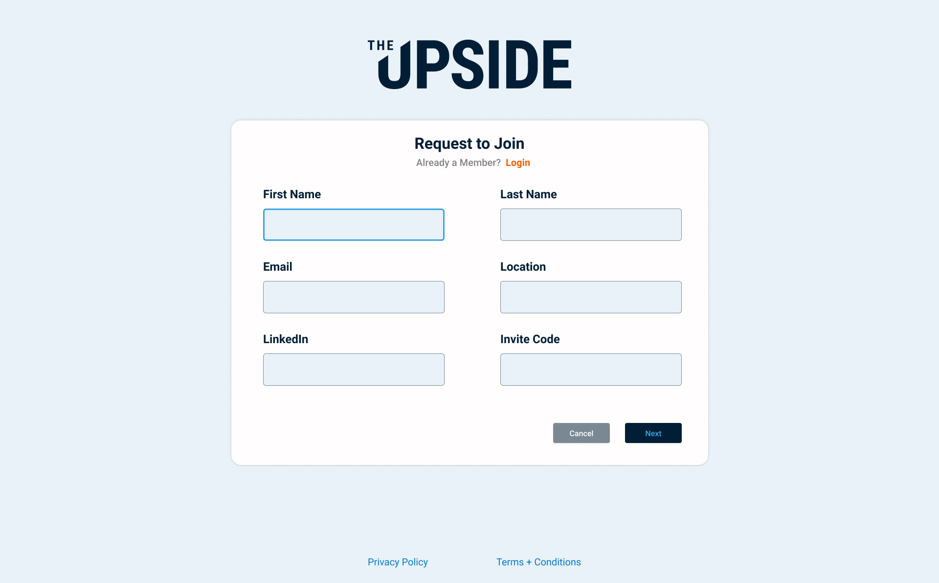
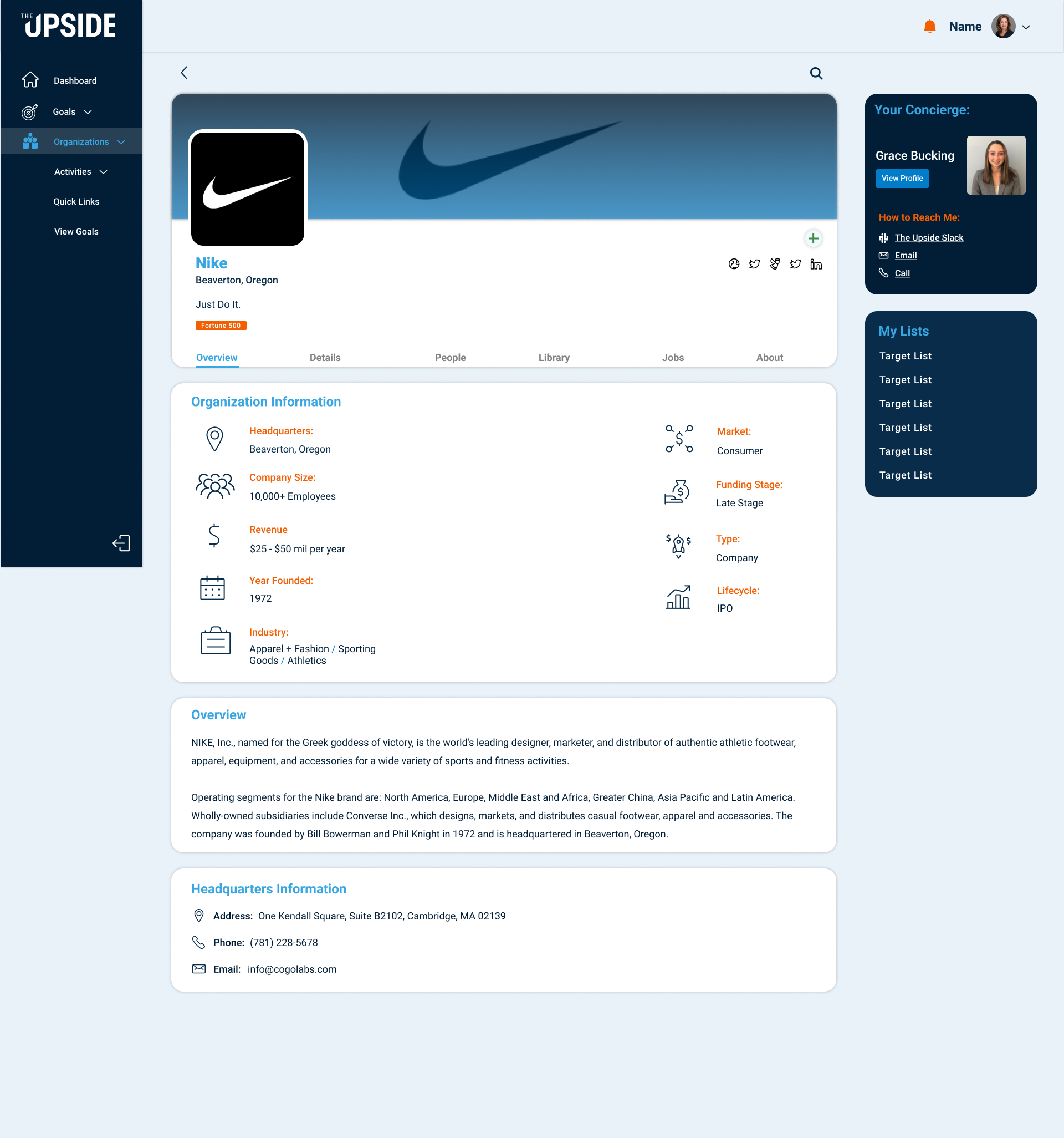
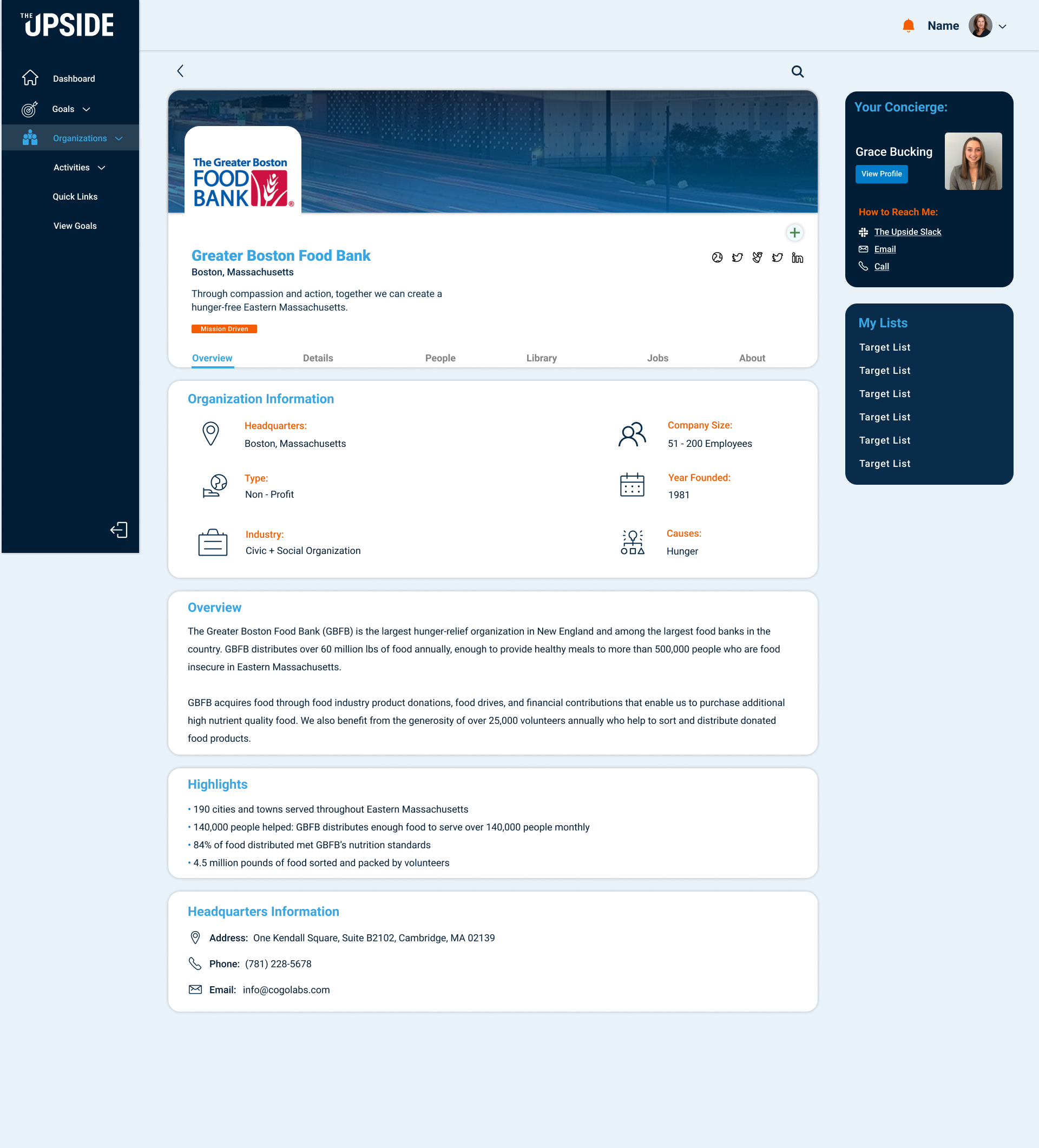
Click any screen to expand. The final deliverable covered all major user journeys: onboarding, discovery, member profiles, goal-setting, and matching.
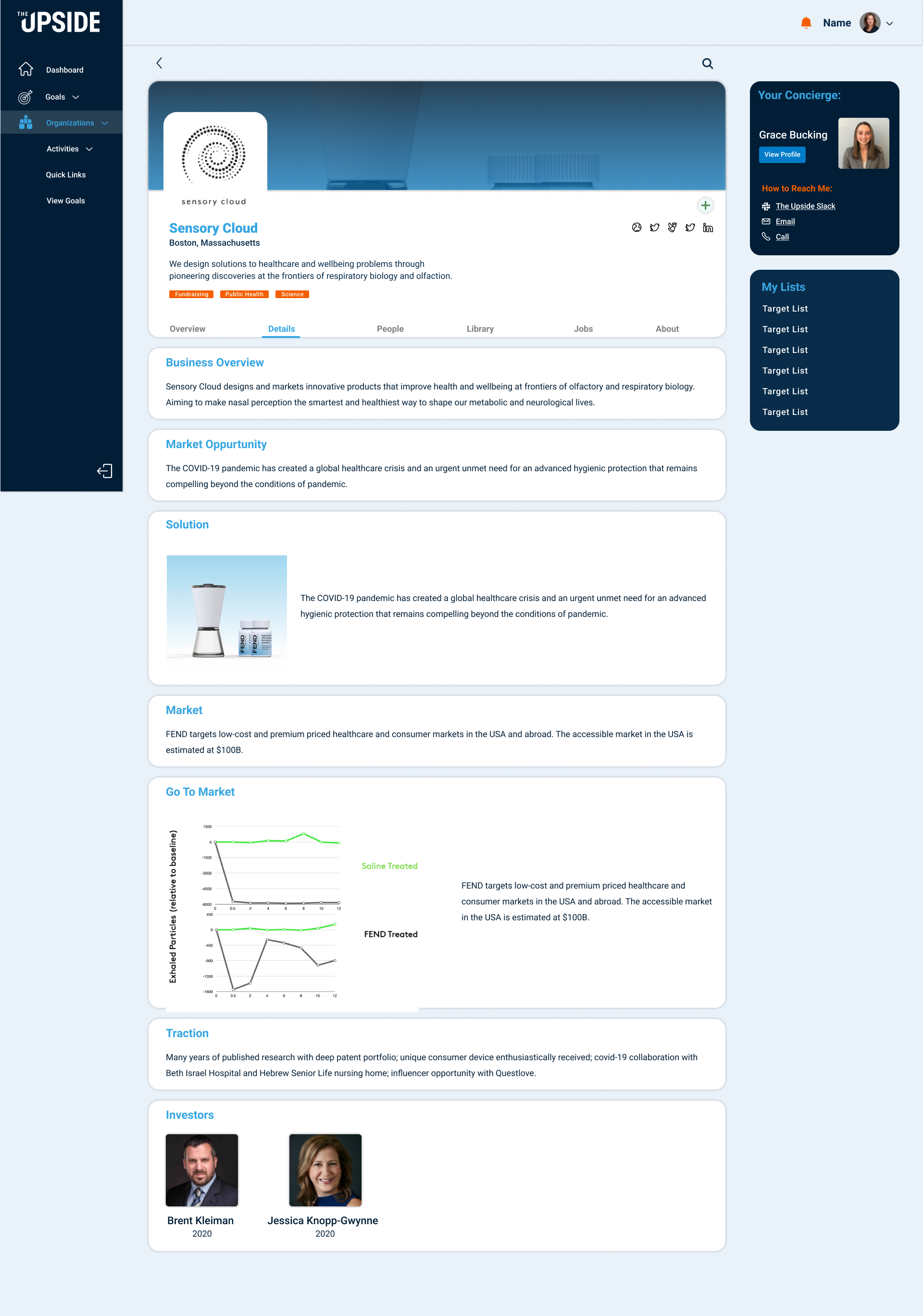
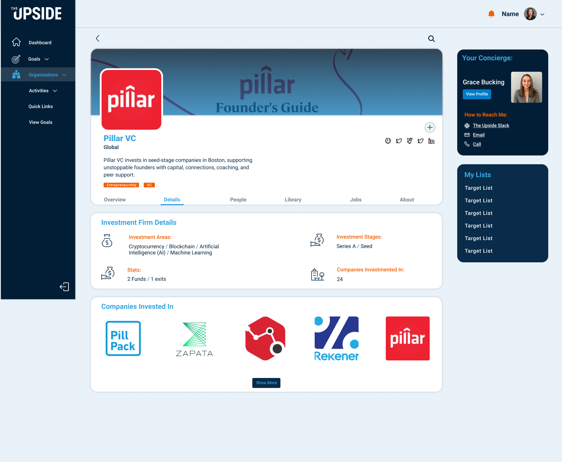
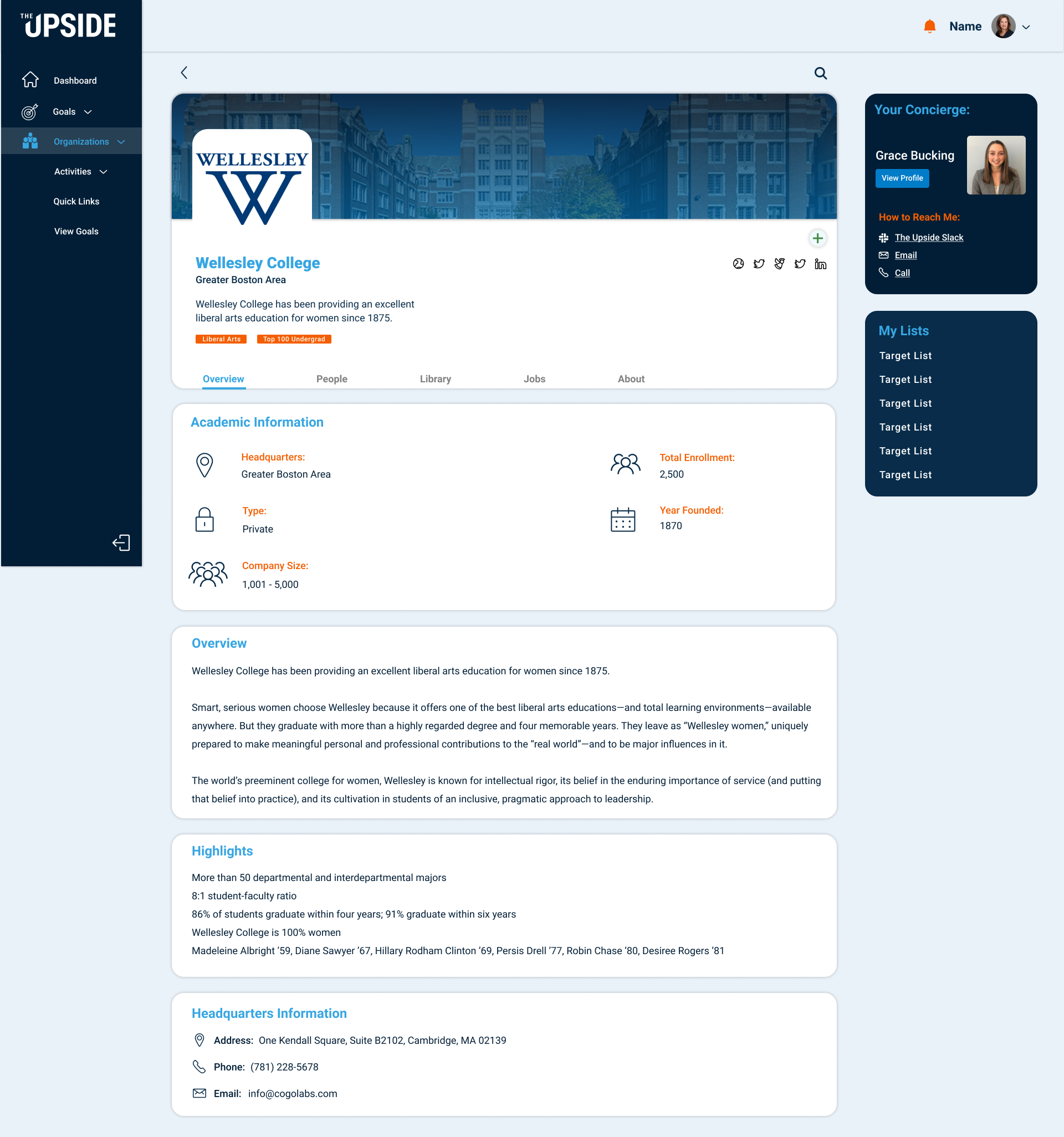
This was a freelance engagement, completed at the handoff of final designs. Post-launch metrics weren't available to me, but the deliverable was a complete, production-ready design system the team could build from directly.