When AI became the art director
Redesigned Aqua's security blog and built an AI-generated image system for their research content, turning dense technical posts into editorial-quality pages.
Great research, invisible on the page
Aqua's security research team was publishing some of the most credible threat intelligence in the cloud-native space. But the blog that housed it looked like every other enterprise security site: generic dark backgrounds, borrowed stock imagery, and a layout that made every post look the same regardless of what was inside.
The imagery problem was the most visible symptom. A post about container escape vulnerabilities sat behind the same blue gradient as a post about compliance tooling. There was no visual connection between what a post was about and how it looked. For a brand built on precision and expertise, the blog wasn't making that case.
The research is best-in-class. The blog doesn't show that.
Paraphrased from team feedback at Aqua SecurityThe project had two tracks running in parallel: a full redesign of the blog homepage and post page layouts, and a new approach to imagery that could scale with the volume of content the research team was producing.
Two tracks, one system
Auditing everything that needed fixing
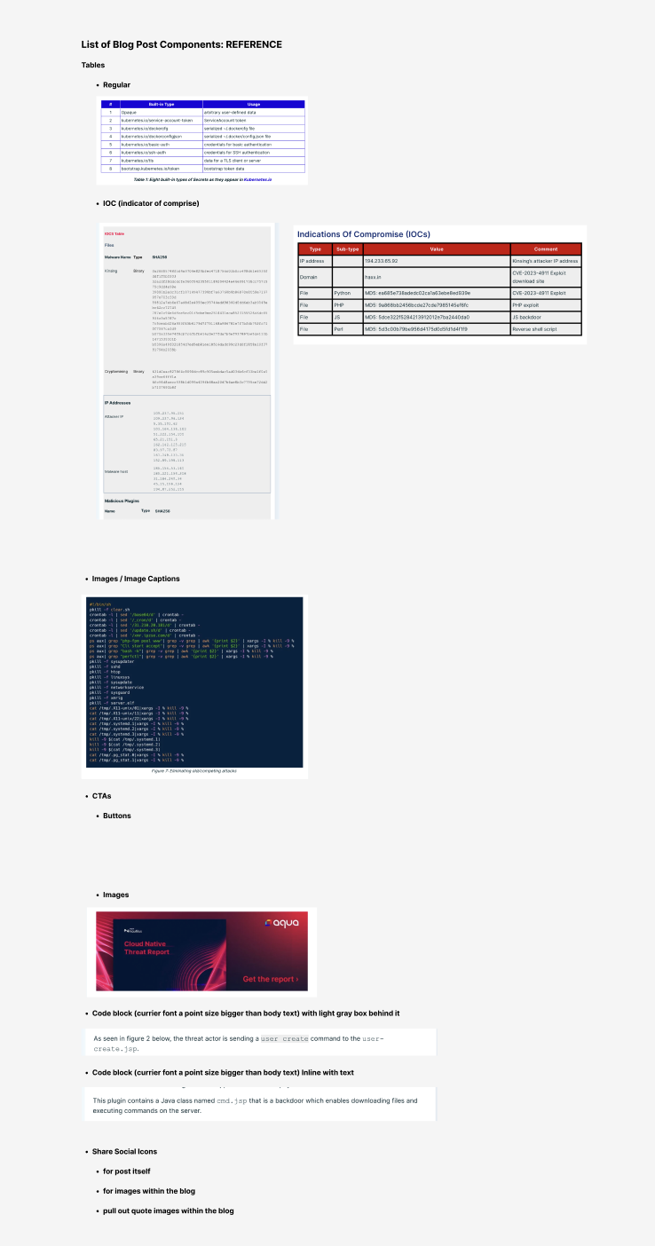
Before designing anything, I cataloged every element of the blog: tables, IOC (Indicator of Compromise) tables, code blocks, pull quotes, CTAs, image captions, author bios. The audit revealed how inconsistently these were being used across posts and how many component patterns were missing entirely.
The imagery audit made the case clearly. Every post used the same dark gradient background, regardless of topic. There was no visual system, no brand consistency, and no way for a reader scanning the blog to know what any post was about from its thumbnail alone. That became the brief for the AI image system.
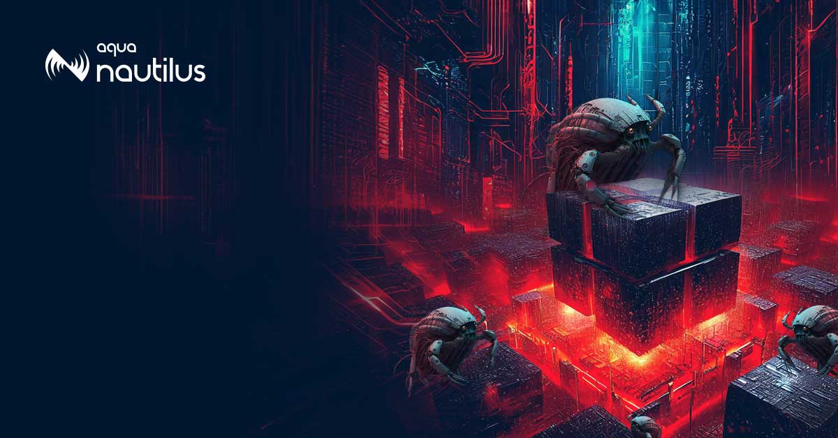
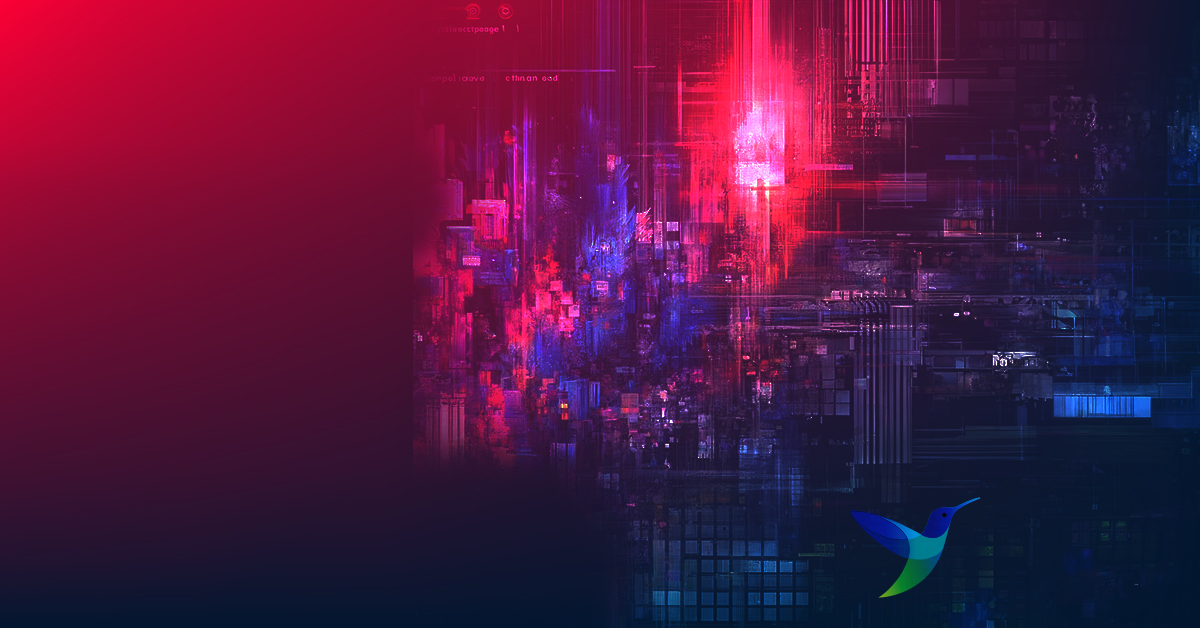
The research topics are inherently technical and abstract: container escapes, supply chain attacks, cryptomining malware. Stock photography couldn't carry that weight without being misleading or generic. AI generation made it possible to create imagery that was conceptually accurate, visually on-brand, and fast enough to scale across 30+ posts without a photo shoot or illustration budget.
But getting there required a reusable prompt template. A vague prompt produces a vague image. The process was built around translating each post's core threat concept into a precise visual metaphor, then layering in style constraints that kept every image consistent across the entire blog.
The images were generated in Adobe Firefly, the tool available at the time. Firefly's style settings, including its cyberpunk style, were tested against other styles before settling on the one that held up across every post.
Teaching AI to think in threat intelligence








A blog that looks like its content
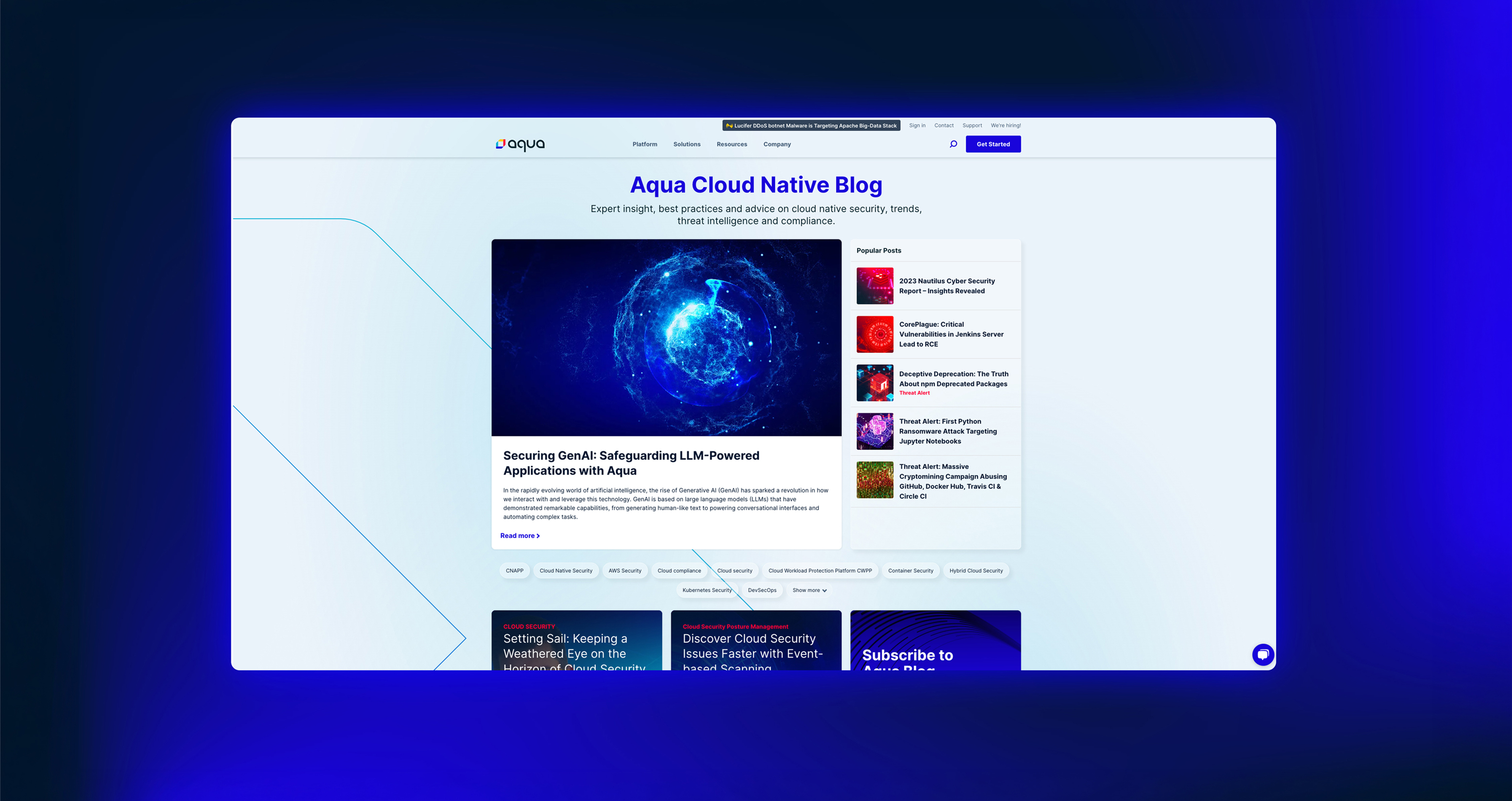
The homepage landed on an editorial structure: featured hero post above the fold, popular posts sidebar, and a filter tag row for topic navigation. The post page was redesigned with larger typography, styled tables, code blocks, in-line CTAs, and a conversion moment at the end of every article.
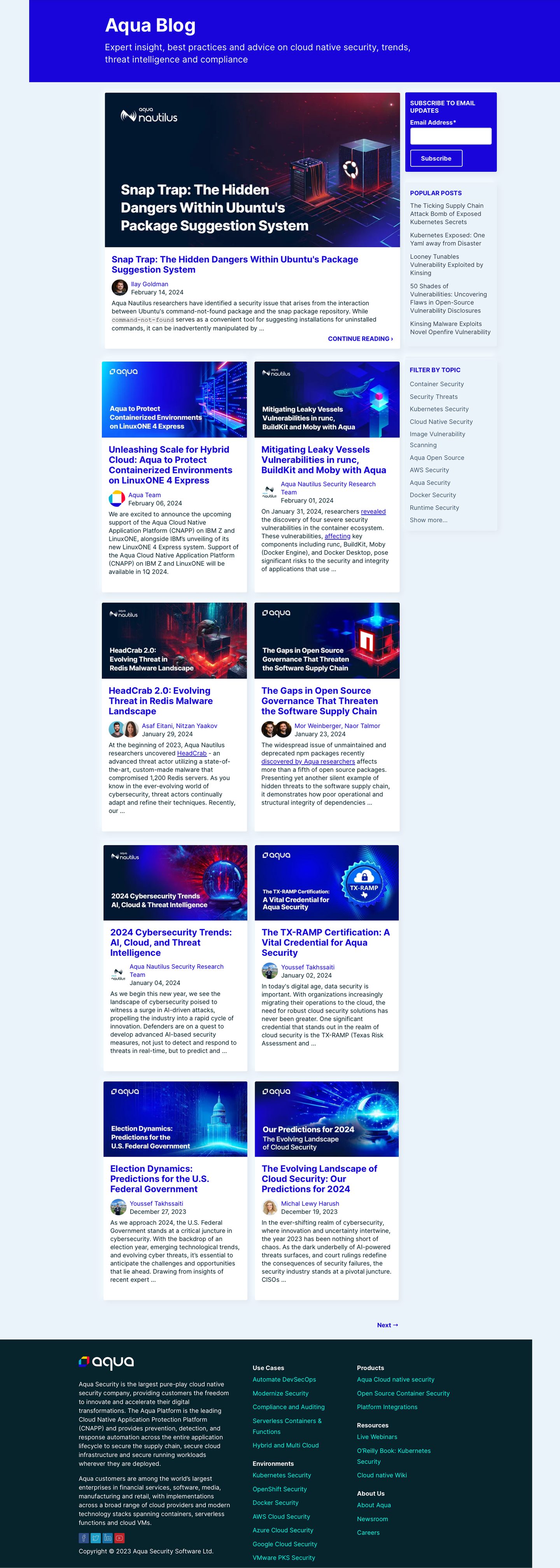
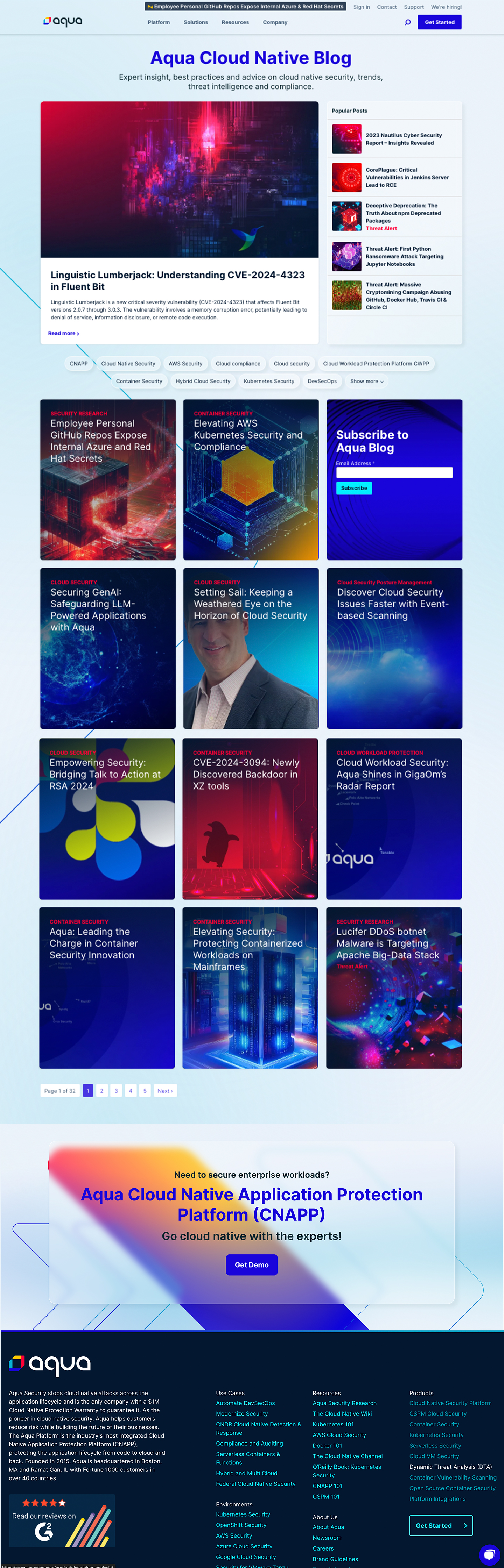
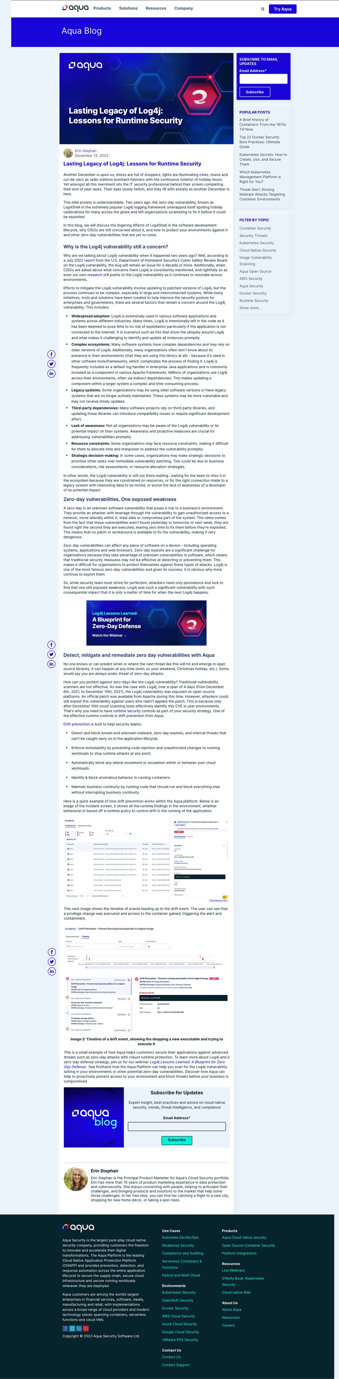

A full live walkthrough shows the scroll experience from the homepage through to an individual post, including hover states, tag filtering, and the reading flow. Both pages are shown as delivered for development.